

Color is one of the hardest decisions when choosing an Hermès bag.
With so many shades available, how do you know which suits you and your wardrobe?
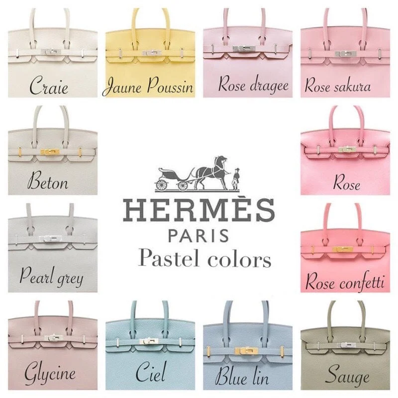
Let’s compare some signature Hermès colors, their moods and styling possibilities. Find a shade that complements your own coloring.
Covering every color would be far too extensive, so we will explore representative shades from each family and what makes them appealing 🙂
(White, yellow, orange, red, pink, purple, blue, green, neutrals and gray, in that order.)
Blanc (White)
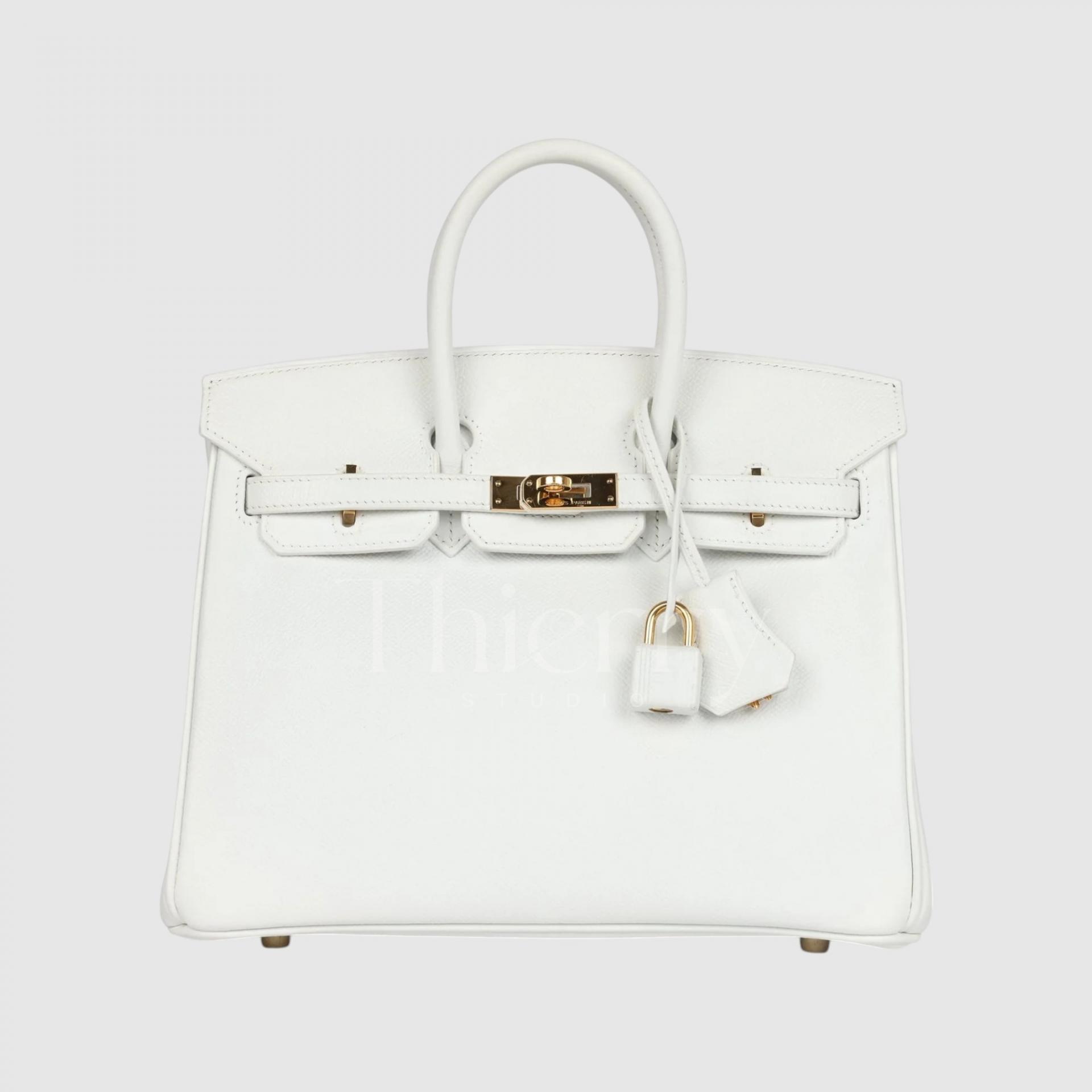
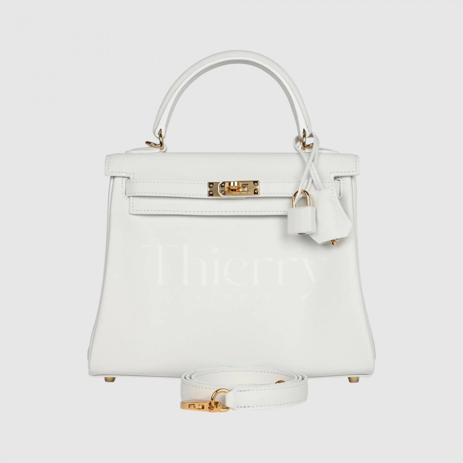
Known as Blanc or White, this is color code 01, the first in the Hermès palette. It is the purest, brightest white, with a crisp, cool undertone.
Blanc has a detail that sets it apart: look closely at the padlock, and you will see that its outer surface is wrapped in white leather.
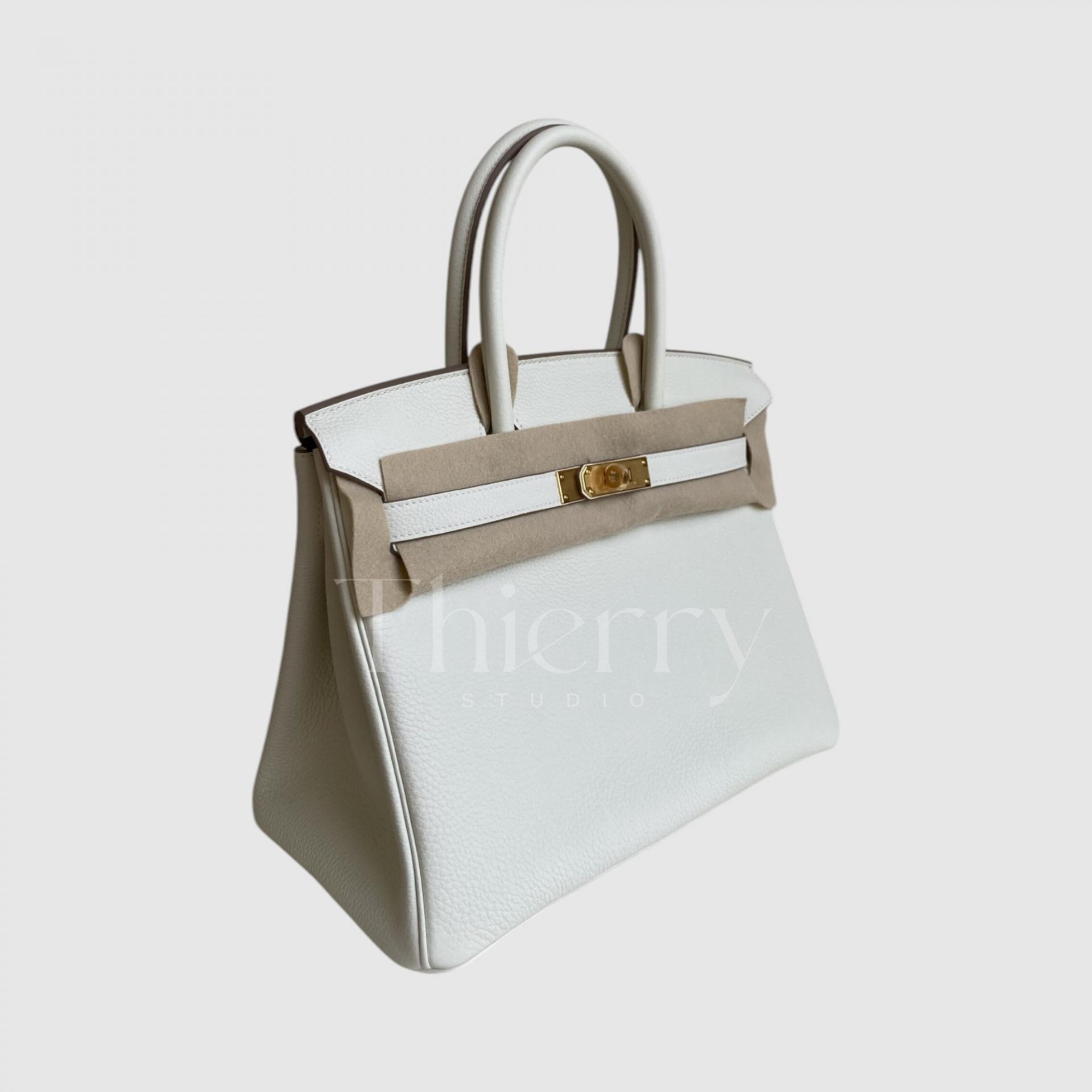
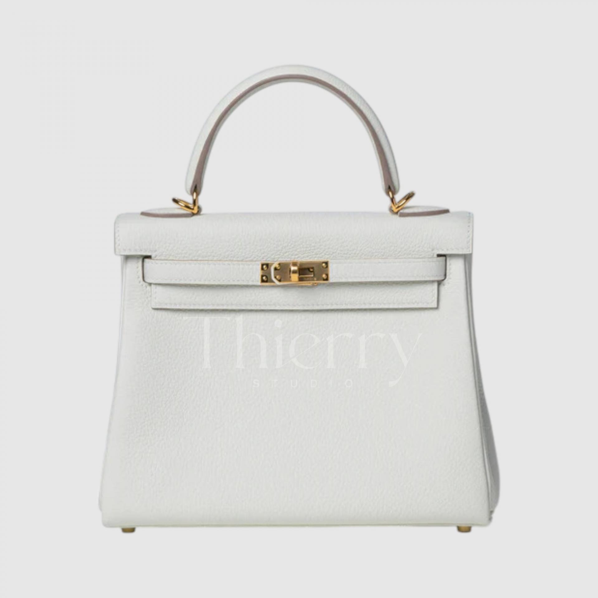
Mushroom
Introduced in 2022, Mushroom evokes its namesake with a warm blend of beige and gray.
Within the white family, it is the deepest and most distinctly beige, giving it a grounded, richer off-white character.
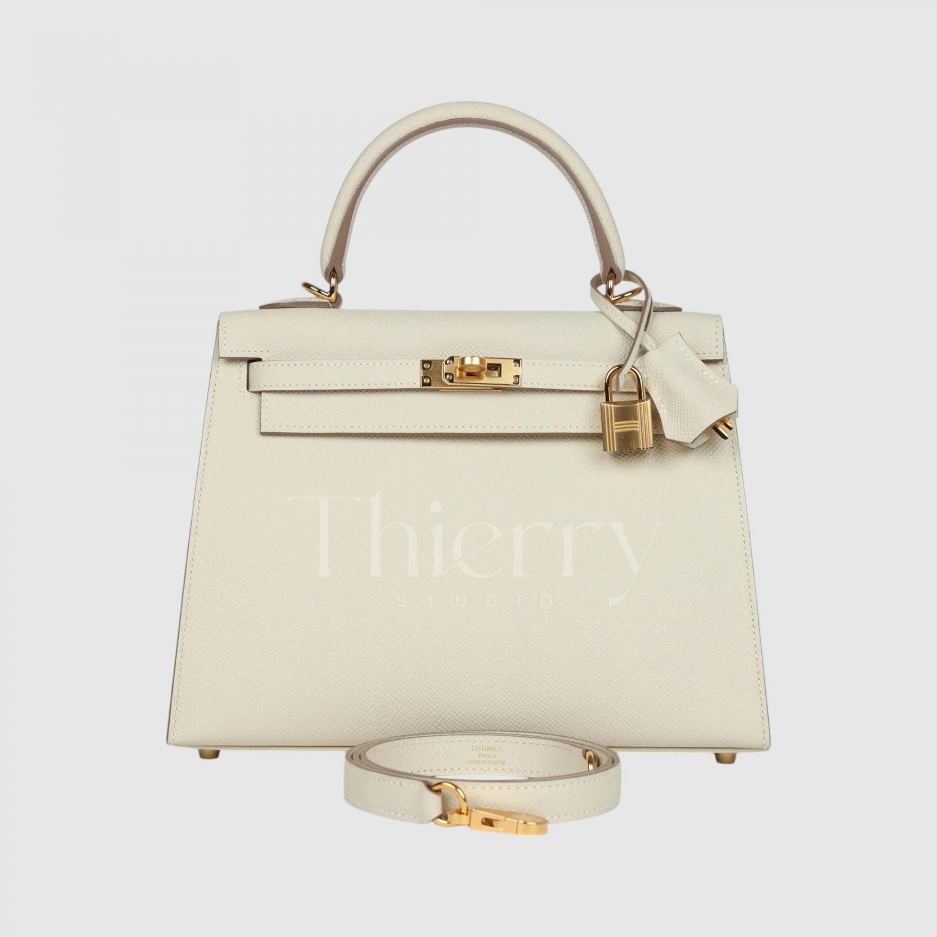
Craie
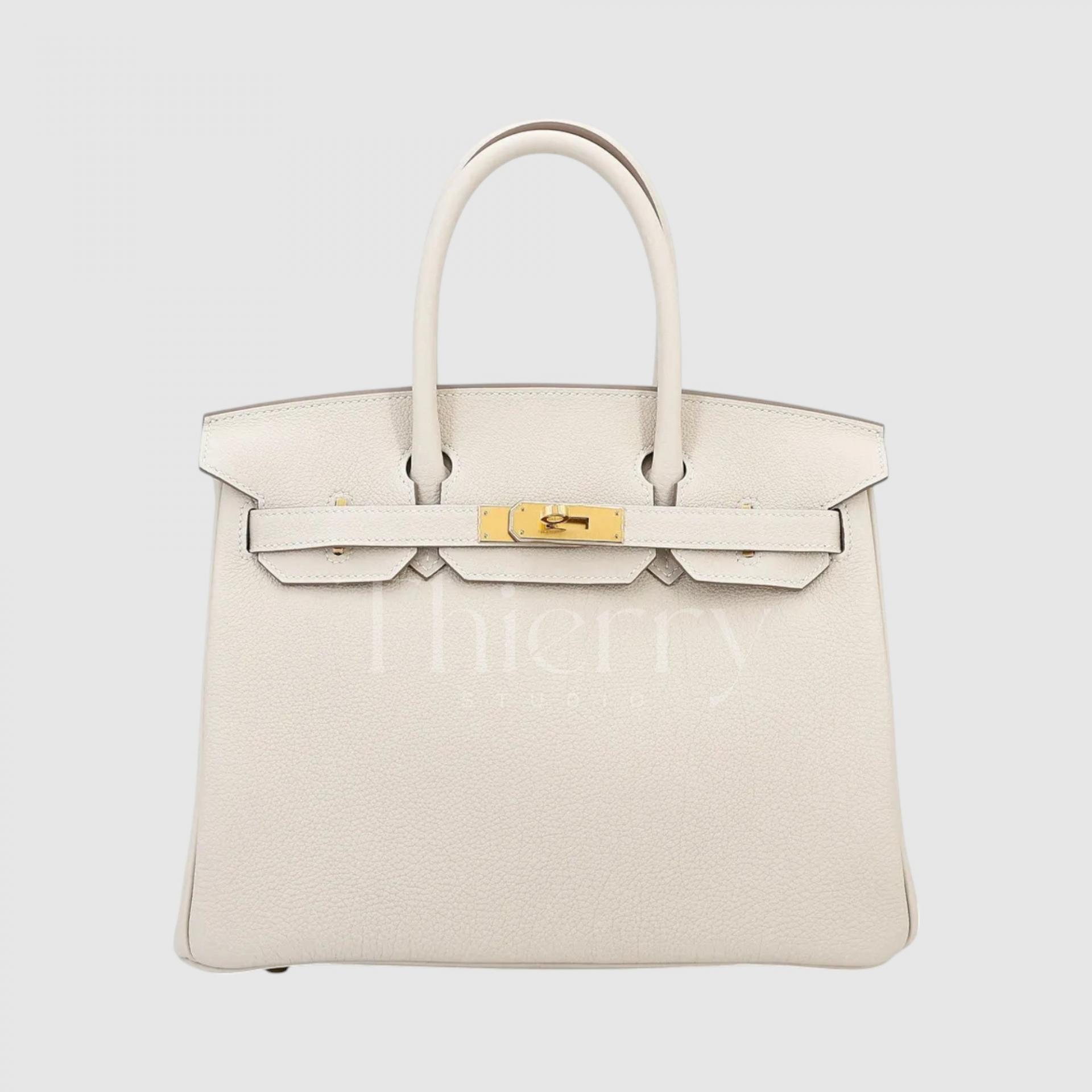
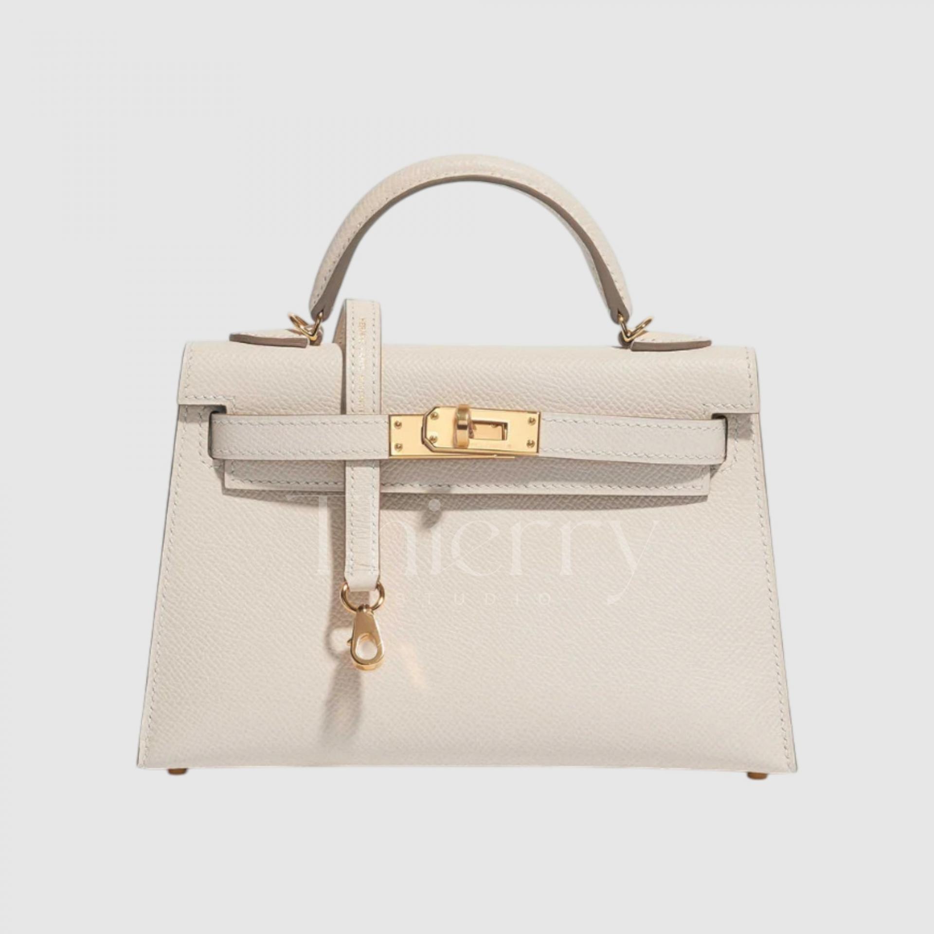
Craie means “chalk” in French and has a soft, elegant cream or off-white tone.
It works easily with many outfits and is considered one of Hermès’ classic colors, appearing year after year and retaining strong resale appeal. It is particularly popular on the Birkin 25.
Craie hardly needs an introduction: alongside Black, Gold and Étoupe, it is one of the most popular neutrals.
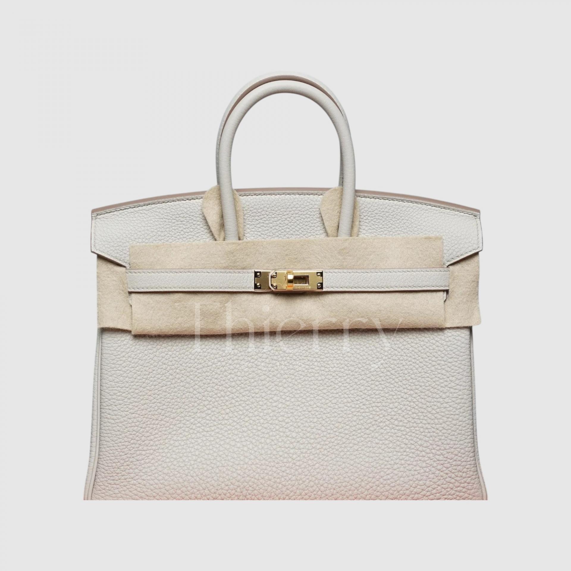
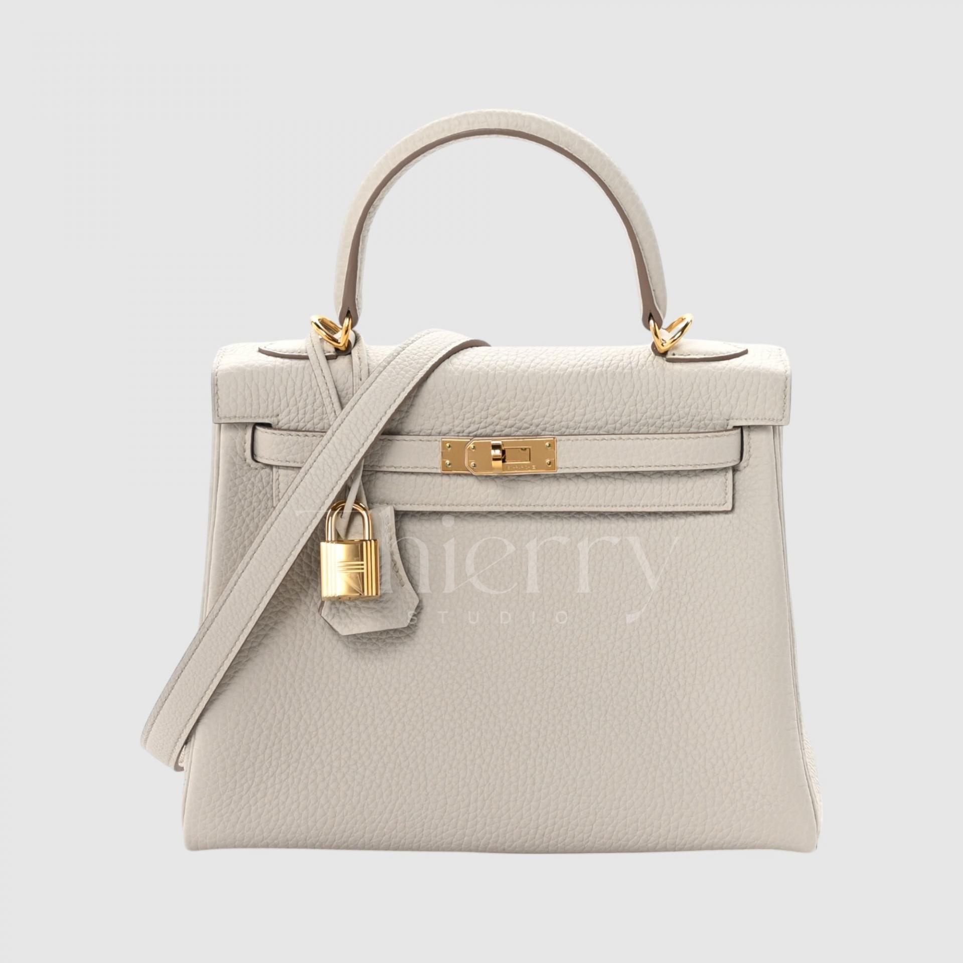
Beton
Beton means “concrete” in French. It has a cool, urban feel, with more gray than other shades in the white family, recalling the cool surface of cement or concrete.
It is crisp and refined without feeling harsh. Less creamy than Craie and far cooler than Nata, it emphasizes gray rather than warm ivory.
A lovely choice for anyone who prefers a minimalist style 🙂
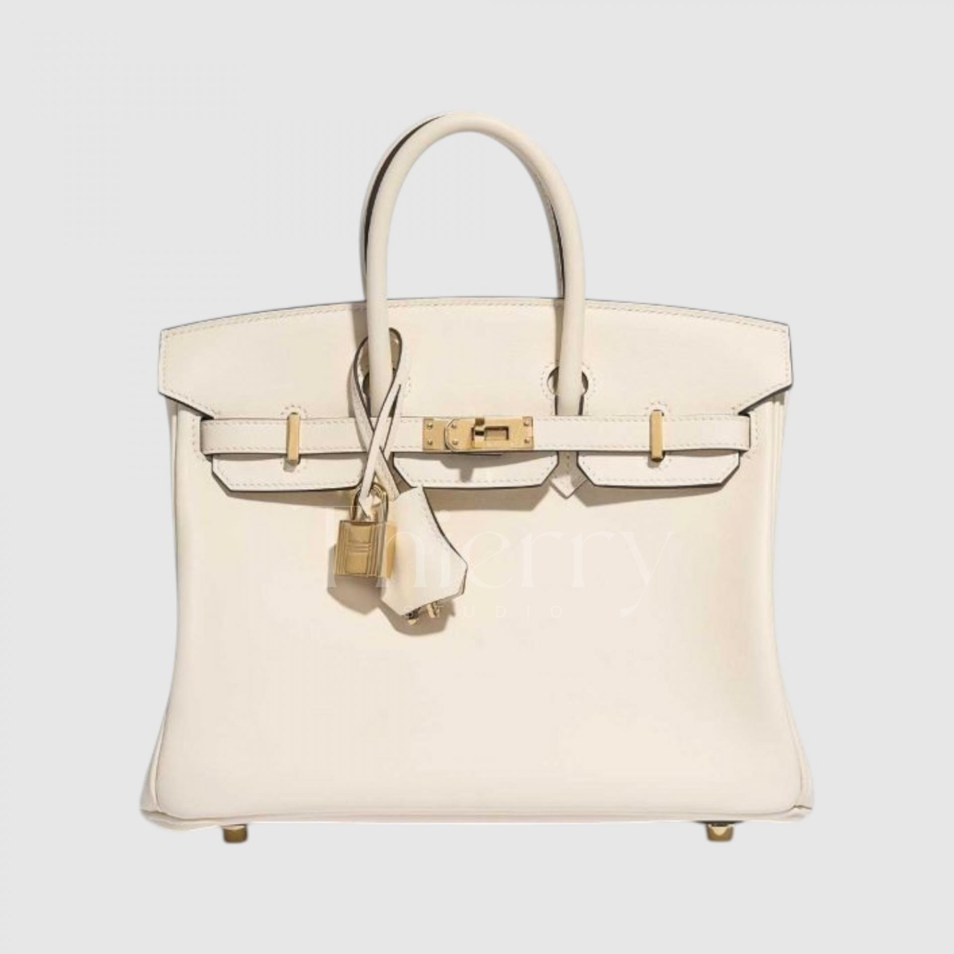
Nata
Named after the Spanish word for “cream,” Nata is a warm, creamy ivory. Sitting between beige and white, it has a milky tone that feels softly sunlit.
A subtle yellow undertone gives it a gentle, classic feel. Think vanilla milkshake: ideal when you want something light yet warm.
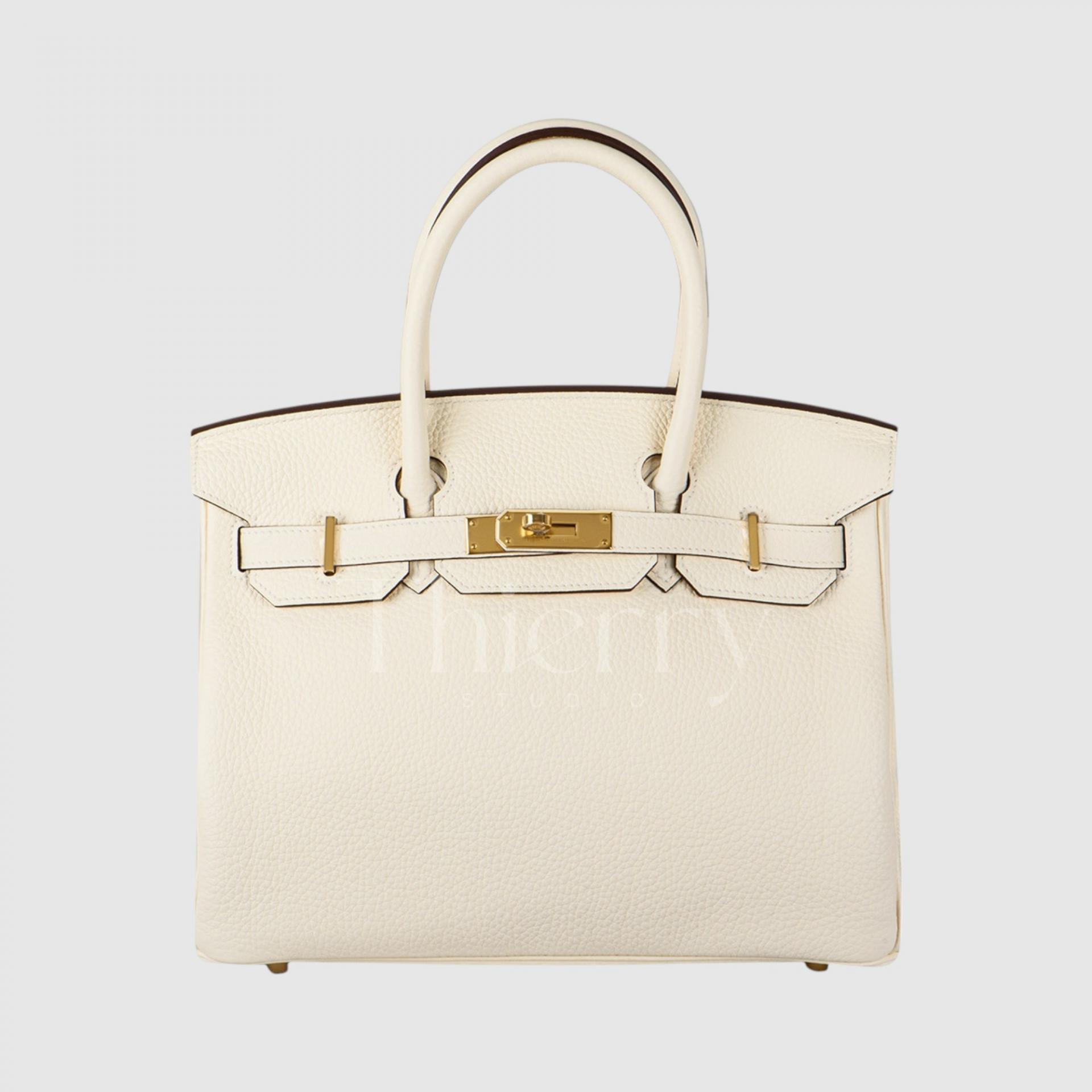
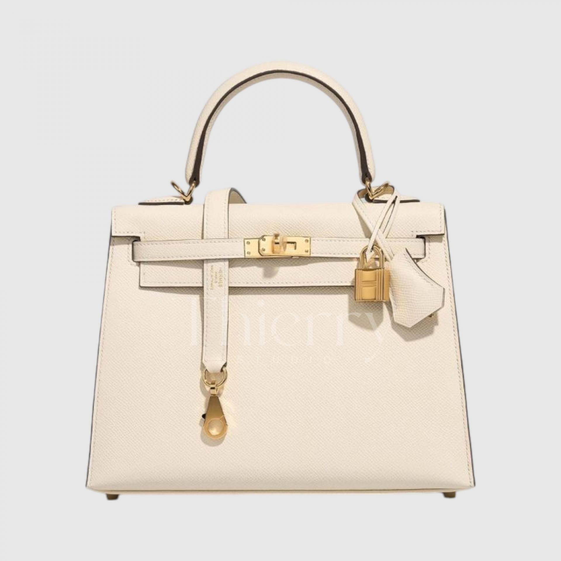
All of these light bags are versatile, but looking more closely at styling,
White, Craie and Nata suit fresh summer looks or monochrome outfits—outfits built around a single color.
Beton’s cool modernity makes it an urban match for gray and black clothing,
while Mushroom works beautifully with natural-looking beige and brown outfits.
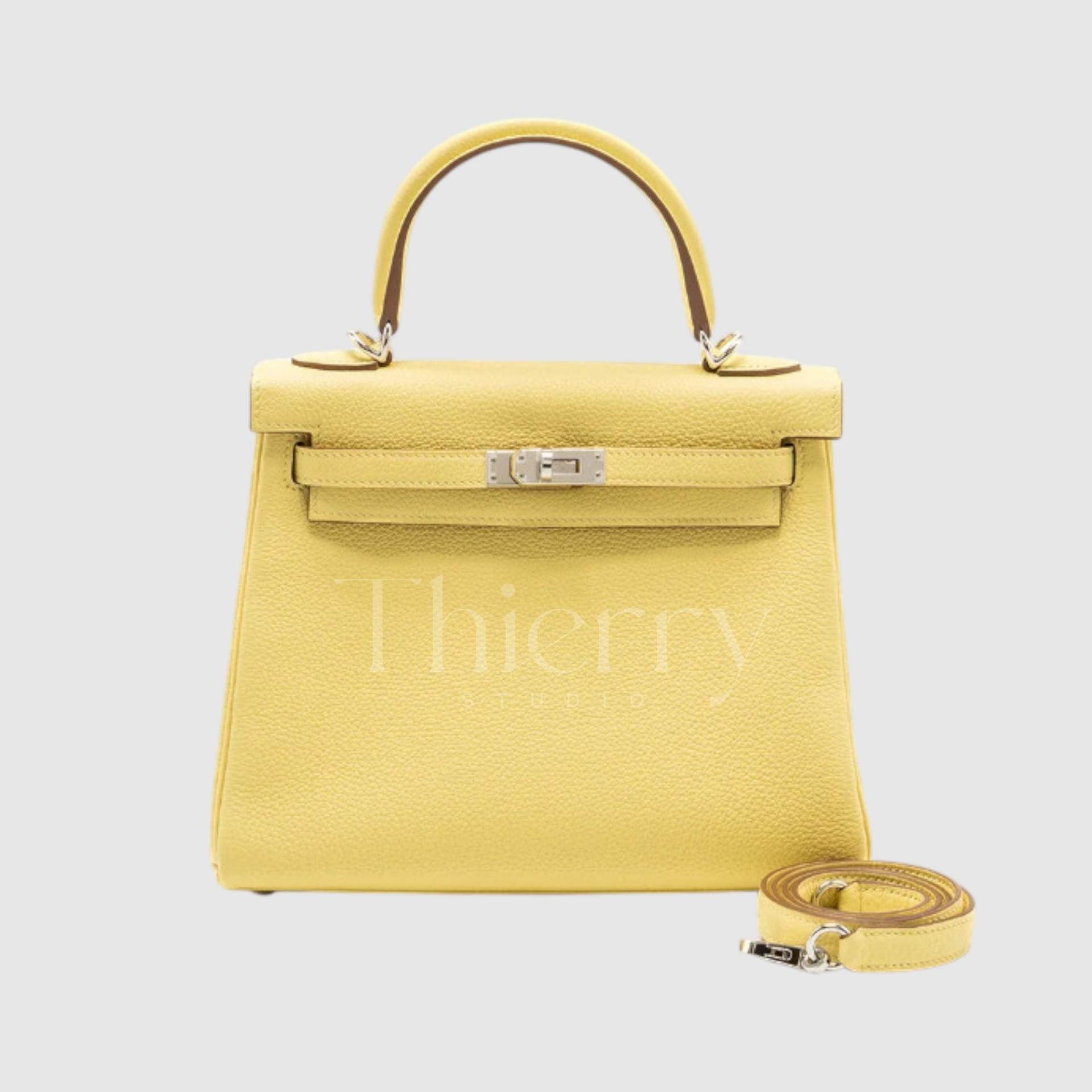
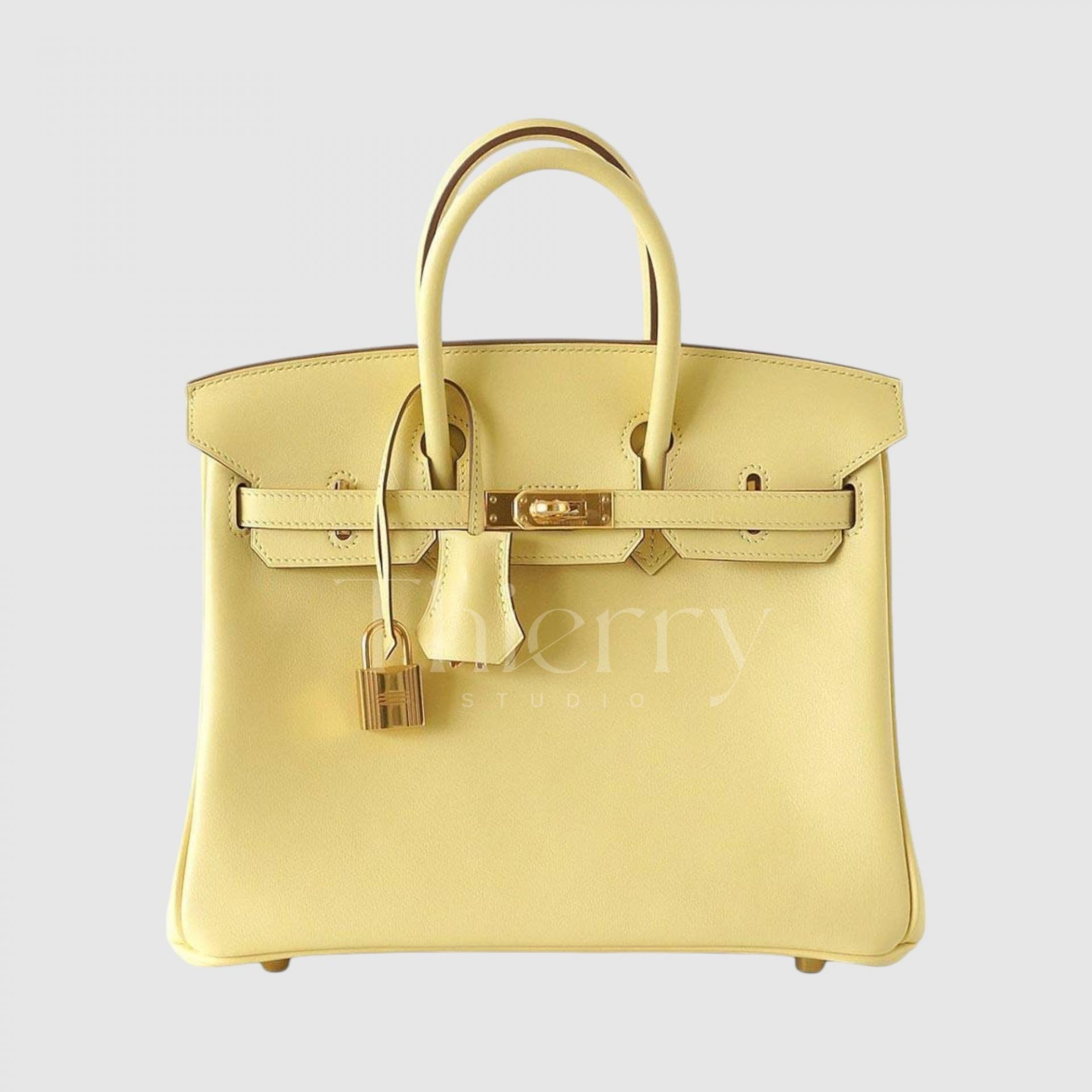
Jaune Poussin
Meaning “chick yellow,” Jaune Poussin is a pale, soft, eggshell-like pastel yellow. Among the lightest yellows, its low saturation makes it a subtle, charming accent color.
This soft pastel yellow looks lovely with a light spring tweed jacket or a white dress for a fresh finish.
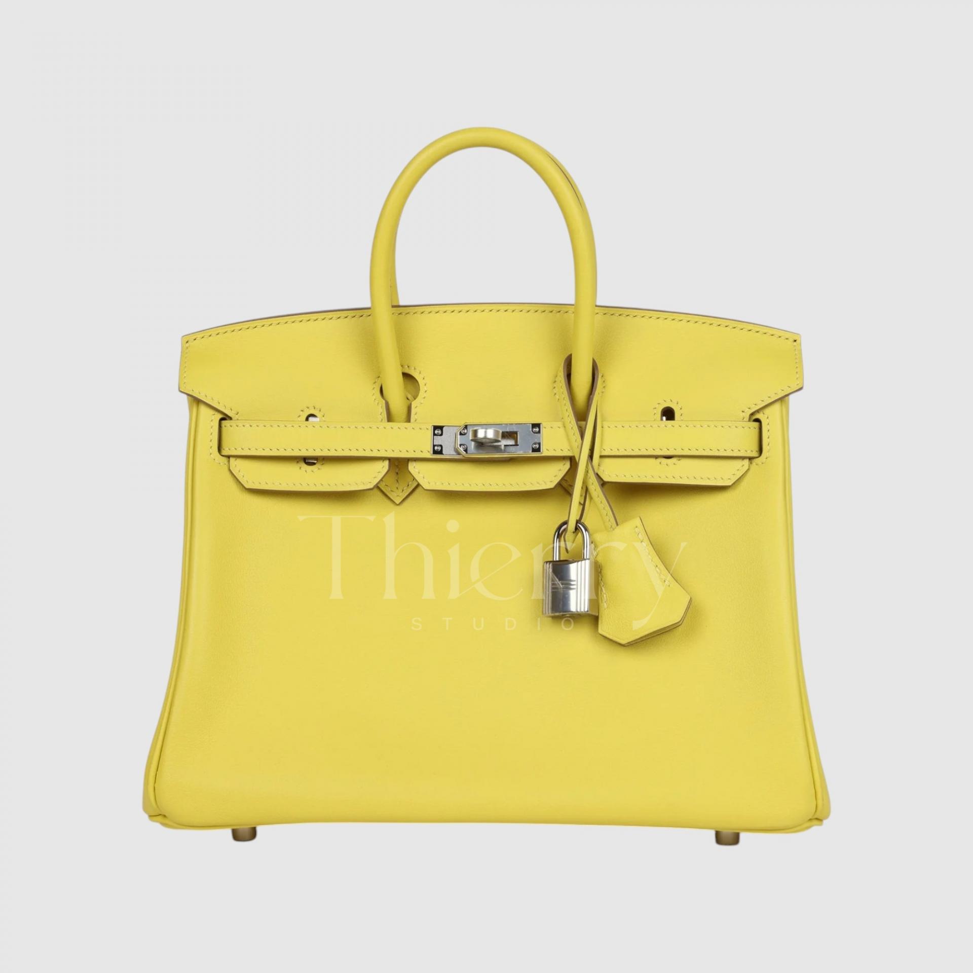
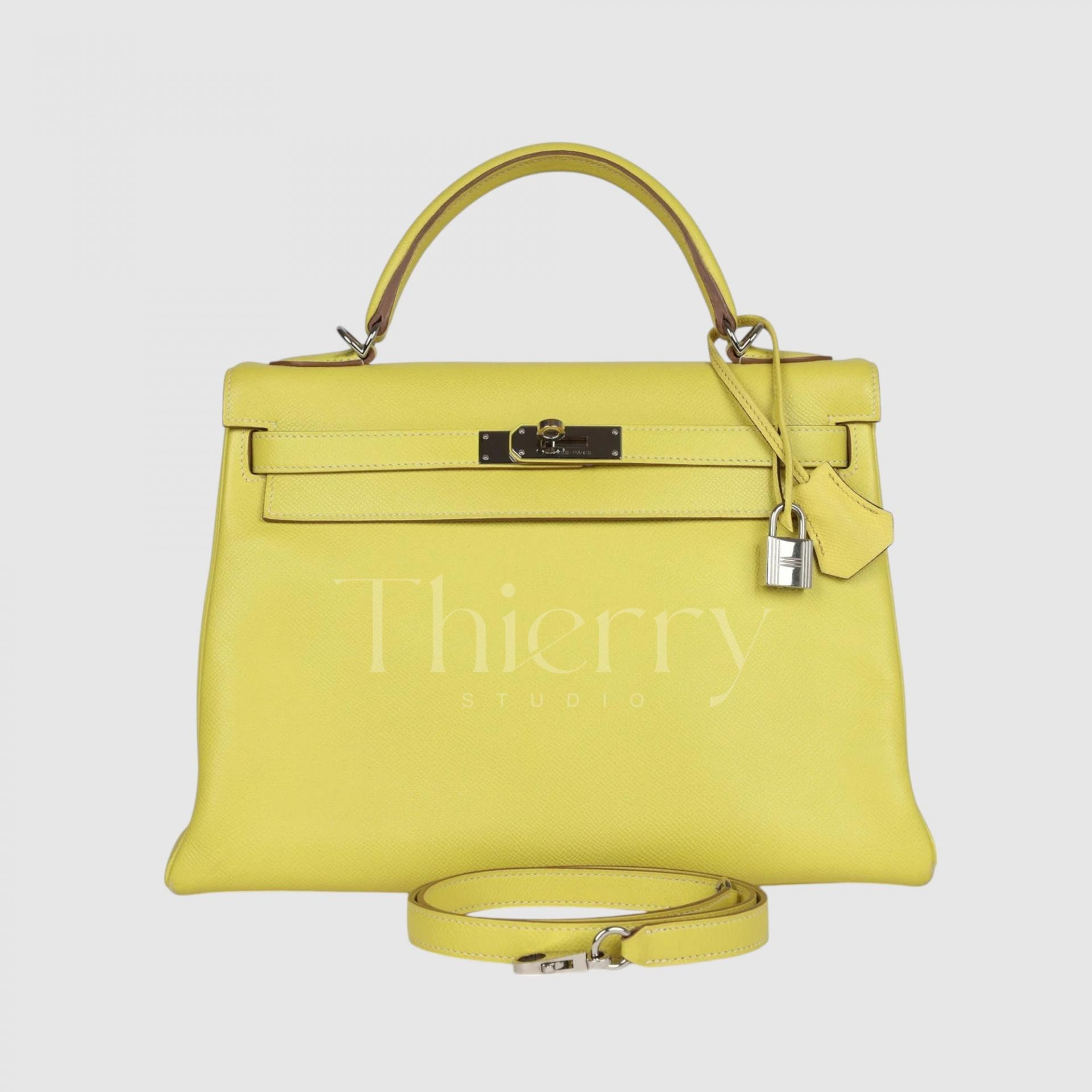
Lime
Introduced in 2011, Lime is, like the fruit, a bright yellow with a hint of green. This almost fluorescent lemon yellow is highly saturated and cool-toned, making it fresh and eye-catching.
Compared with Lime, Jaune de Naples is slightly warmer and more distinctly yellow, whereas Lime is a cool yellow with a refreshing green cast.
Use it as an accent with a simple white T-shirt and jeans for a lively, contemporary look. It is also ideal for summer holiday outfits and looks wonderful with a white shirt 🙂
Jaune de Naples
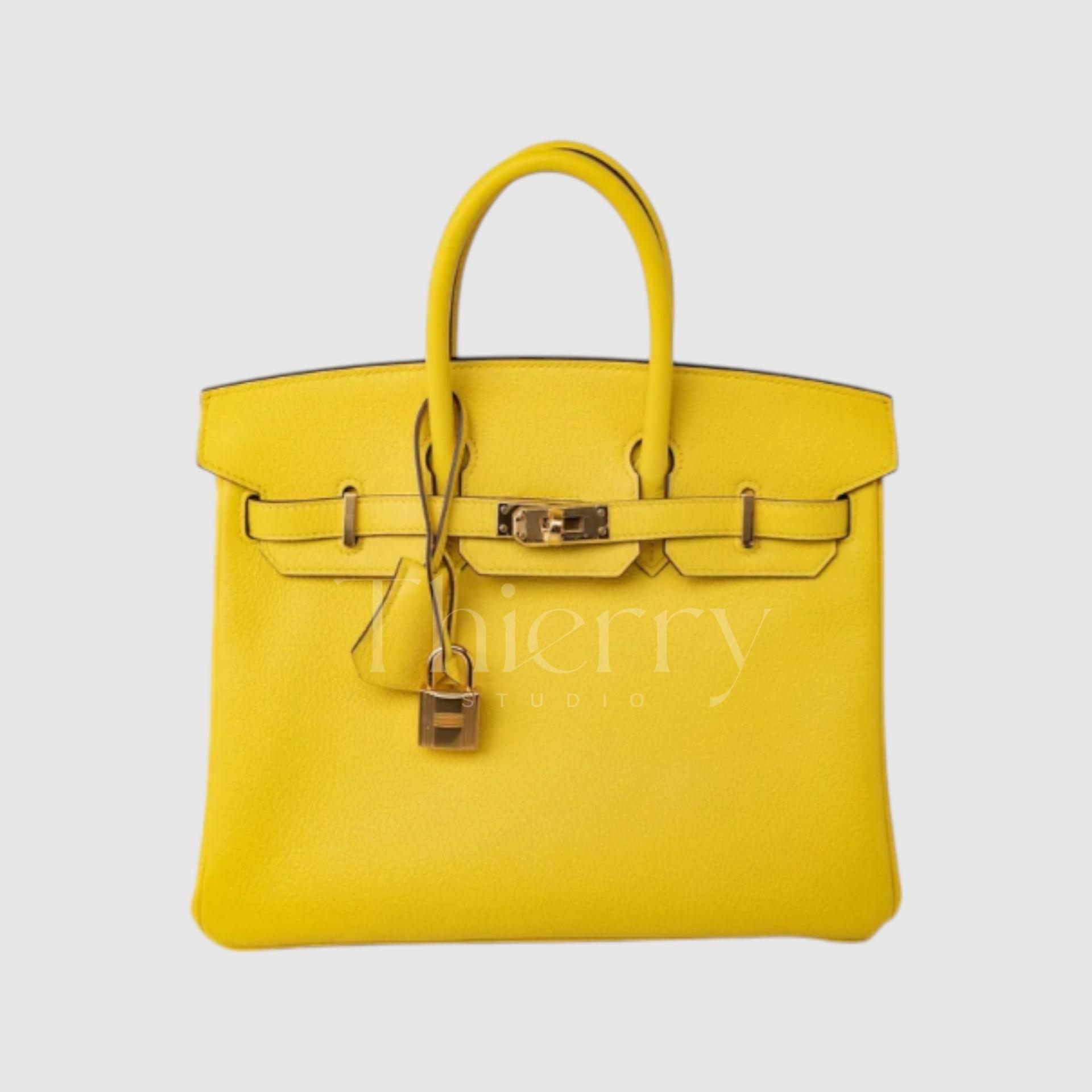
Jaune de Naples is a slightly deeper, clearer pastel yellow. Like Jaune Poussin, it is soft, but has a little more energy and brightness, with the warmth of sunshine.
A slight orange undertone makes it warmer than Jaune Poussin. Pair it with ivory or beige for a refined, radiant look.
Jaune Ambre
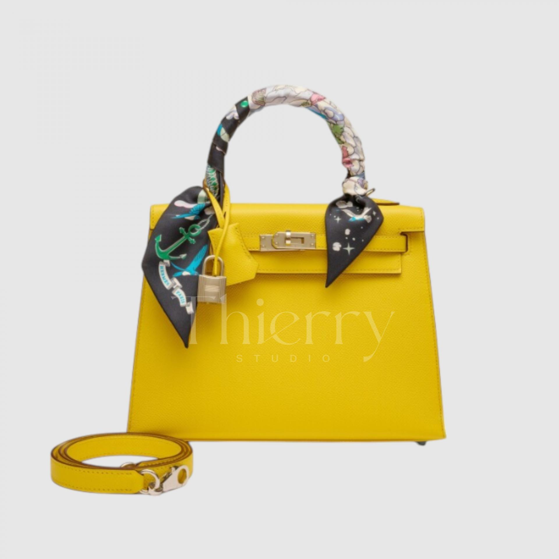
Introduced in 2018, Jaune Ambre, as its name suggests, is a shade inspired by amber. It is a vivid, sunny yellow with a hint of orange that gives it a rich, golden depth.
Although saturated, its slightly muted tone works harmoniously with brown and khaki, capturing a classic Hermès mood. It is a particularly striking color in person.
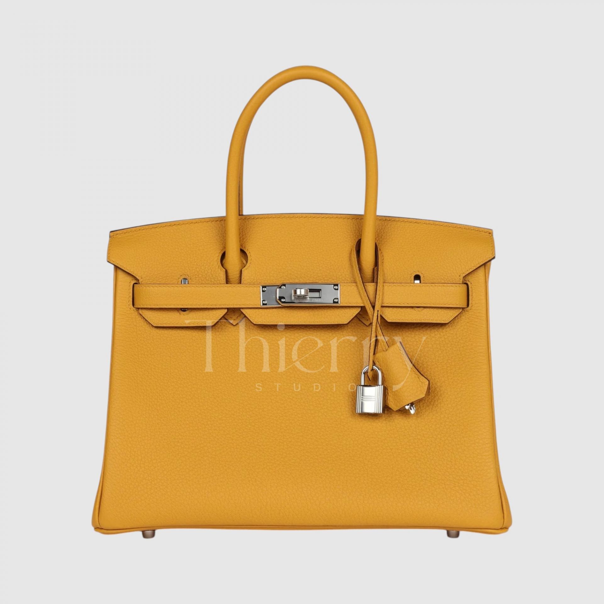
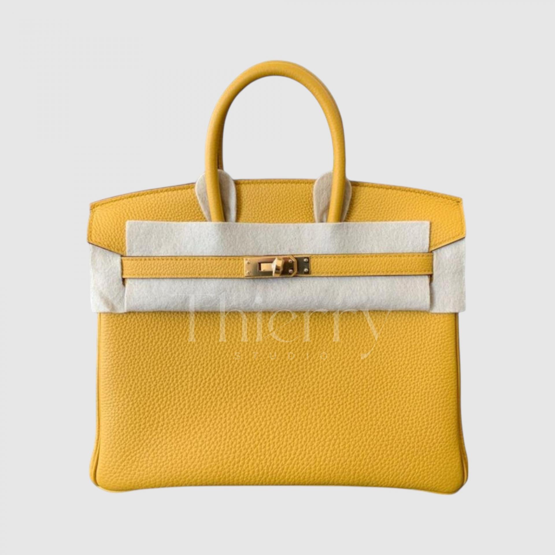
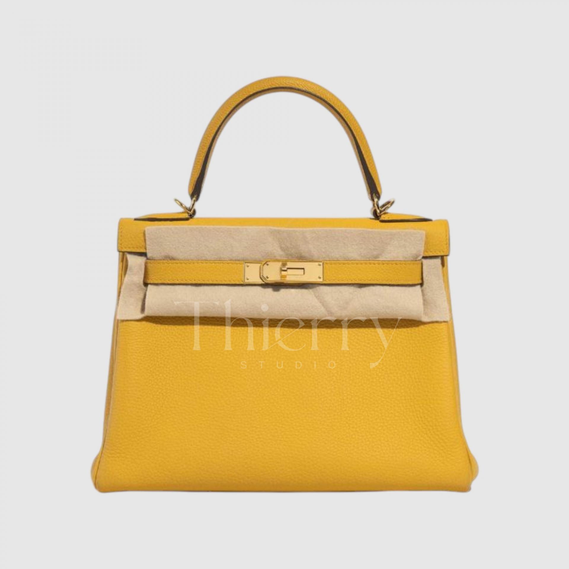
In general, lighter yellows feel playful and casual,
while deeper yellows feel more refined and mature 🙂
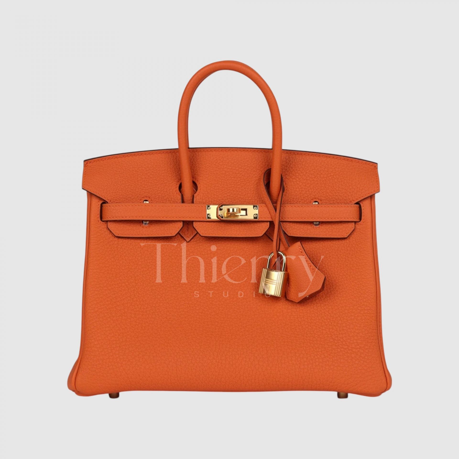
Orange H
The classic Hermès orange is the vivid orange of the house’s signature boxes. Between yellow and red, it is a bright tangerine that makes an excellent accent for many outfits.
Use it to enliven navy, white or beige, or pair it with a patterned accessory such as an Hermès scarf 🙂
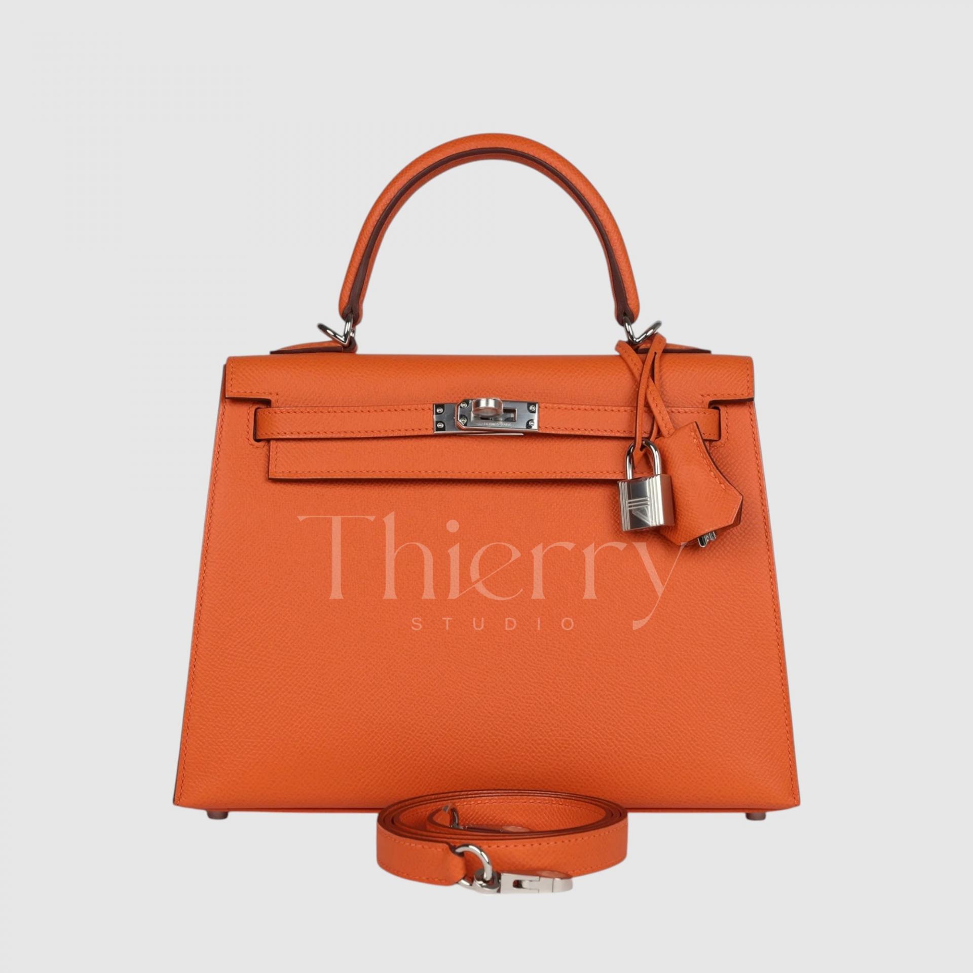
Feu
Introduced in 2009, Feu is a brighter, more intense, flame-like orange. More vivid and radiant than Orange H,, it has a fiery, almost pure-orange character, maximizing orange without leaning toward red or pink.
A Feu bag brightens the face and gives a simple outfit a bold focal point. Because the color is so striking, try it as an accent with an all-black or all-white look, or a lively addition to a casual T-shirt-and-denim outfit.
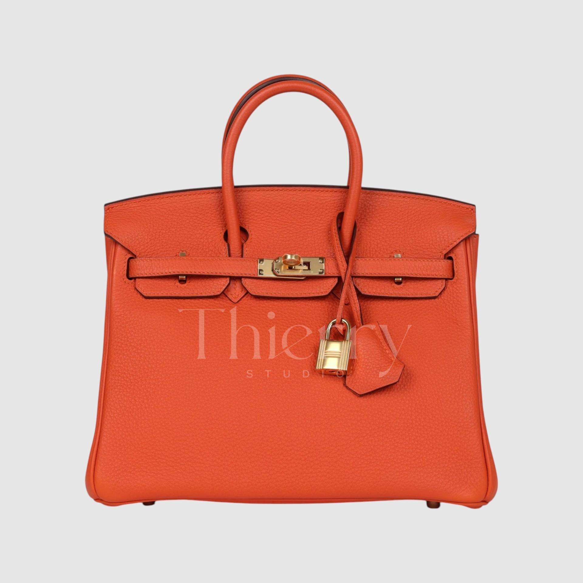
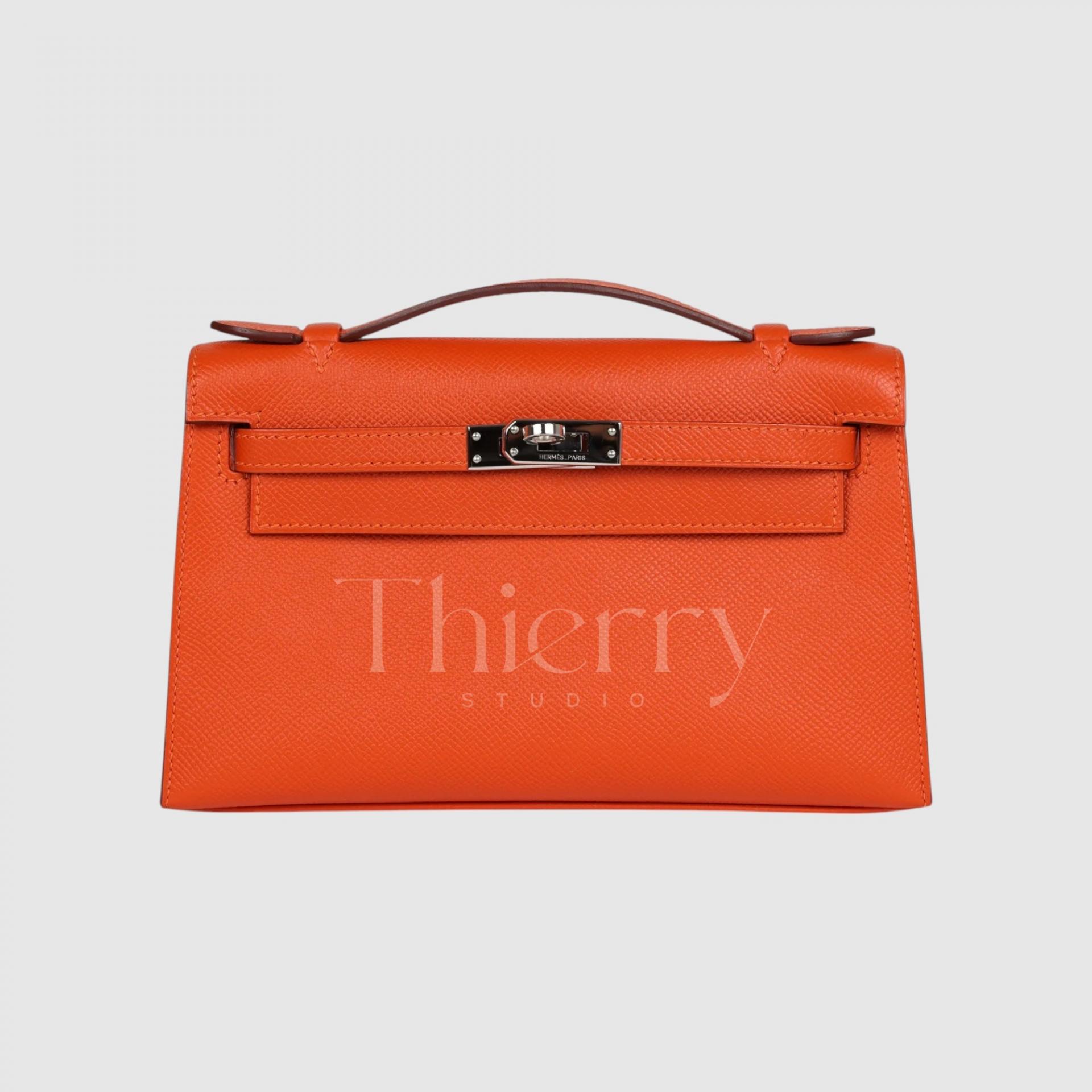
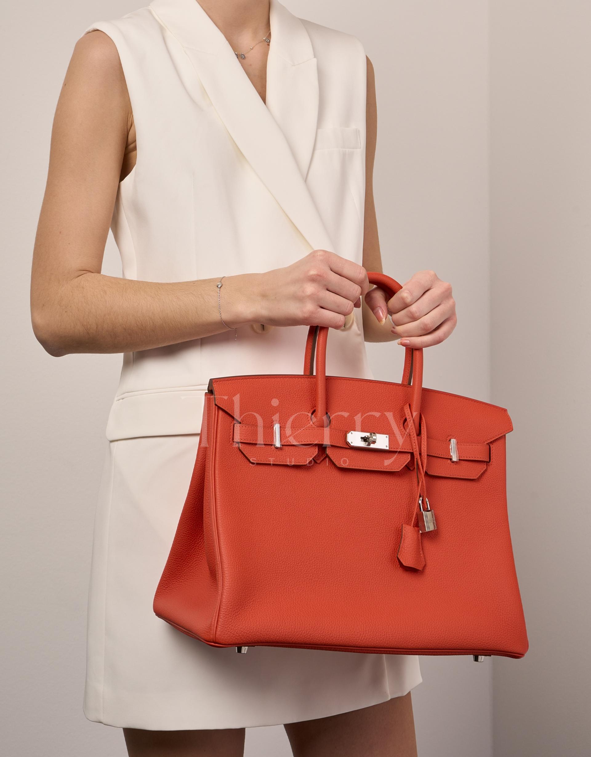
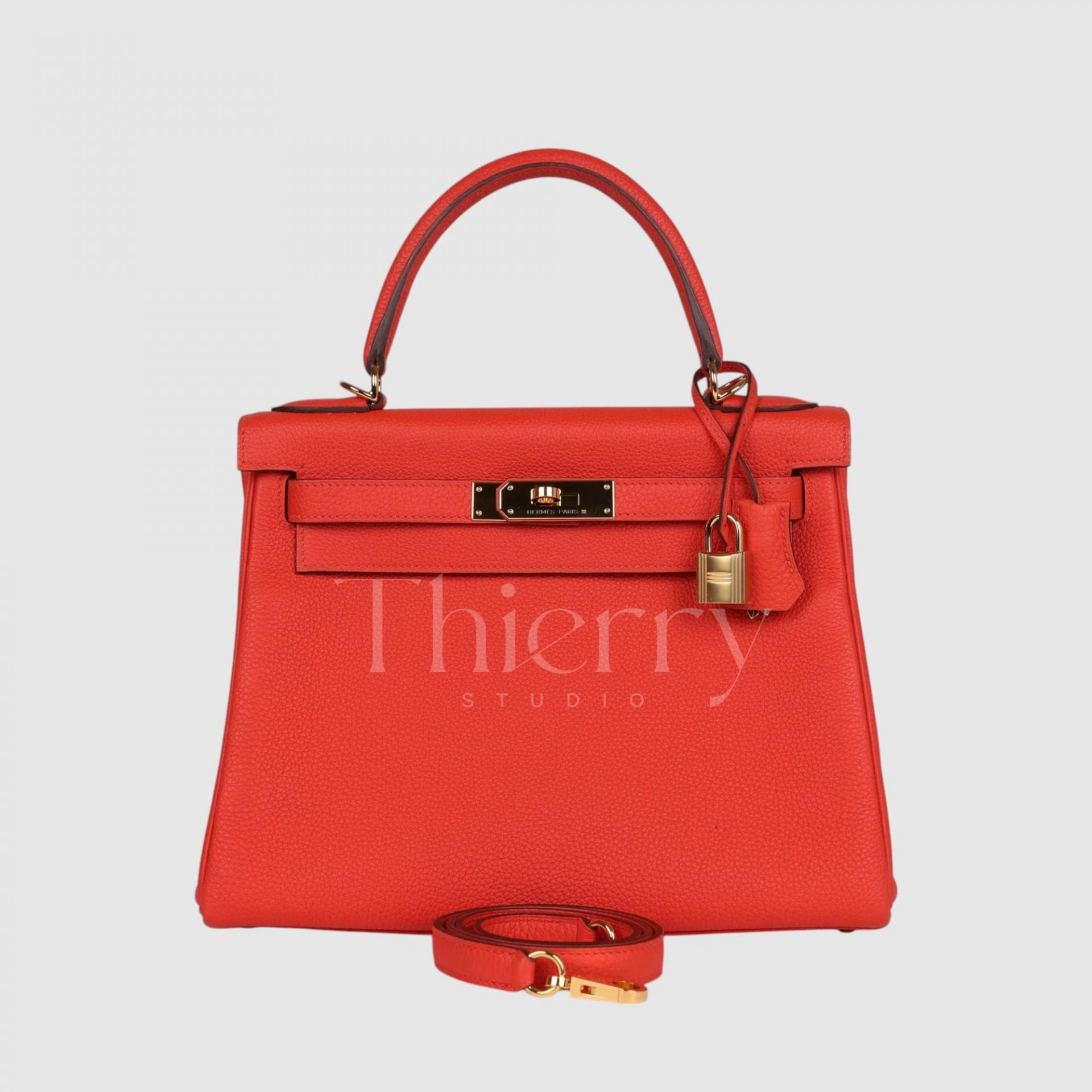
Capucine
Introduced in 2012, Capucine takes its name from the vivid orange-red nasturtium flower. A lively shade between orange and red, it can be described as a clear, coral red.
Its orange undertone feels cheerful and bright, making it a lovely accent with summer dresses or casual outfits. It also pairs well with other orange-toned Hermès accessories.
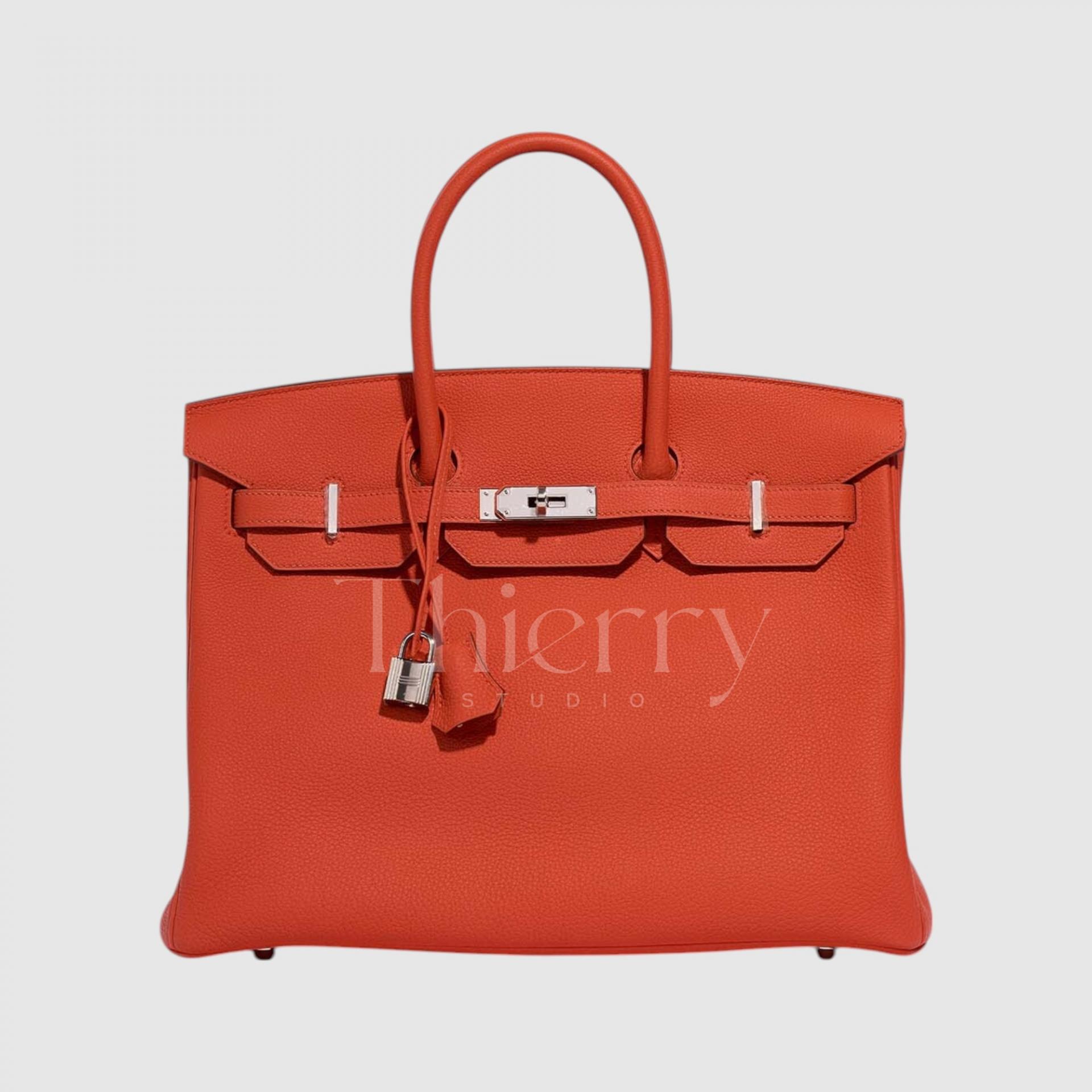
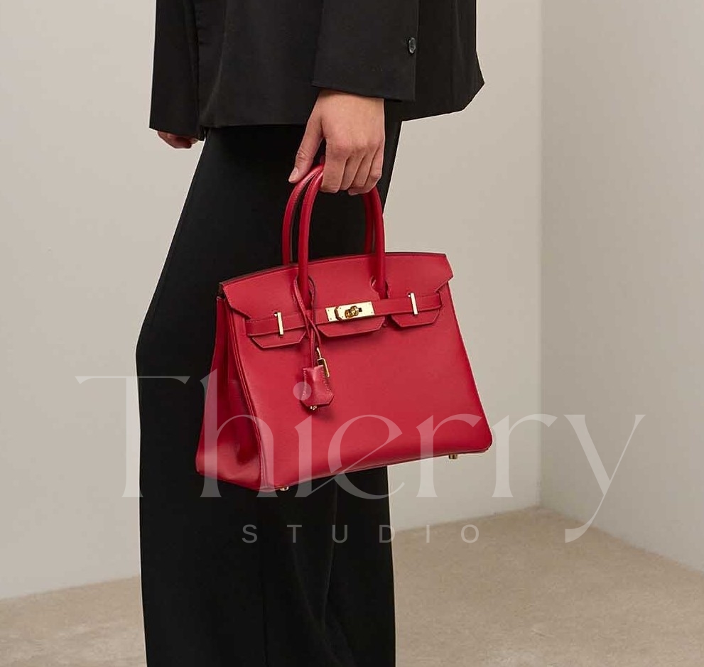
Rouge Casaque
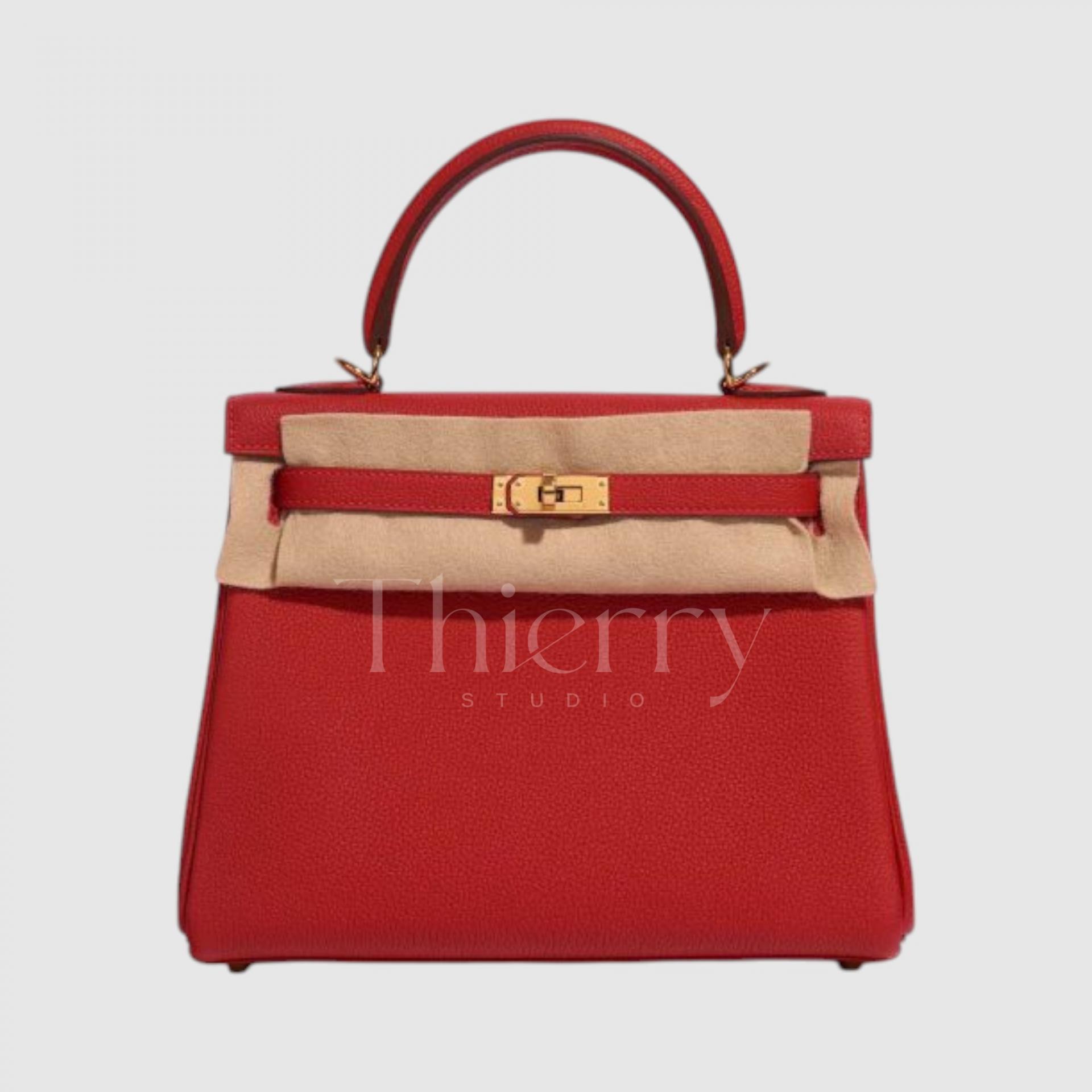
One of Hermès’ classic reds, Rouge Casaque is a clear, vivid true red.
Loved since its introduction in 2012, it has the elegance of a strong, clean red, with a slight blue undertone that makes it a cool red. With no orange cast, it is a crisp, pure red.
Like most reds, it makes a strong accent with almost any outfit. Black-and-white tailoring gains a polished finishing touch, while denim or navy brings out a French-chic feel.
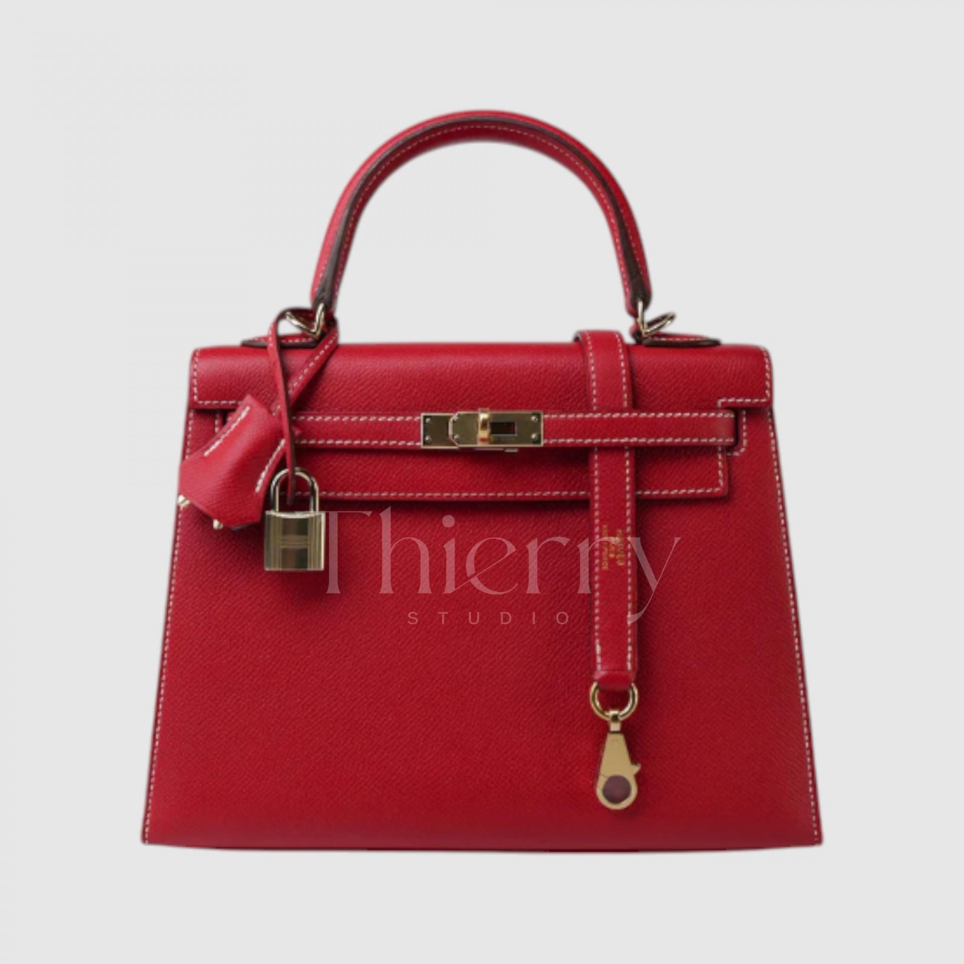
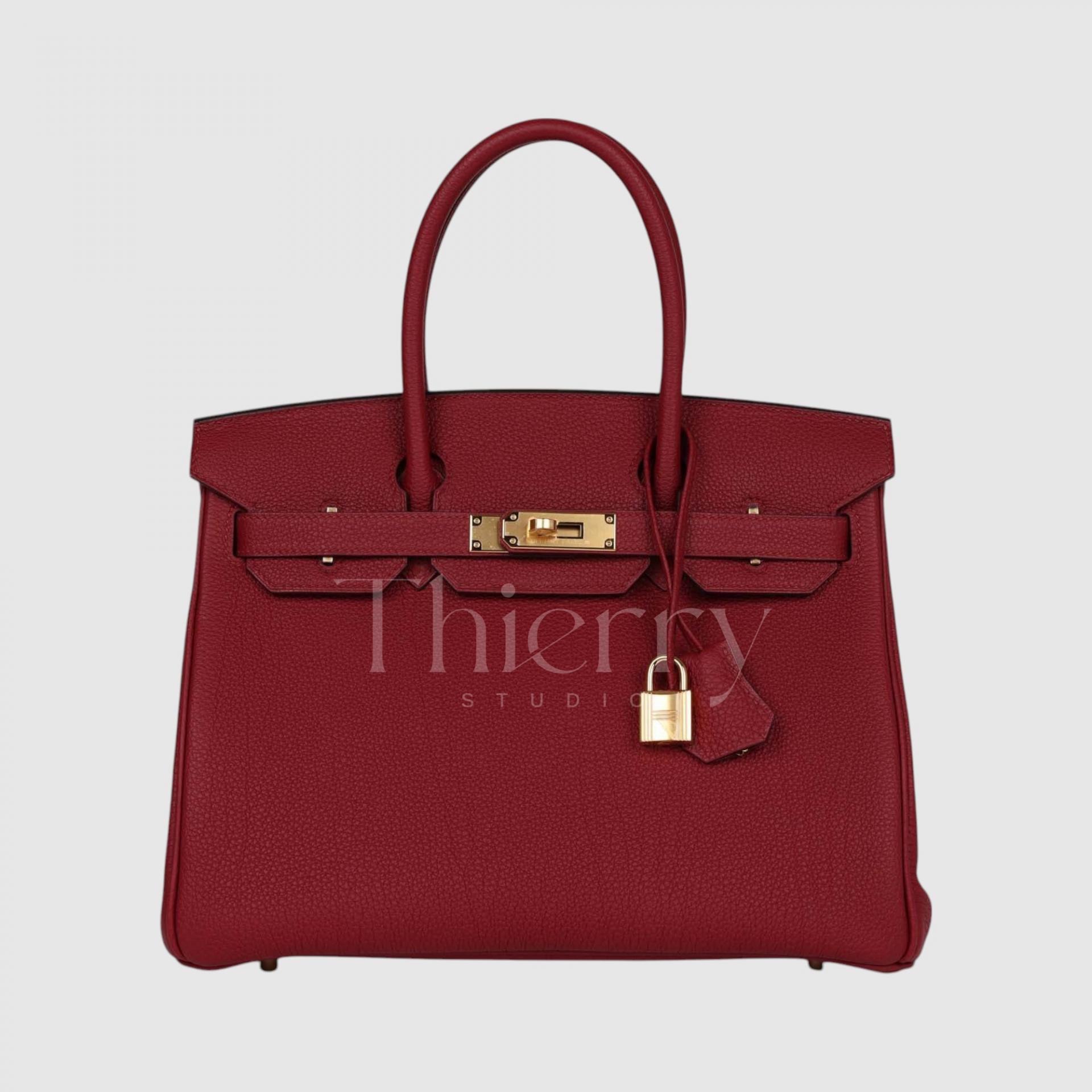
Rouge Grenat
Named for the garnet gemstone, Rouge Grenat is a deep garnet-like purplish red. Compared with other reds, it sits in the darker wine family with a subtle purple cast, creating a refined, dignified mood.
Its depth suits formal occasions and autumn or winter coats, making it useful as an understated, elegant color accent. For an even richer effect, pair it tonally with deep brown or burgundy.
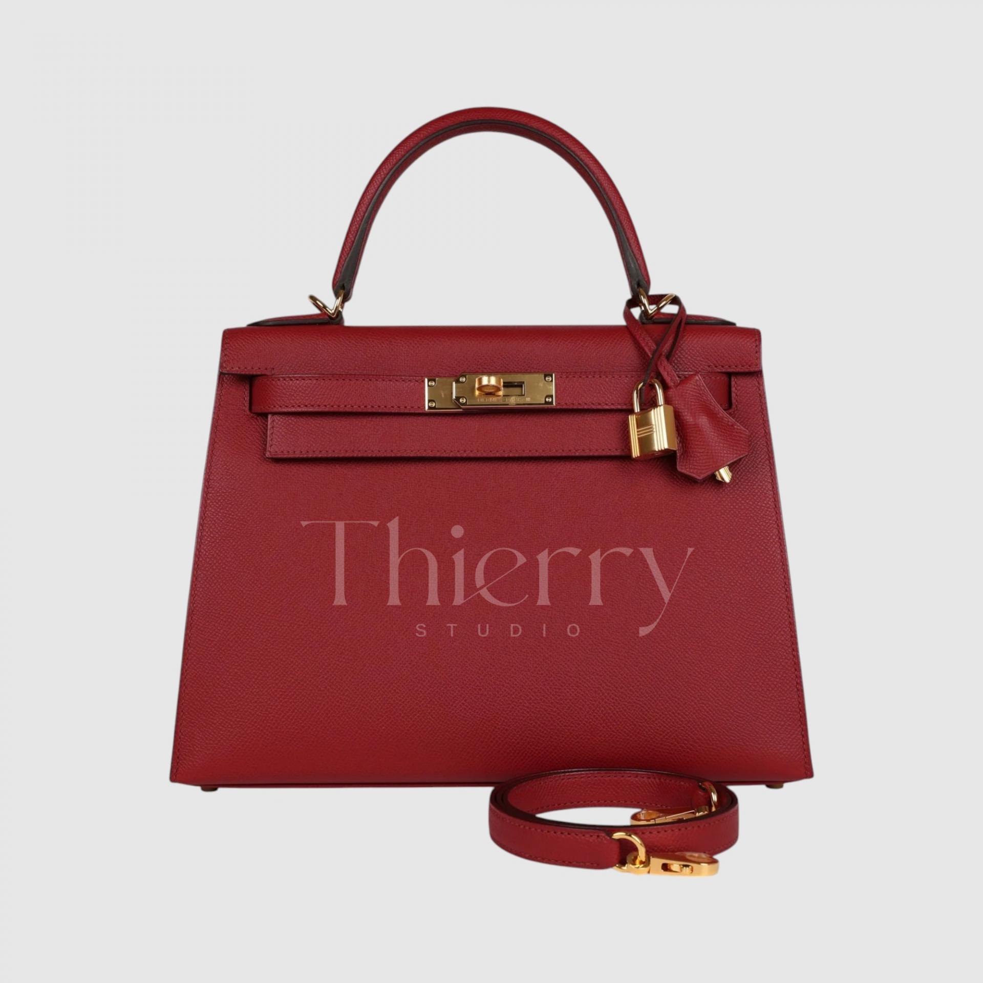
For styling, Capucine is the brightest and most playful, making a lively accent for everyday outfits.
Rouge Casaque is a quintessential red that works well for dressed-up looks and formal occasions.
Rouge Grenat is ideal when you want a classic colored bag but would rather avoid black, serving as a distinctive wine-toned neutral 🙂
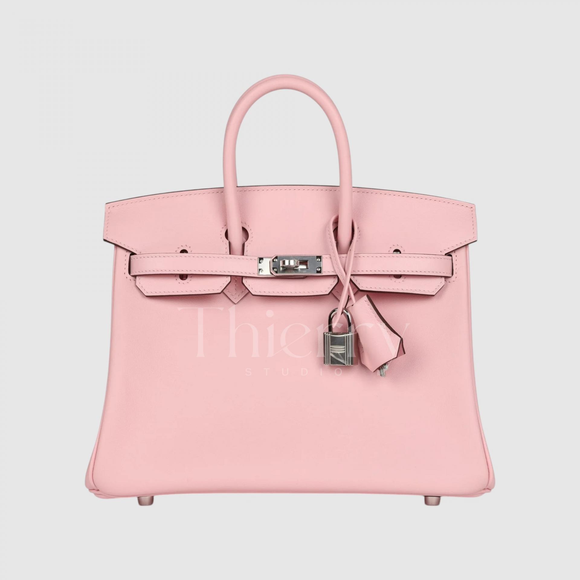
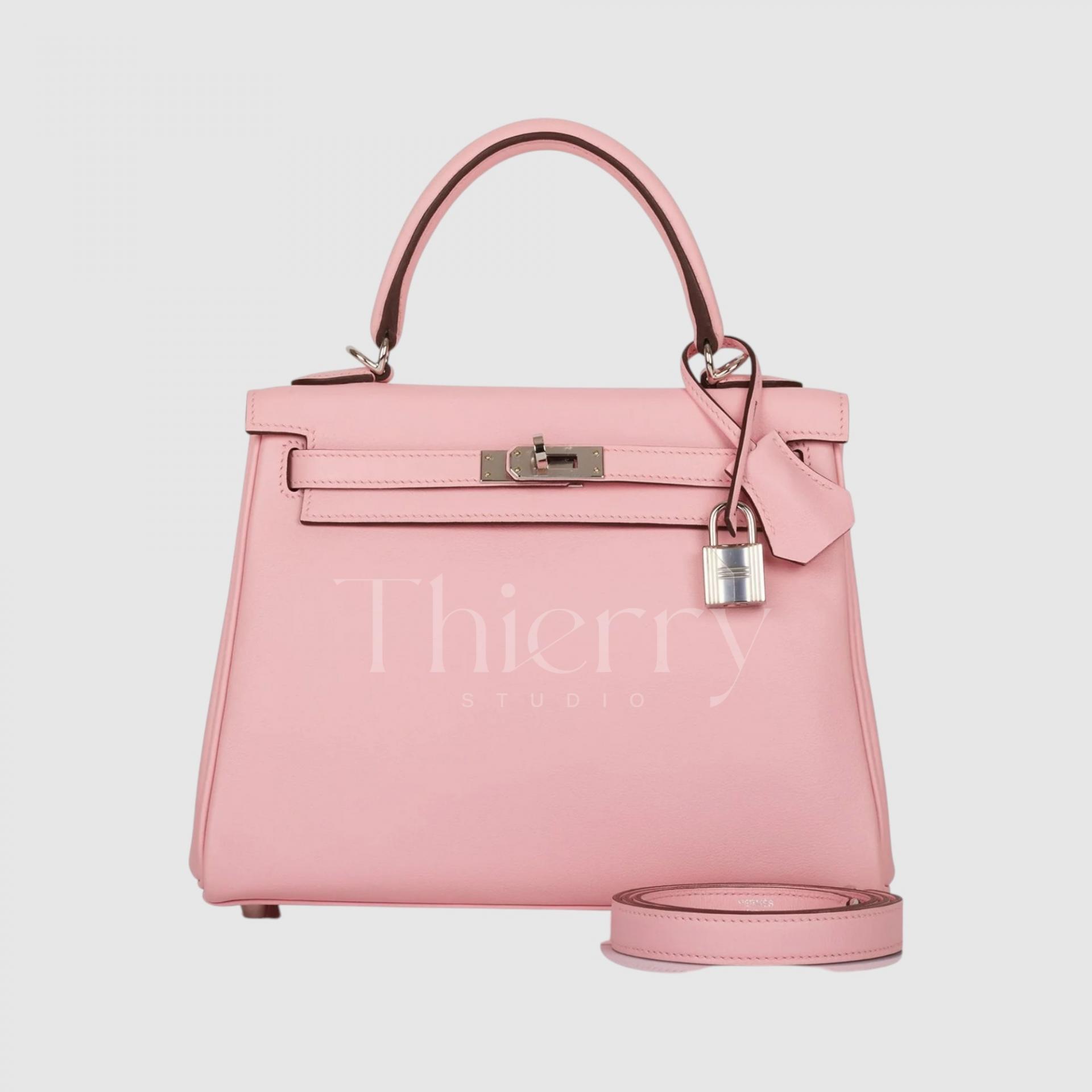
Rose Sakura
Inspired by cherry blossoms, Rose Sakura is a warm pale pink with a hint of apricot.
Its soft, feminine, powdery tone creates a romantic, elegant mood. Pair it with white or light gray for a feminine look.
It is particularly lovely in spring, and one of the standout favorites among Hermès pinks.
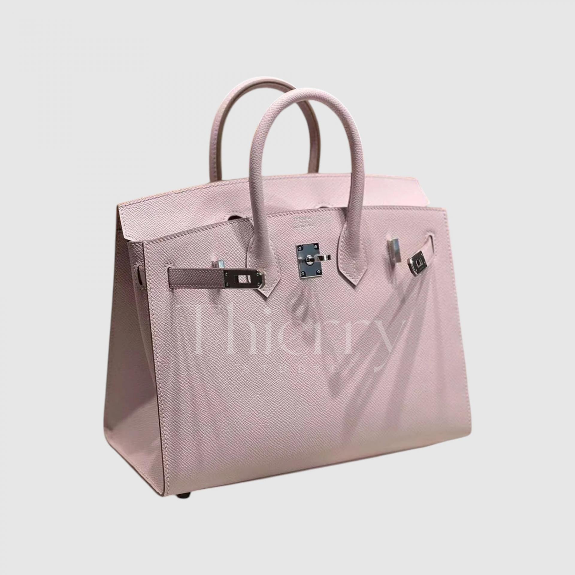
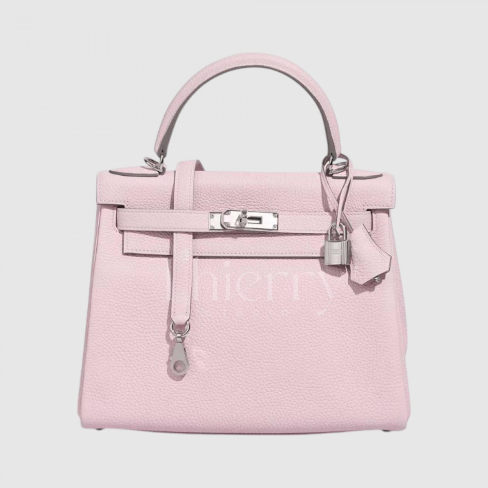
Mauve Pale
Mauve Pale is a very pale lavender pink with a lilac cast.
This low-saturation, cool pastel has a calm, refined feel and a subtle presence.
Muted gray or blue clothing makes an elegant pairing. With less of pink’s sweetness, it can also be a fresh accent for formal occasions.
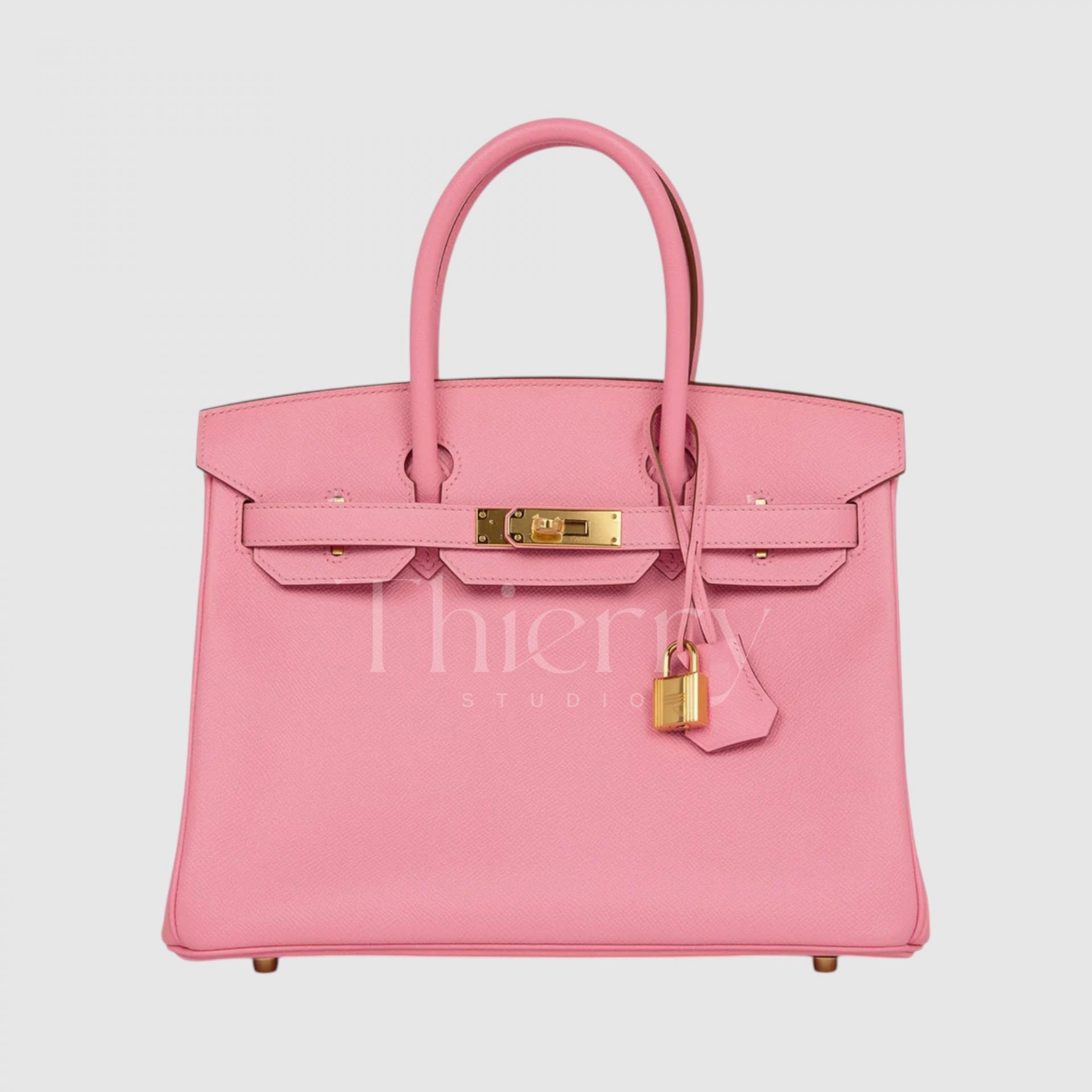
Rose Confetti
Rose Confetti is a bright pastel pink, cheerful as scattered confetti, with a slightly bubblegum-pink quality. It is not deeply saturated, but its brightness makes it noticeable, playful and charming.
A beige two-piece outfit or sky-blue clothing creates a fresh, romantic pairing 🙂
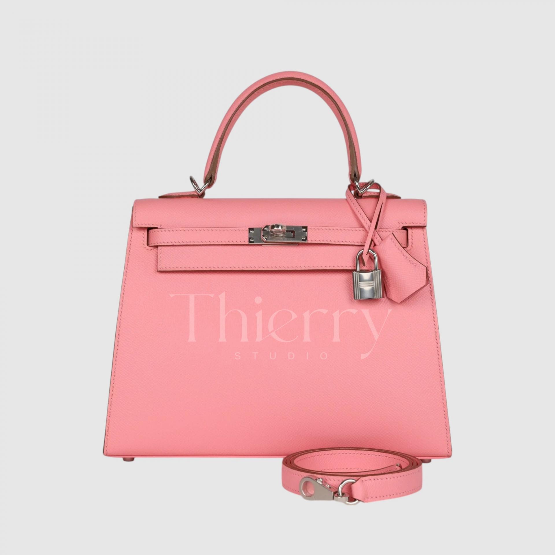
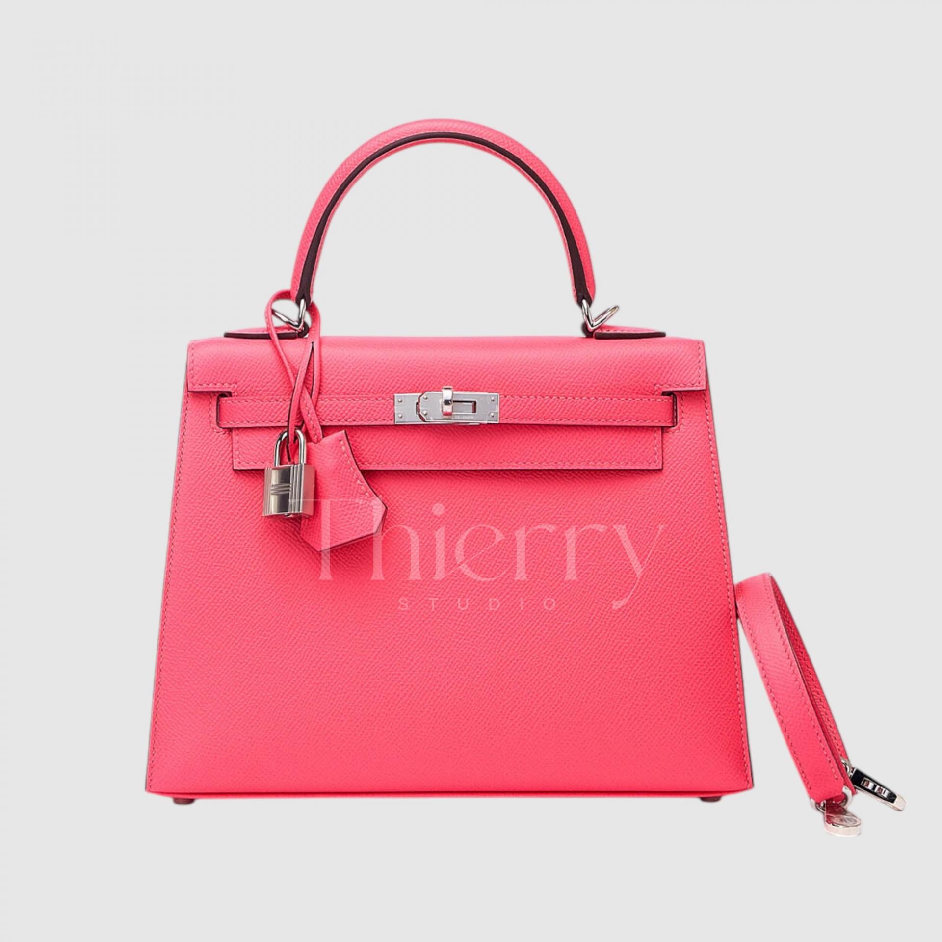
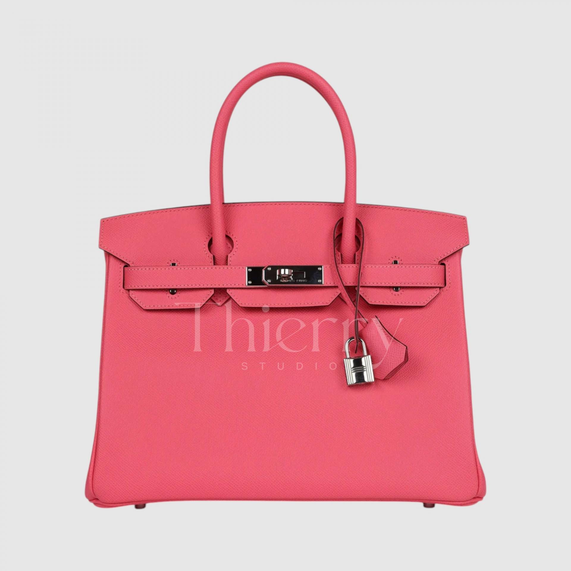
Rose Azalée (Rose Azalée)
Like an azalea flower, Rose Azalée is a clear, cool coral pink.
Combining warm coral and cool pink undertones, it is a bright, lively pink and one of the most popular in the Hermès palette.
Rose Azalée is a vivid pink without a fluorescent cast, so it makes a strong accent with many outfits. In particular, it brightens white, gray and other monochrome looks, or pairs beautifully with easy neutrals such as navy and beige☺
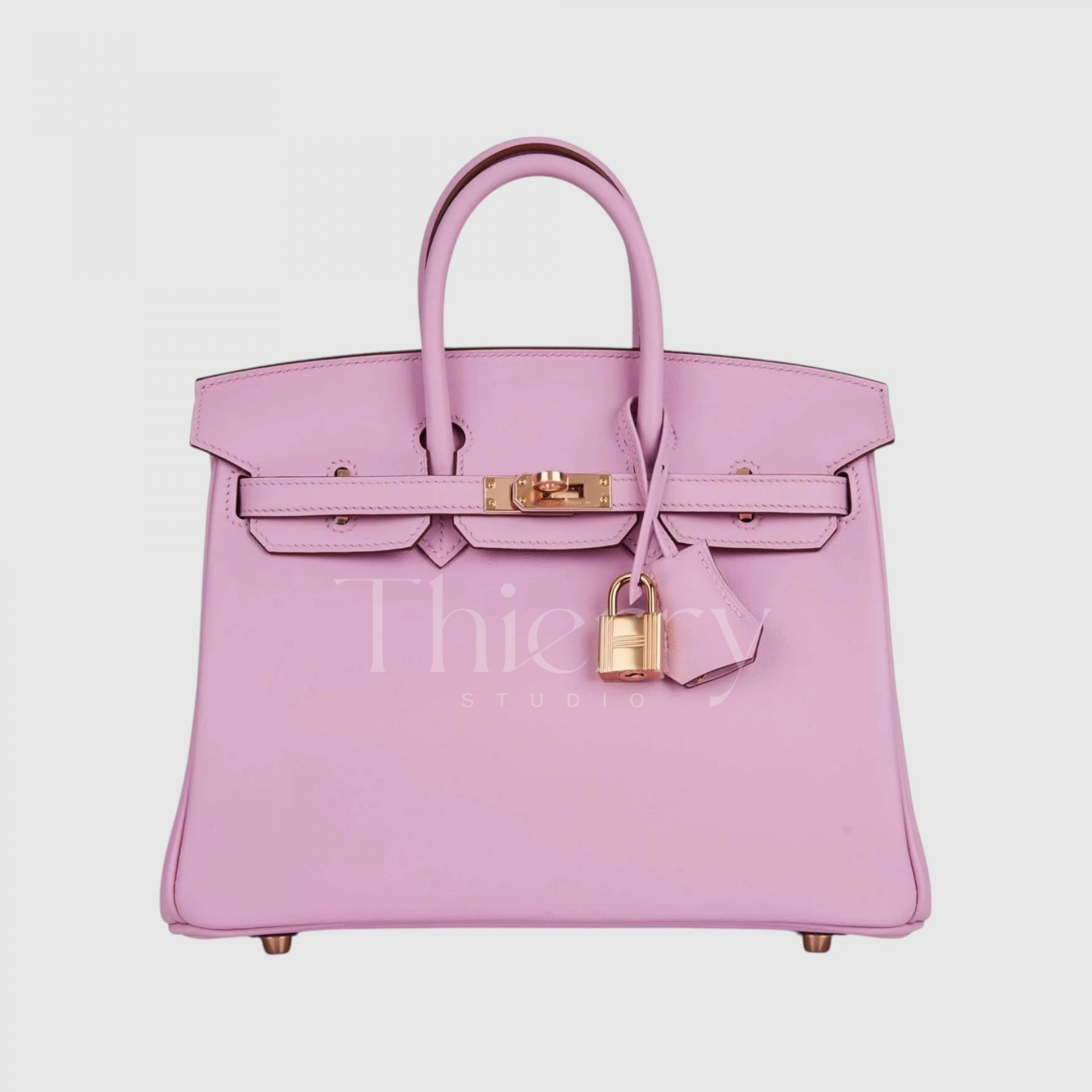
Mauve Sylvestre (Mauve Sylvestre)
Mauve Sylvestre is a soft lilac pink with a slight warm undertone.
More saturated and pinker than Mauve Pale, it is a richer, warmer pastel. Its nuanced color makes it a refined accent for simple outfits, while its slightly greater saturation than Sakura or Confetti gives it a more mature, luxurious feel.
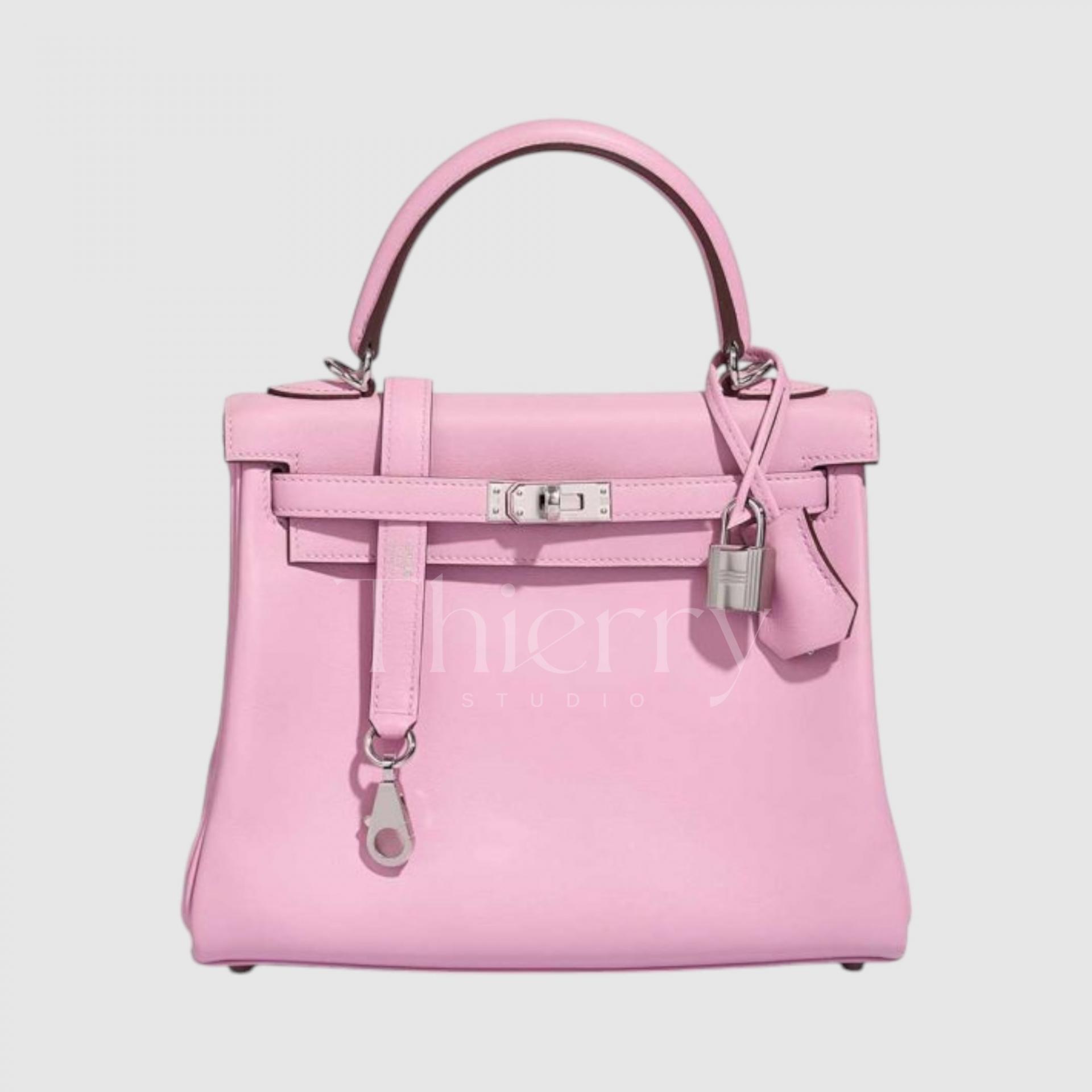
Rose Extrême
True to its name, Rose Extrême is a deep, intense pink with very high saturation. A bag in this shade naturally draws the eye, so use it as an accent against all black or all white for a polished result.
It also works surprisingly well with playful streetwear. Though a hot pink, a slight red undertone adds maturity, making it a beautiful match for an evening outfit or a feminine silk dress.
This is a truly captivating shade in person.
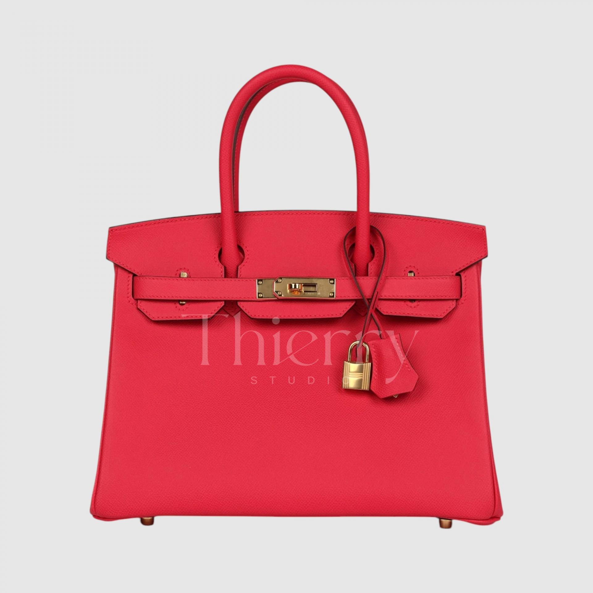
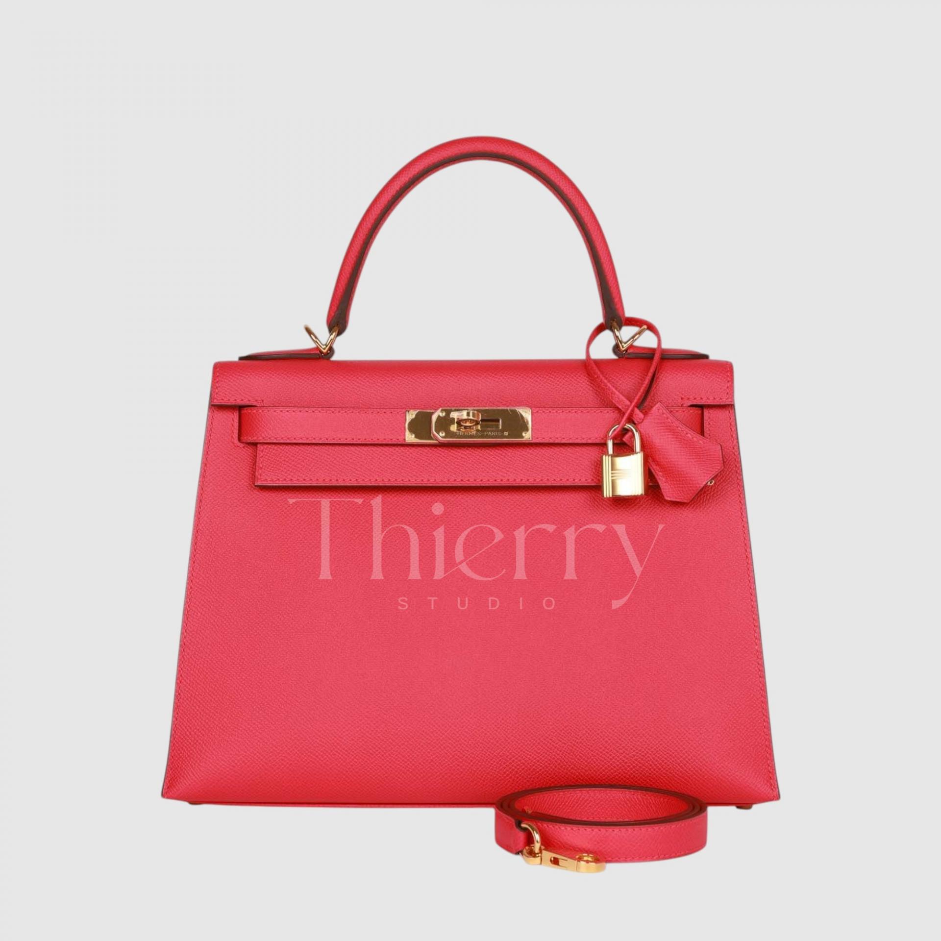
Pale shades such as Sakura, Confetti and Mauve Pale suit bright spring and summer dresses or skirt outfits for a romantic accent,
while stronger shades such as Azalée and Extrême make bold color accents against simple, solid-colored clothing.
Rouge H
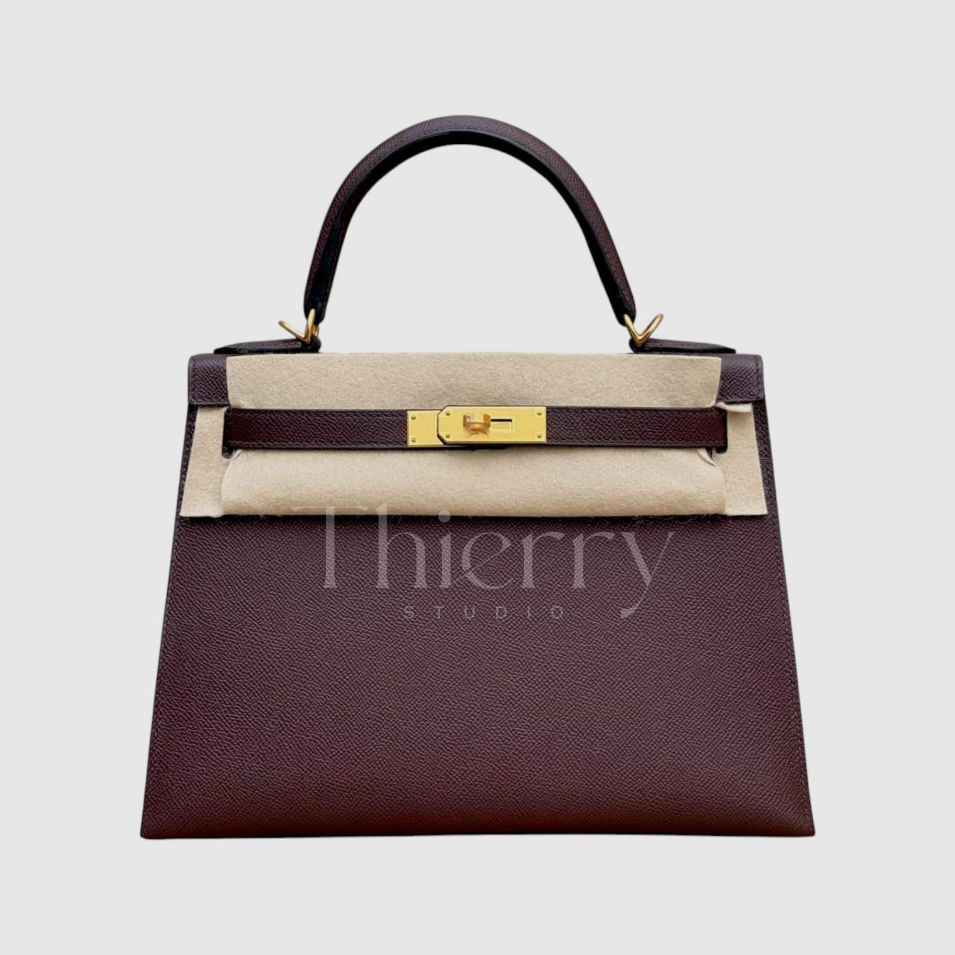
A quintessential Hermès classic, Rouge H is a shade used since 1925: “deep, rich reddish brown.” This wine red has a hint of brown and can look almost brown in low light, creating a quiet, classic mood.
Named after the H in Hermès, it is a color associated with tradition and refinement. Gold hardware brings out its warmth and vintage charm beautifully 🙂
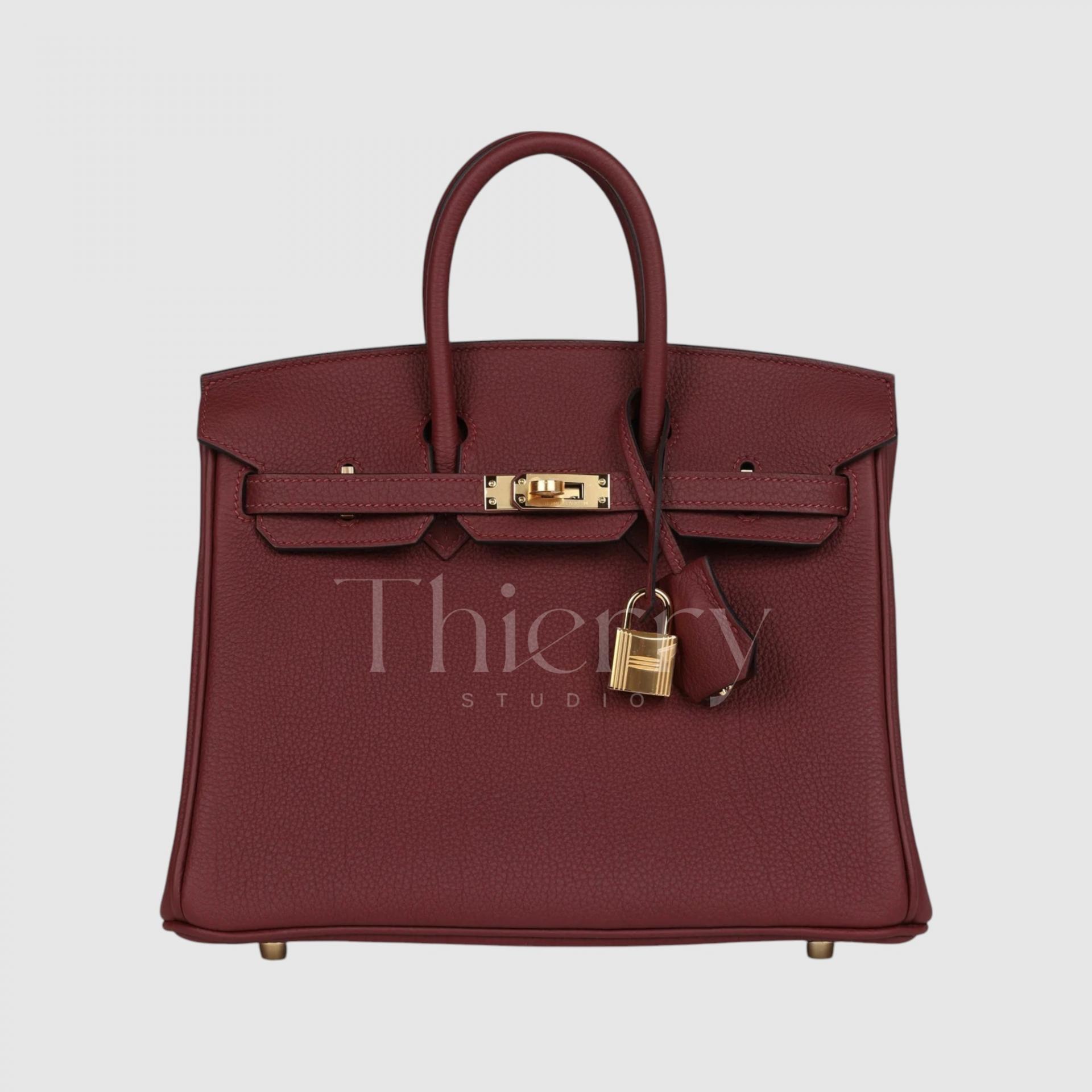
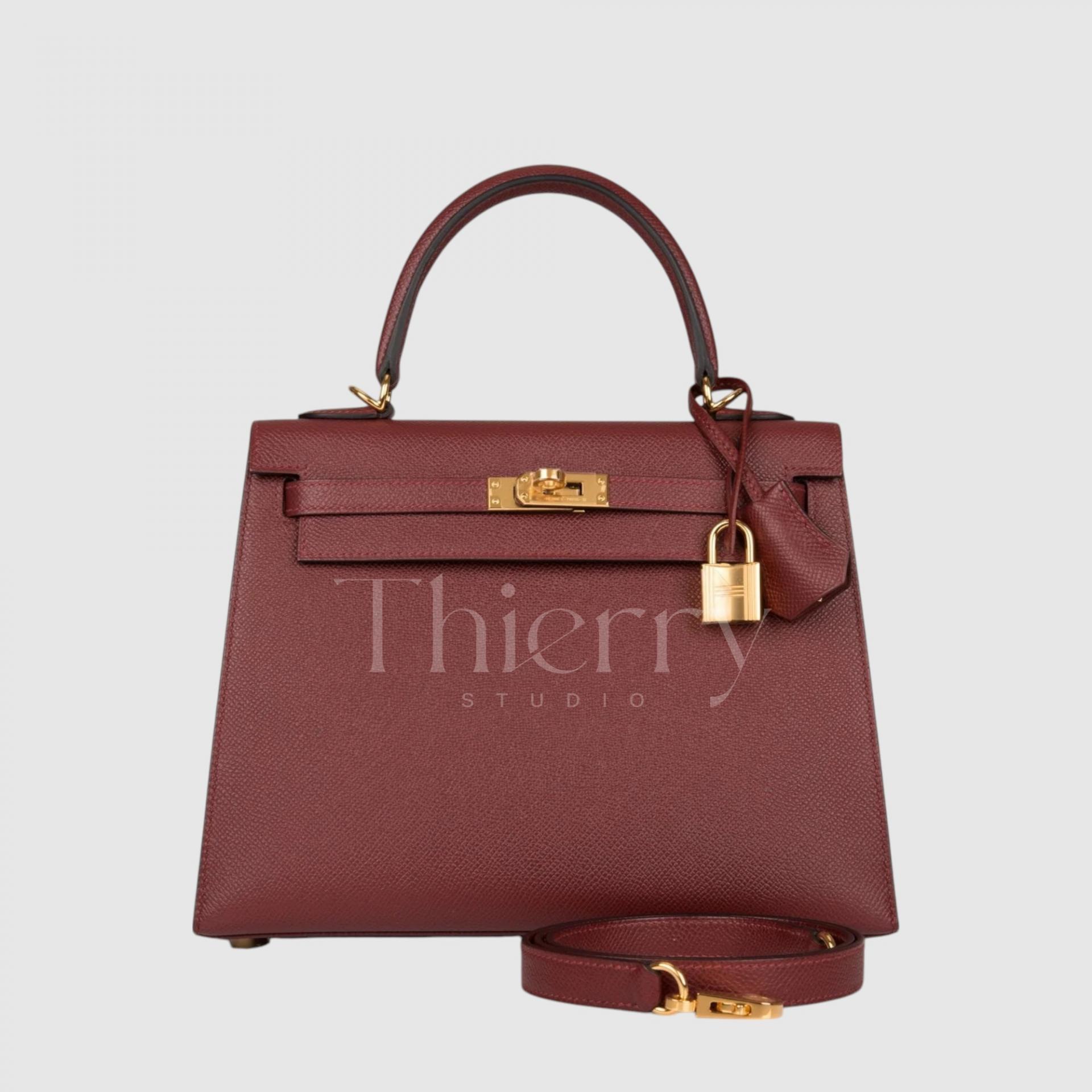
Bordeaux
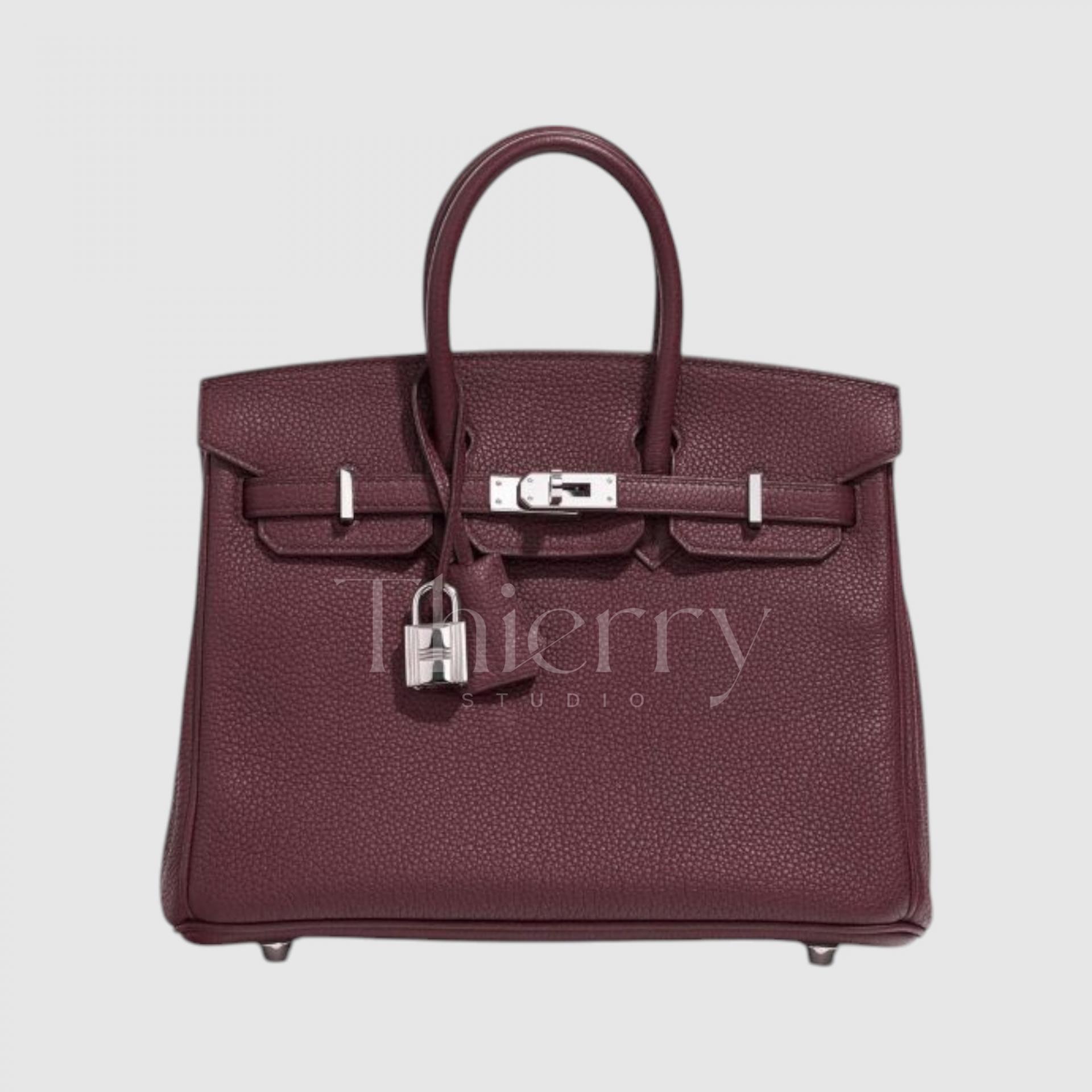
Evoking the wines of Bordeaux, this is a deep wine shade similar to Rouge H but subtly different. Rather than strongly purple, it sits between brown and red as a dark red-brown with a refined, luxurious feel.
Both Rouge H and Bordeaux are dark and substantial enough to serve as near-black neutrals. With monochrome autumn or winter coats, they add color without overwhelming the outfit.
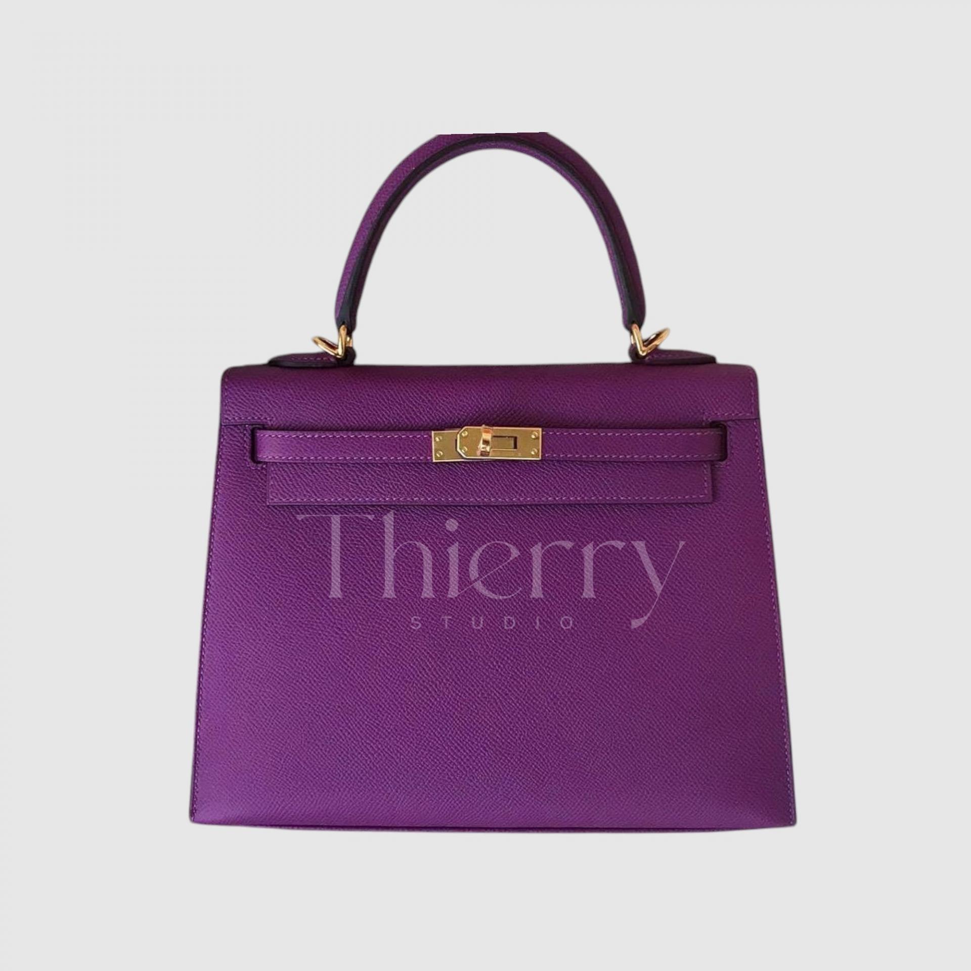
Anemone
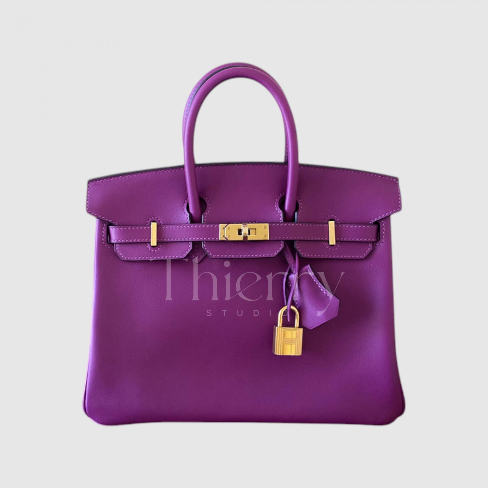
Introduced in 2014, Anemone is a rich purple recalling aubergine flowers or skin. Often described as aubergine, it combines deep purple with a slight red undertone, yet is relatively bright and clear among Hermès purples.
Anemone is the best-known and most popular Hermès purple. Its vivid character comes alive in sunlight, making it a lively purple accent that is not too dark.
Use it to punctuate an all-black outfit, or add distinctive color to a white shirt and dark jeans🙂
Cassis
Introduced in 2011, Cassis takes its name from the blackcurrant.
A deep, nuanced purple with the elegance of amethyst, it is darker and bluer than Anemone, giving it a calm, mysterious mood. From a distance, it can appear almost black or deep navy.
That makes it popular as a distinctive dark-bag alternative to black. Paired with classic Hermès gold or palladium hardware, it has a refined, intriguing appeal.
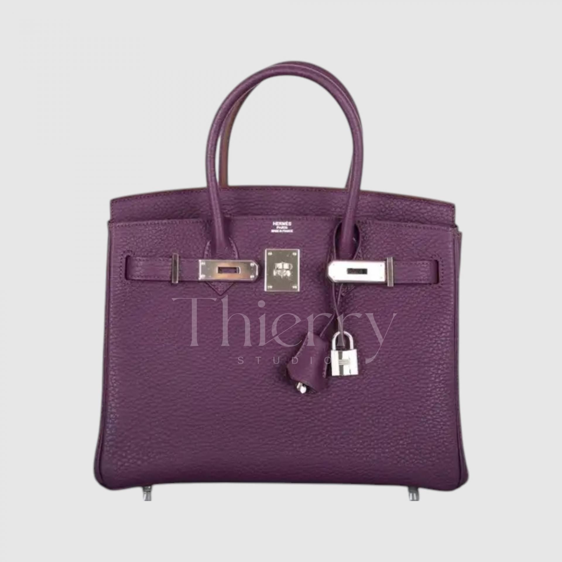
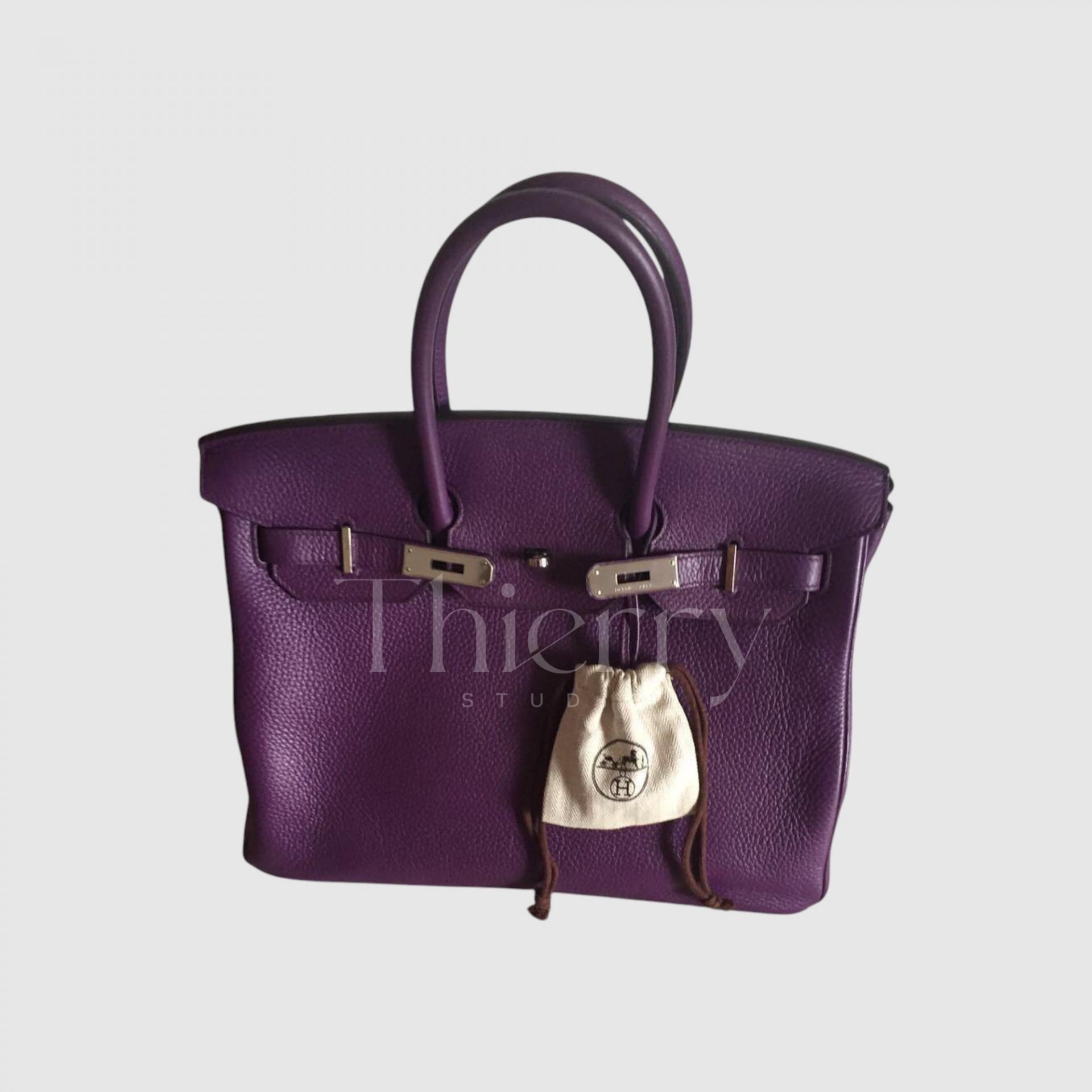
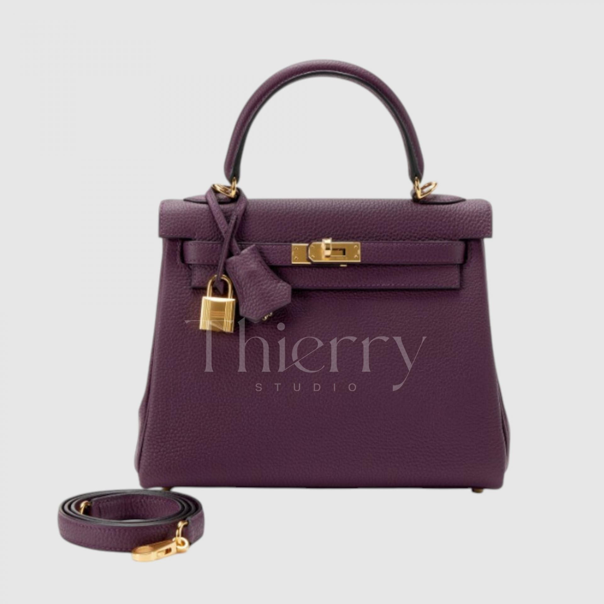
Rouge H and Bordeaux belong to the traditional wine-color family, making them especially suited to formal suits and classic tweed. Brown clothing brings out their warmth.
Anemone and Cassis have purple’s distinctive richness, so they work as accents with simple clothing, or in contrast with yellow accessories for a striking, sophisticated combination.
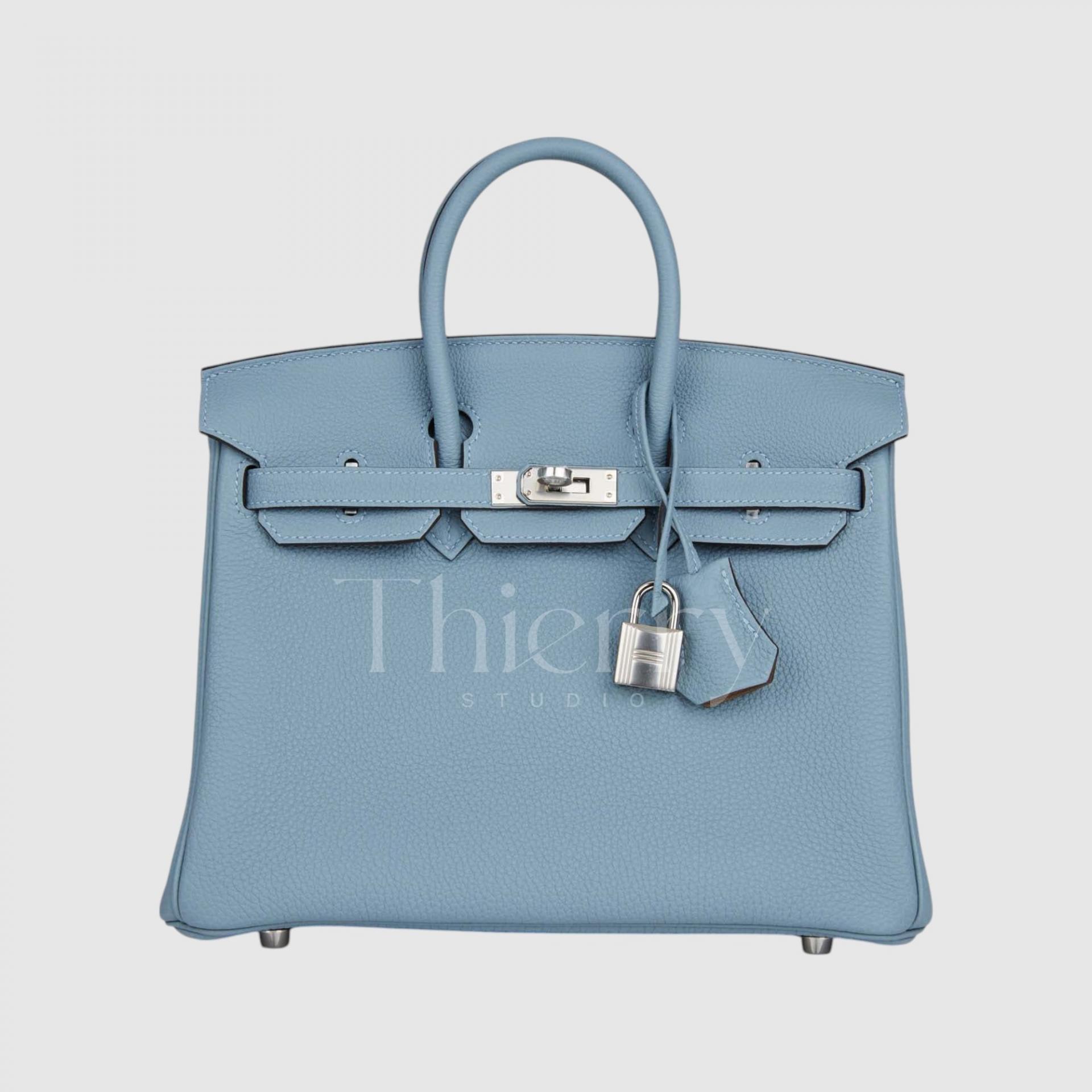
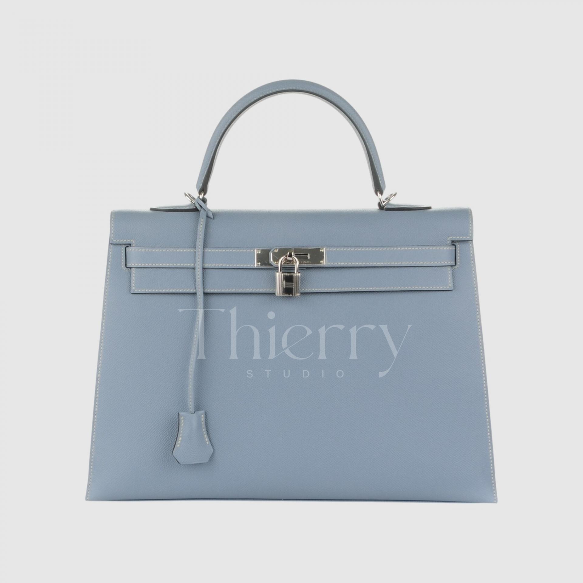
Bleu Lin
Named after linen, Bleu Lin is a soft blue with a very pale gray cast.
Gentle and understated like linen cloth, it is a grounded pastel blue that is neither muddy nor overly vivid, making it easy to wear.
Its cool blue-gray character works beautifully tonally with light clothing such as white and beige, and naturally alongside denim.
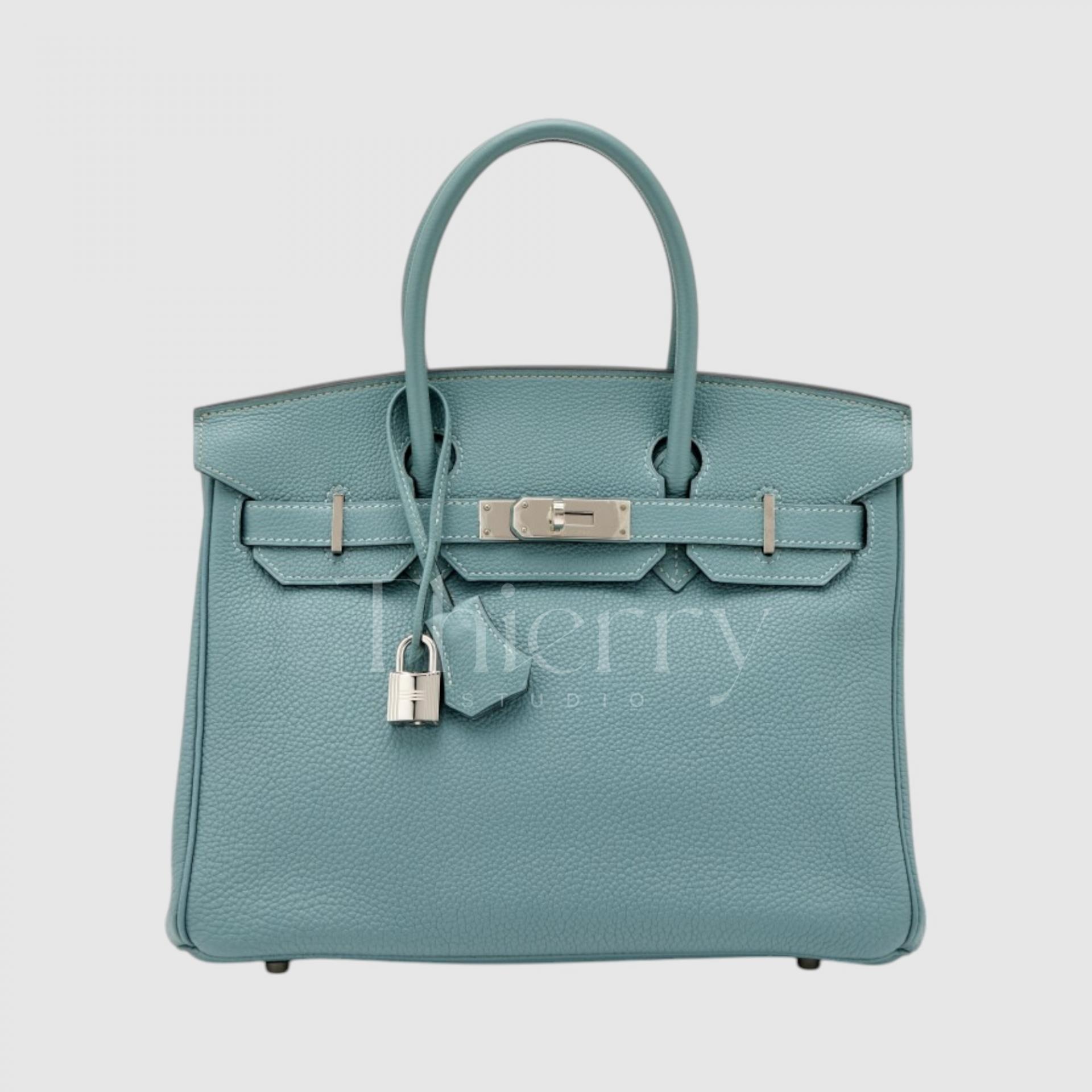
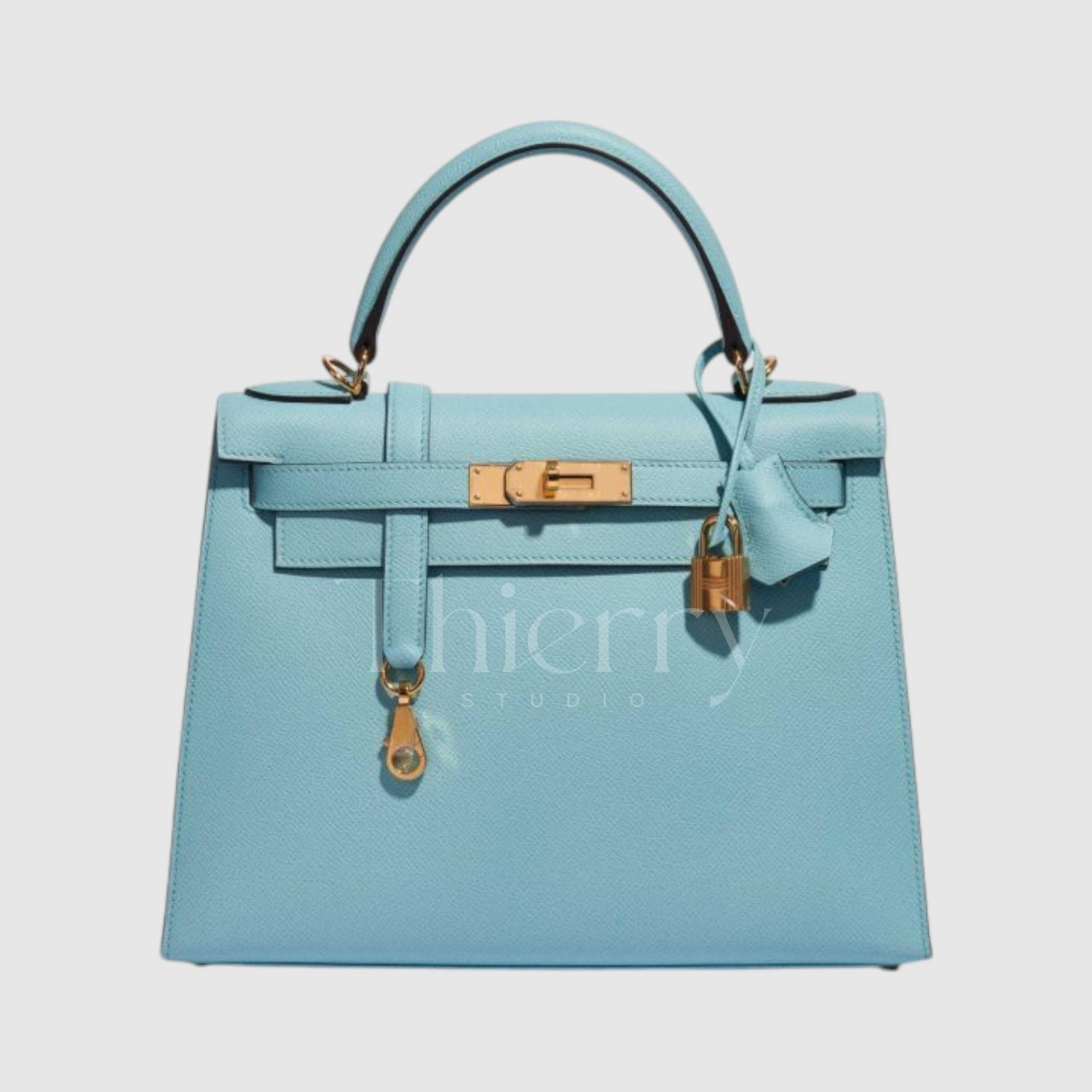
Bleu Ciel
As “ciel” means “sky” in French, Bleu Ciel is a clear sky blue. More saturated than Bleu Lin and free from yellow undertones, it is a clean sky blue with a bright, refreshing feel.
A light Bleu Ciel bag can freshen up a navy or gray suit or a floral dress with a cool, airy touch.
Personally, I think Bleu Ciel suits larger Birkins, from size 30 upward. Victoria Beckham is particularly known for her fondness for the size 35 in this shade.


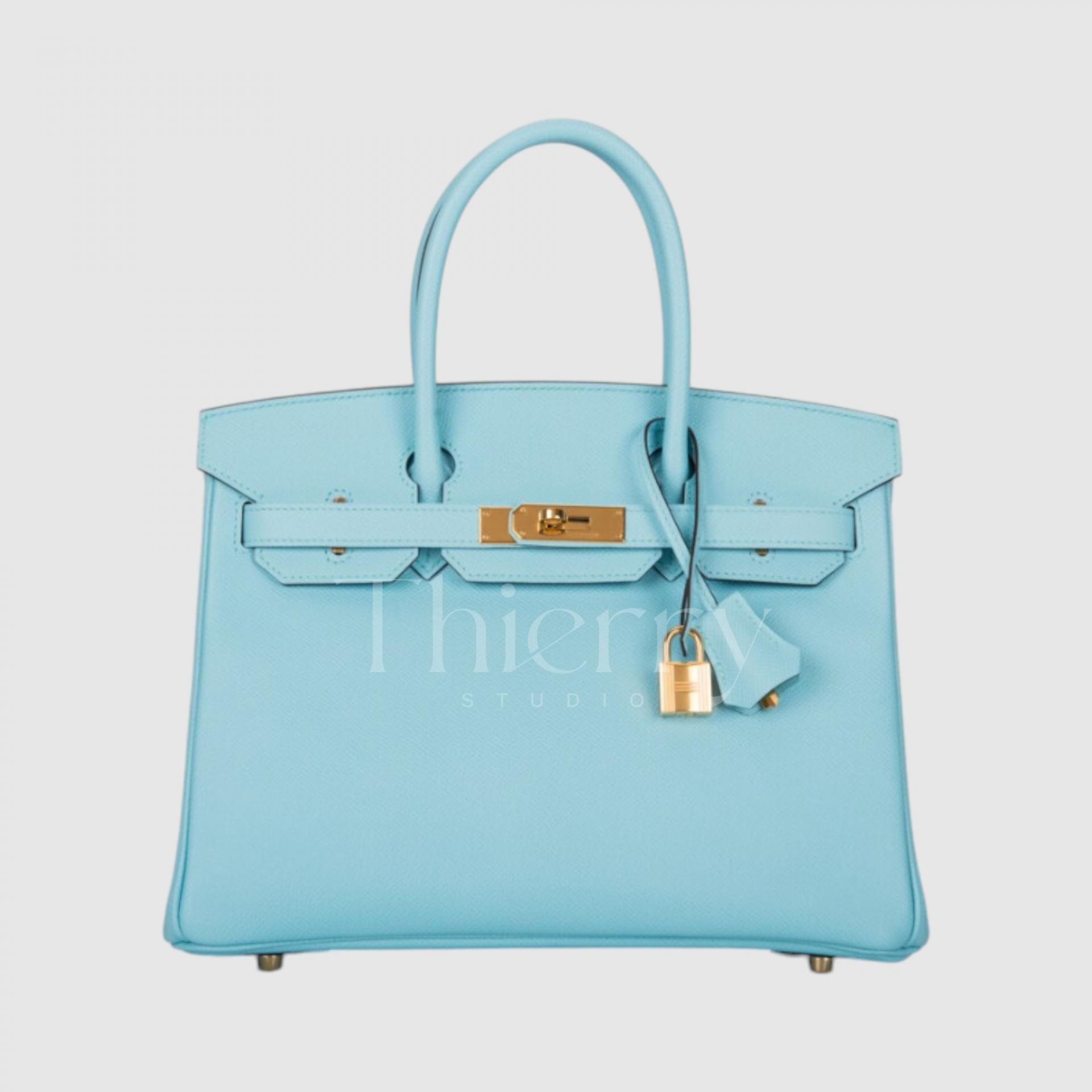
Bleu Atoll
Introduced in 2015, Bleu Atoll recalls the waters around South Pacific coral islands with its clear turquoise blue. A slight green undertone gives this bright, bold shade an instantly eye-catching quality.. ?
A Bleu Atoll bag is ideal with white linen or resortwear in summer, and brings energy to casual everyday outfits.
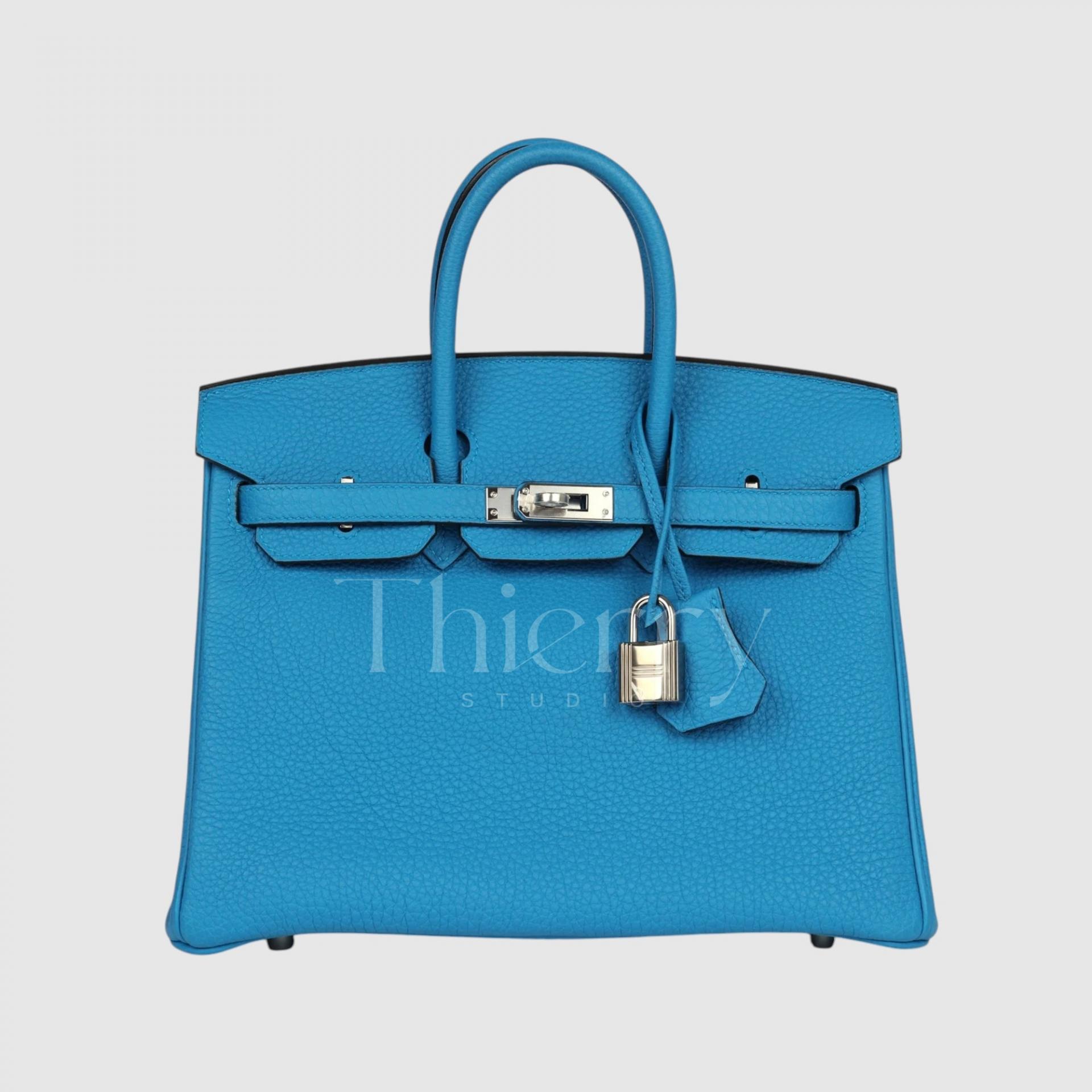
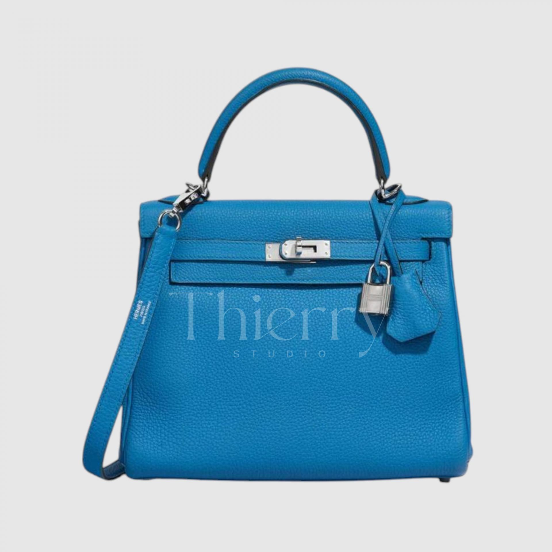
Bleu Zanzibar
Inspired by the waters around Zanzibar, Tanzania, Bleu Zanzibar is a slightly deeper, bluer bright turquoise than Bleu Atoll. In simple terms, it is a bright emerald blue with a very subtle green undertone that feels exotic and distinctive.
Bright in sunlight yet calmer indoors, it makes a useful accent color across the seasons.
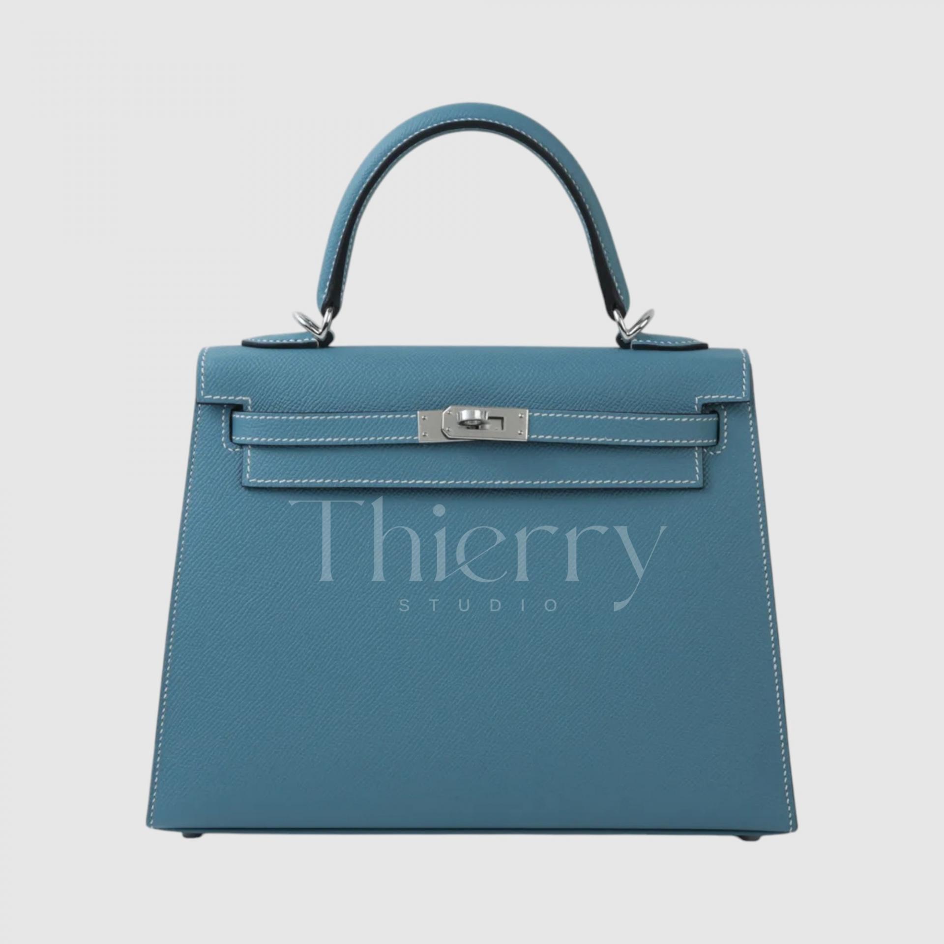
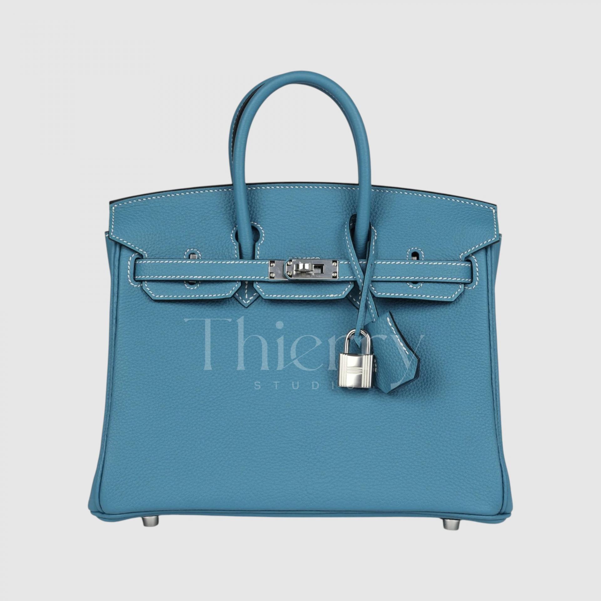
Bleu Jean
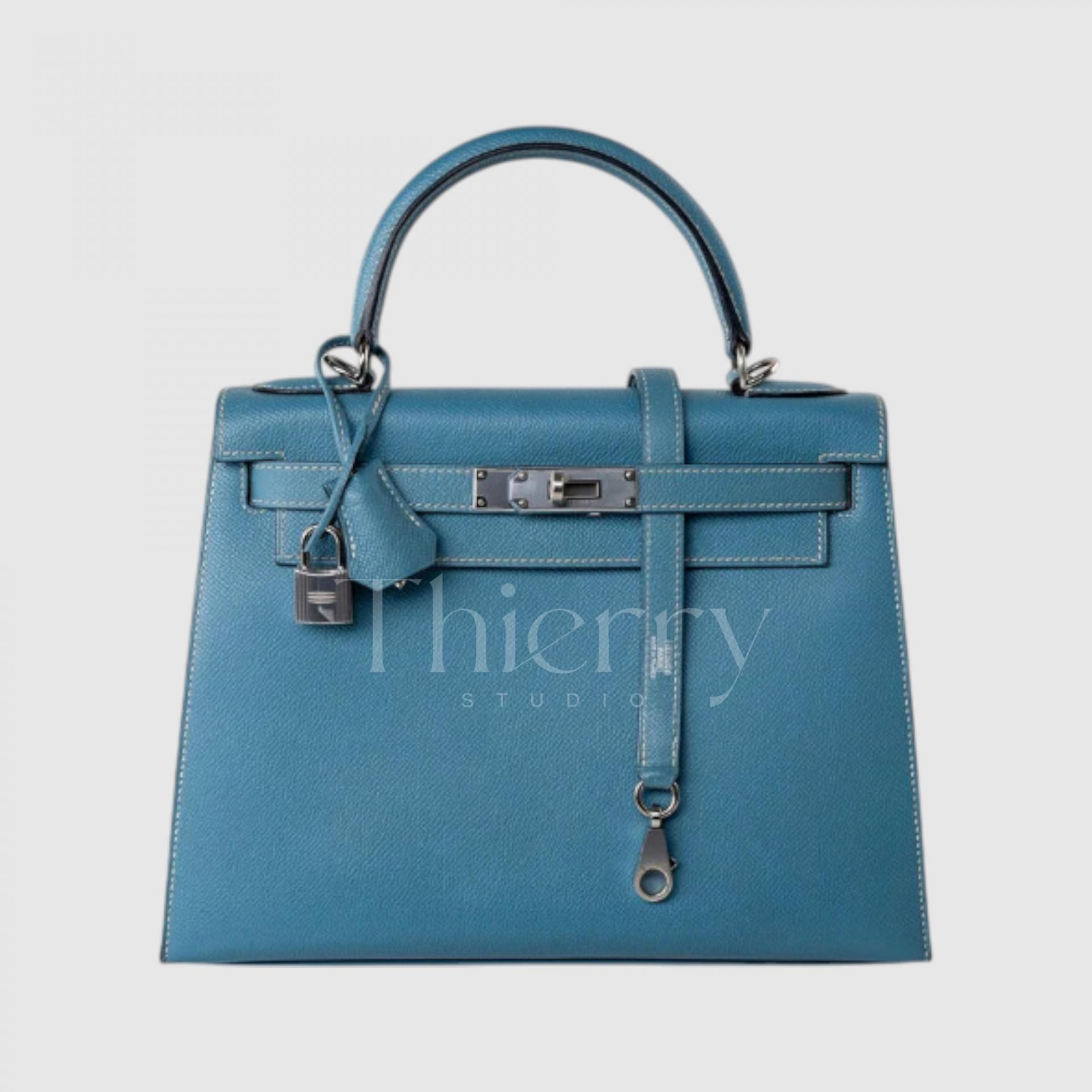
A leading favorite in the blue family: Bleu Jean.
True to its name, it is a medium-toned vintage blue reminiscent of denim. Slightly faded and dusty, with a balance of gray and blue, it is a popular shade that suits almost any outfit without looking loud.
Bleu Jean has an easygoing character: carry it with a T-shirt and jeans for an effortless look. It also works beautifully with white and tan, making it a year-round everyday bag color.
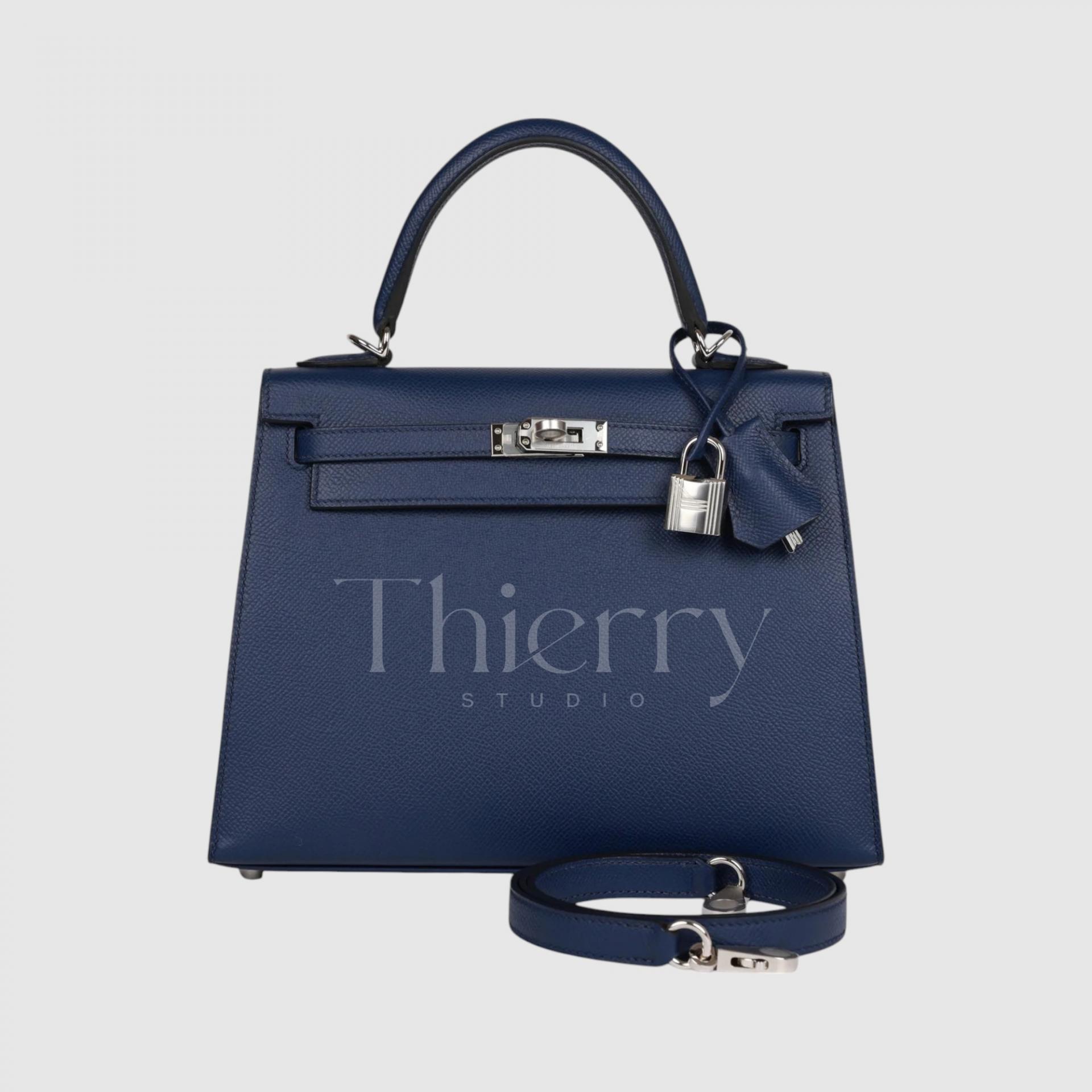
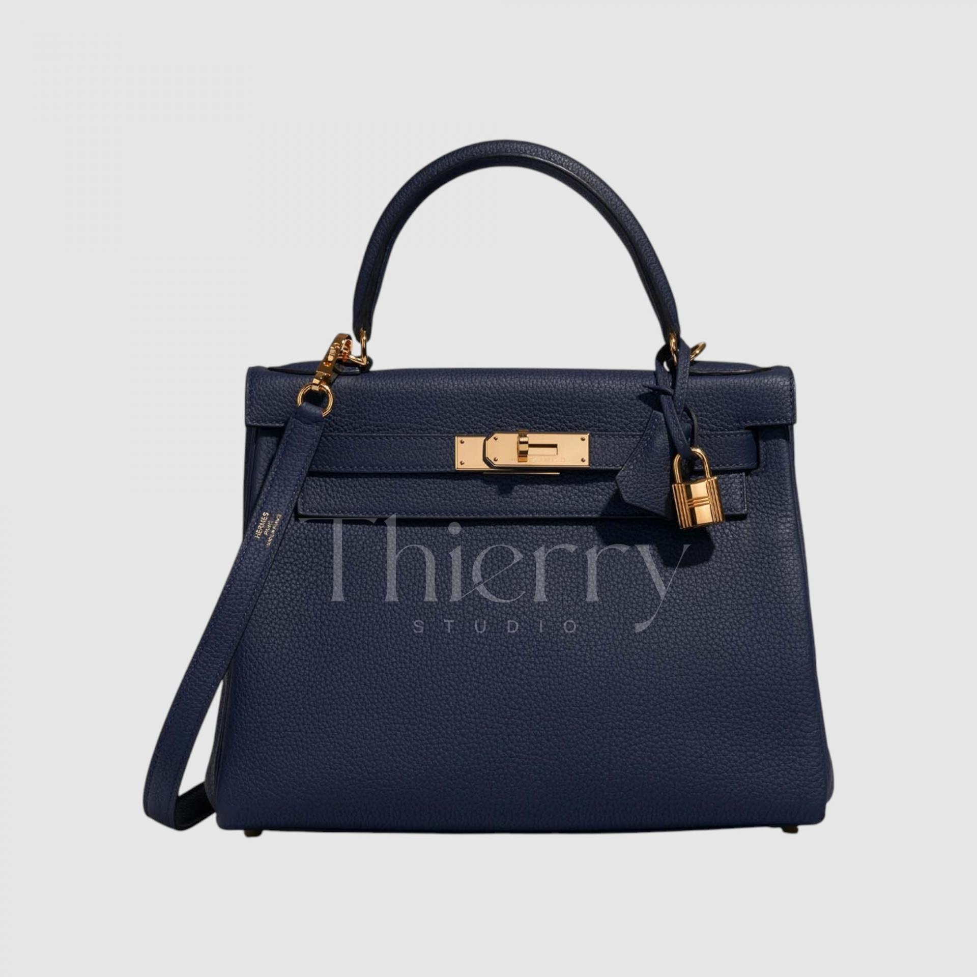
Bleu Saphir
Named after the sapphire gemstone, Bleu Saphir is a rich, deep blue with a violet undertone. Clear, deep navy with a touch of purple gives it an elegant, luxurious feel, with a sheen that recalls the night sky in person.
A Bleu Saphir bag looks particularly refined with an evening dress or formal outfit. For everyday wear, it is a livelier alternative to black, creating a rich autumn mood with burgundy or deep green.

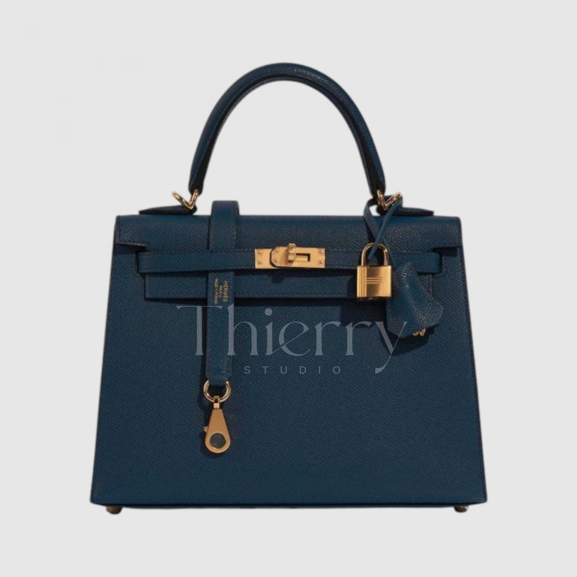
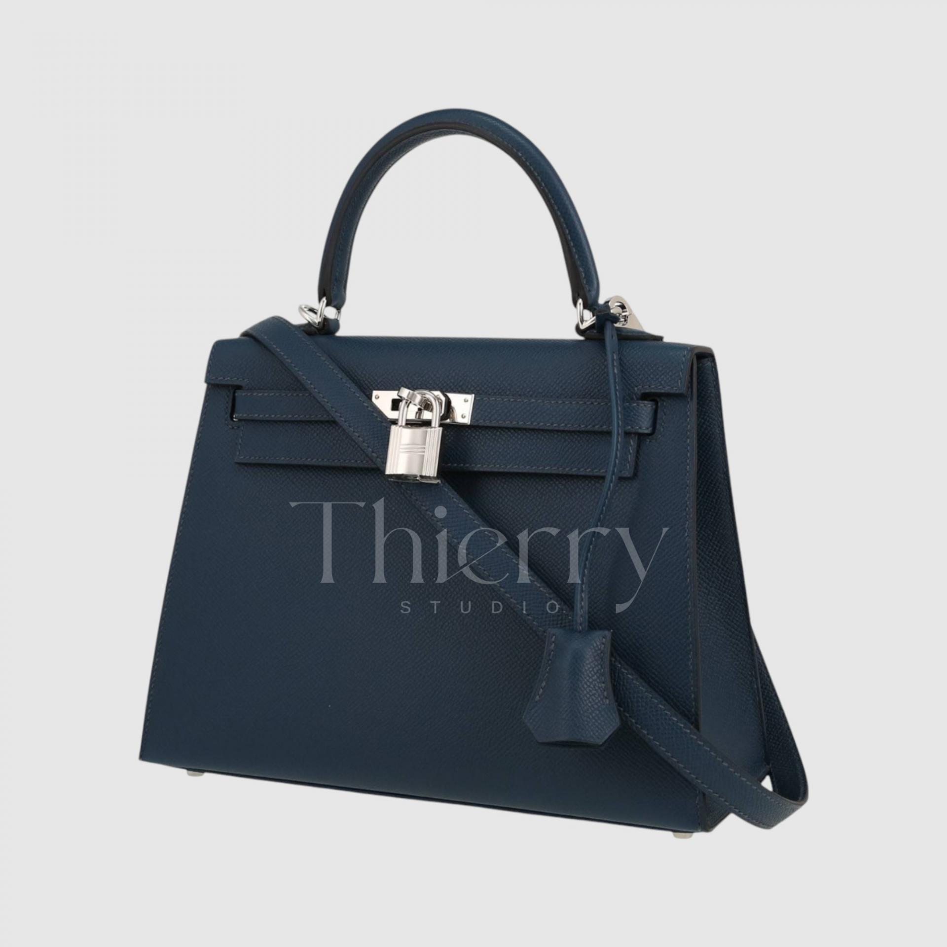
Bleu de Prusse
Bleu de Prusse means “Prussian blue,” referring to the historic pigment: a deep, rich blue-navy.
Although cool at first glance, it also carries subtle teal and gray notes, making it a complex deep blue that evokes the depths of the Baltic Sea.
It pairs unexpectedly well with autumn leaf tones and winter knits. Its balance of warmth and coolness makes it a versatile dark color for any season🙂
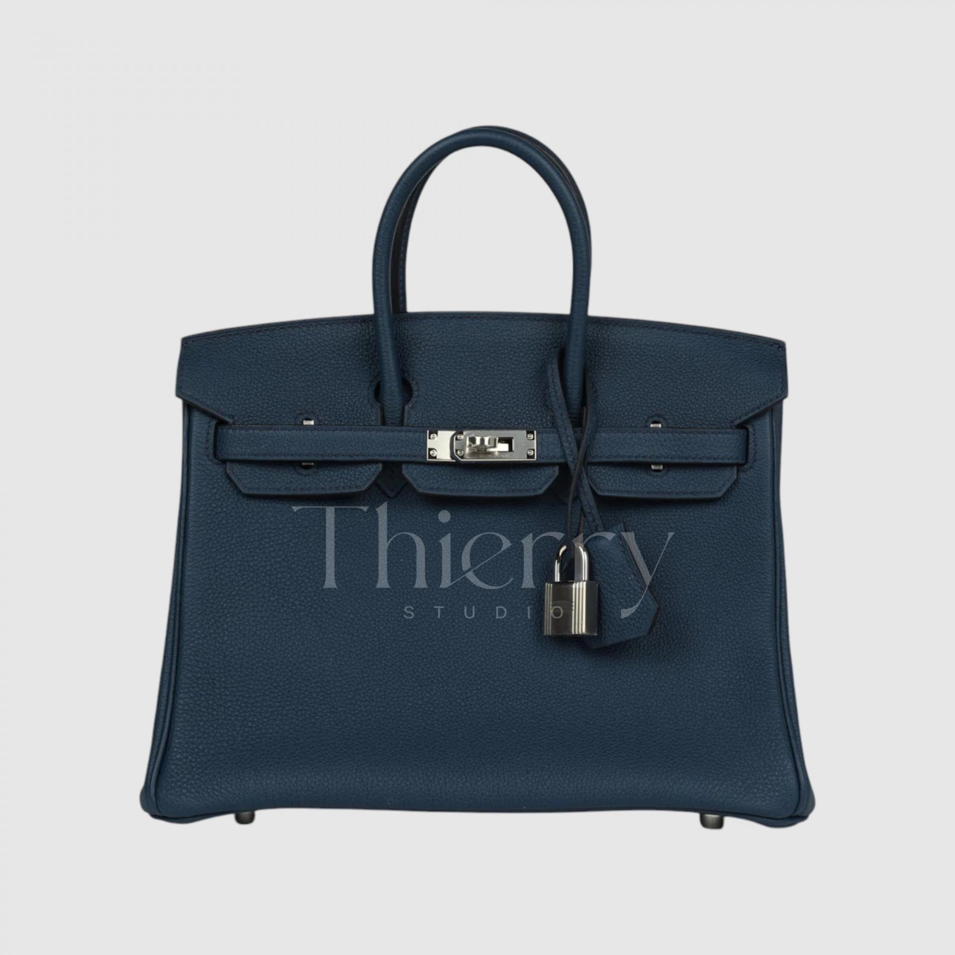
Bleu Nuit
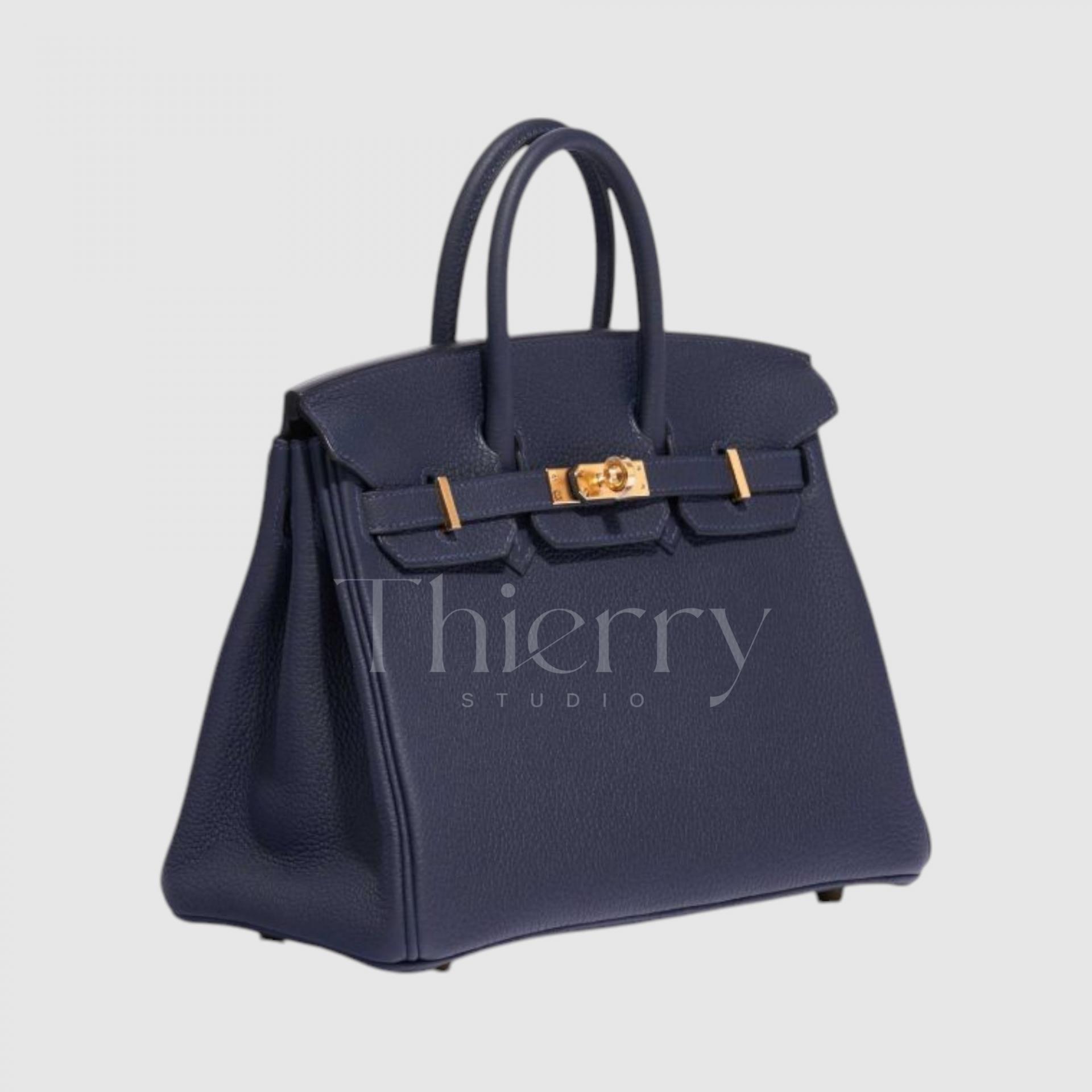
Taking its name from the French word for “night,” Bleu Nuit is a midnight navy, almost black.
This very dark blue combines subtle violet and black undertones for a classic, alluring impression.
Bleu Nuit is one of the finest neutrals for tailoring or dressed-up looks, adding depth and presence. It looks especially sophisticated under evening lighting, making it a favorite for formal occasions.
It is a popular choice for anyone who finds black too predictable but prefers a subtle, understated color 🙂
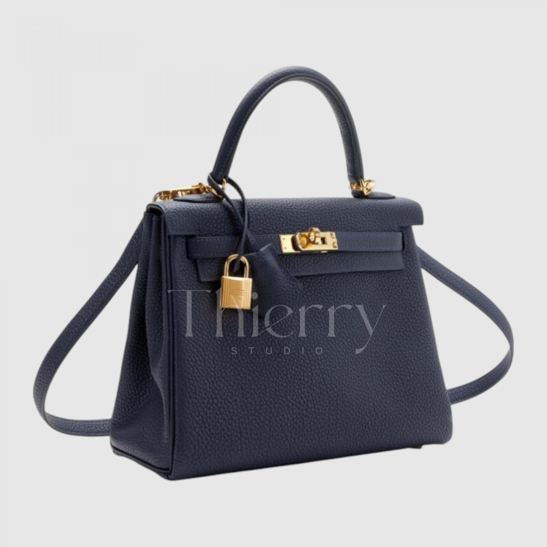
Bleu Indigo
Like indigo dye, Bleu Indigo is a rich, deep navy blue and a long-standing Hermès staple. Bluer than Bleu Nuit, this traditional navy can vary in depth depending on the leather.
An Indigo bag brings a grounded feel to business-casual or neatly tailored outfits. Popular with both men and women, it is also often chosen for coordinating couples’ accessories.
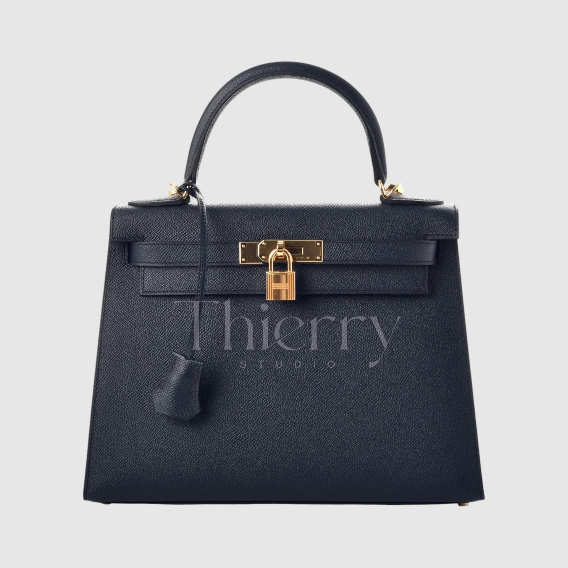
As these examples show, blues can cover everything from casual to formal depending on their lightness and undertone.
Pale Bleu Lin and Bleu Ciel suit fresh spring and summer casualwear or resort looks,
while Atoll and Zanzibar make vibrant accents for travel and holiday outfits.
Mid-toned Bleu Jean is an easy everyday choice,
while deeper shades such as Saphir, Prusse, Nuit and Indigo are all sophisticated dark blues that add elegance to formal clothing 🙂
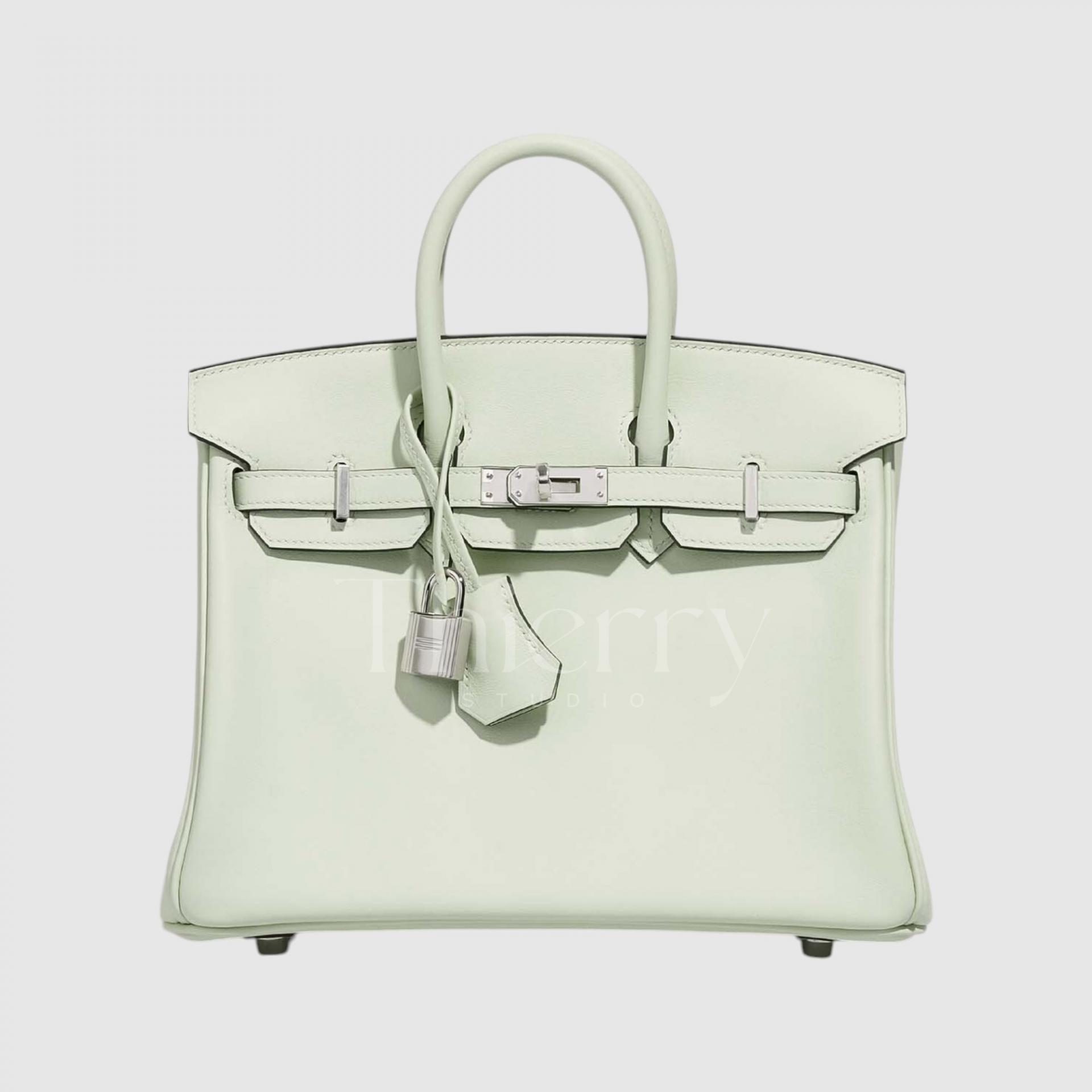
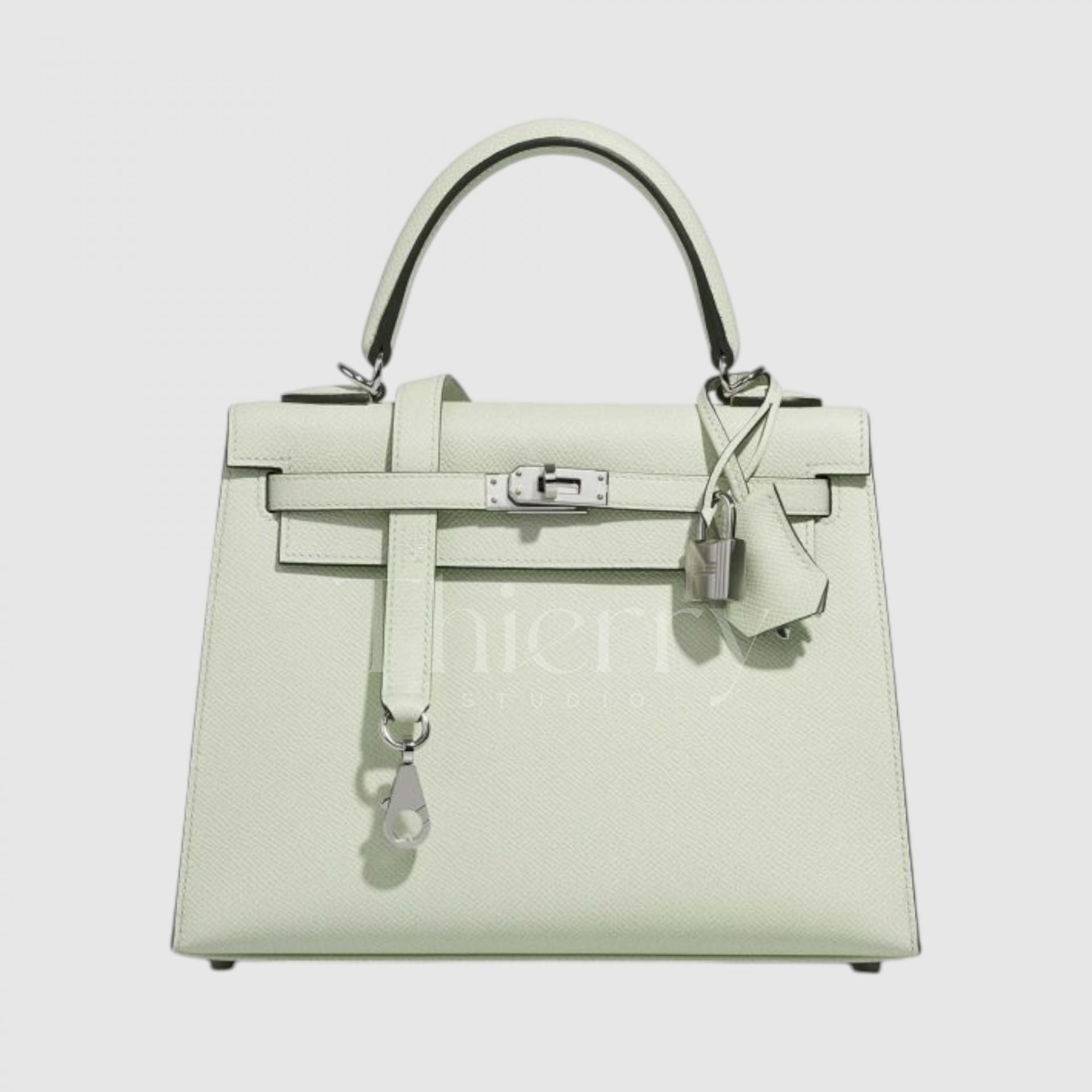
Vert Fizz
With a light, sparkling feel like a fizz cocktail, Vert Fizz is a very pale green close to a whitish mint. At the lightest end of pastel mint, it is fresh yet soft, adding a subtle lift to almost any outfit.
It is especially effective with white or light gray as a refined pastel accent, creating a lively spring or summer mood.
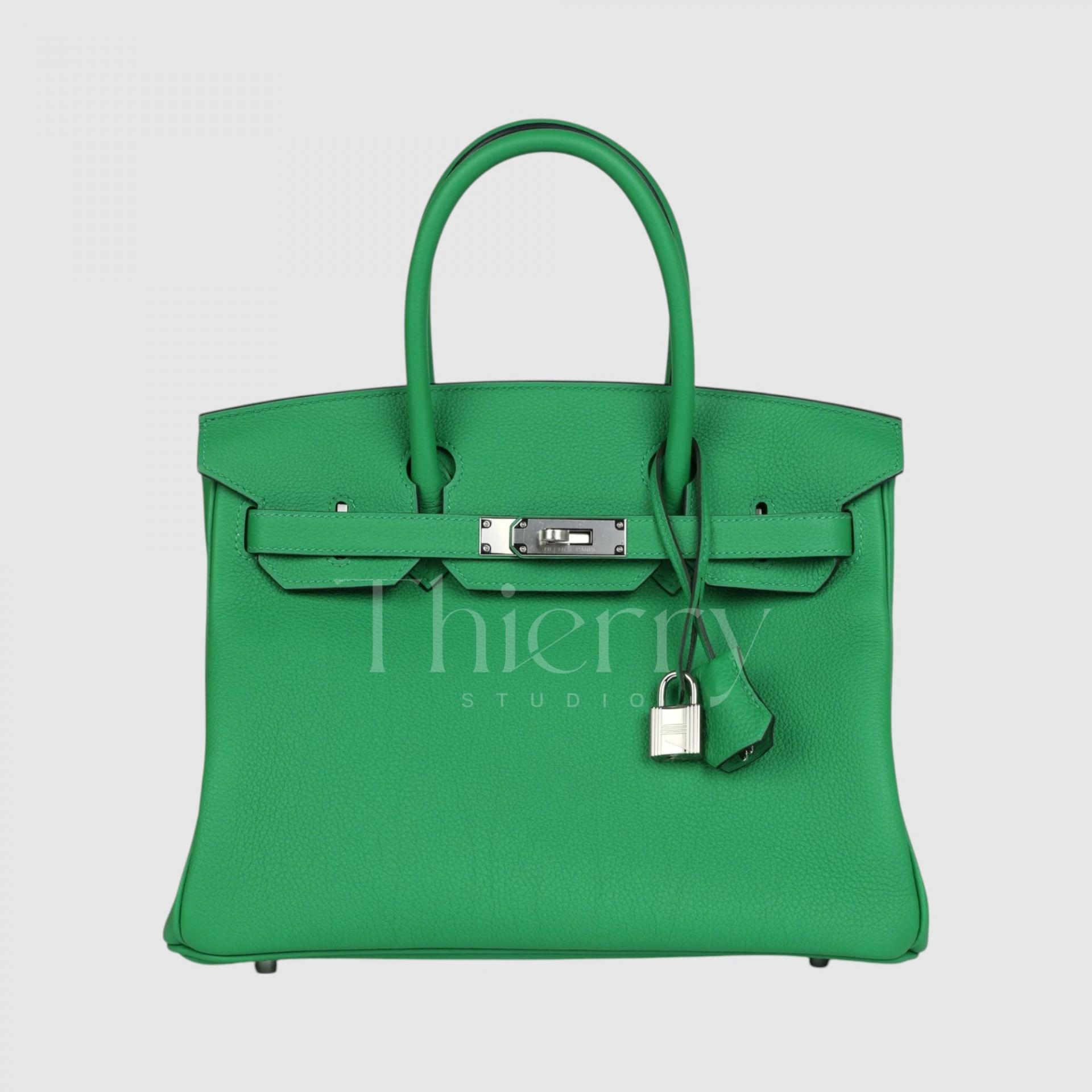
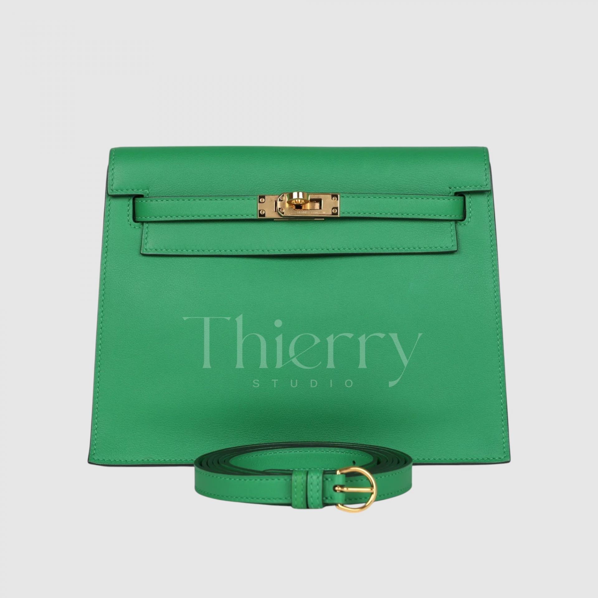
Bamboo
Like bamboo leaves, this is a clear, grassy green and one of the brightest, most saturated, almost fluorescent greens in the palette. Lighter than the similar Vert Vertigo, it is among Hermès’ most eye-catching vivid greens, with a warm yellow-green undertone.
Its almost fluorescent freshness makes it a contemporary pop of color with streetwear or monochrome casual outfits, and a lively addition to summer combinations.
Vert Vertigo
Introduced around 2017, Vert Vertigo is a classic mid-toned green. It is more muted than vivid Bamboo and lighter than the deep emerald of Malachite.
Think of it as less bright than Bamboo, but lighter than Malachite..
Vert Vertigo adds a lively accent to green tailoring or a khaki coat, and brings freshness to a cream knit with jeans.
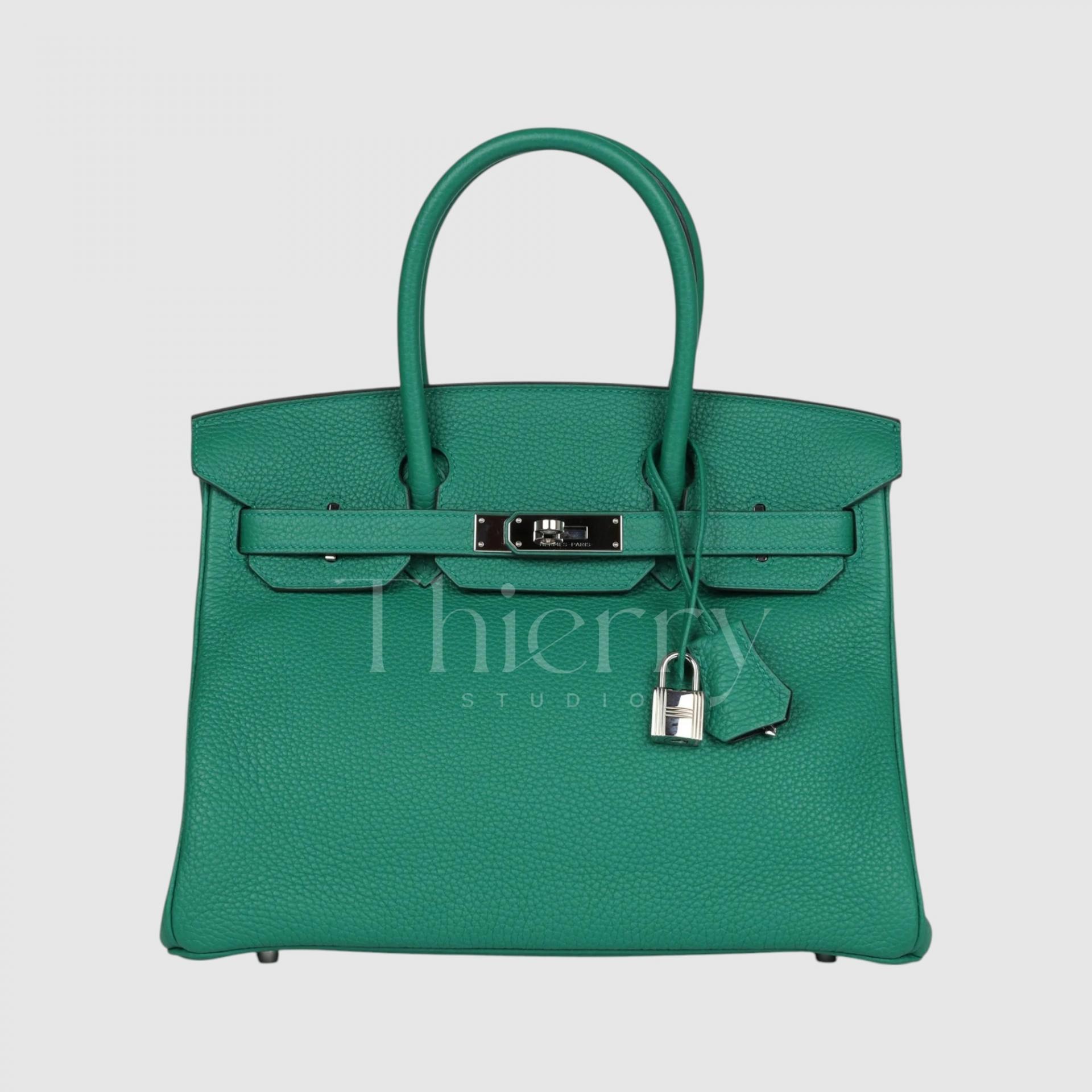
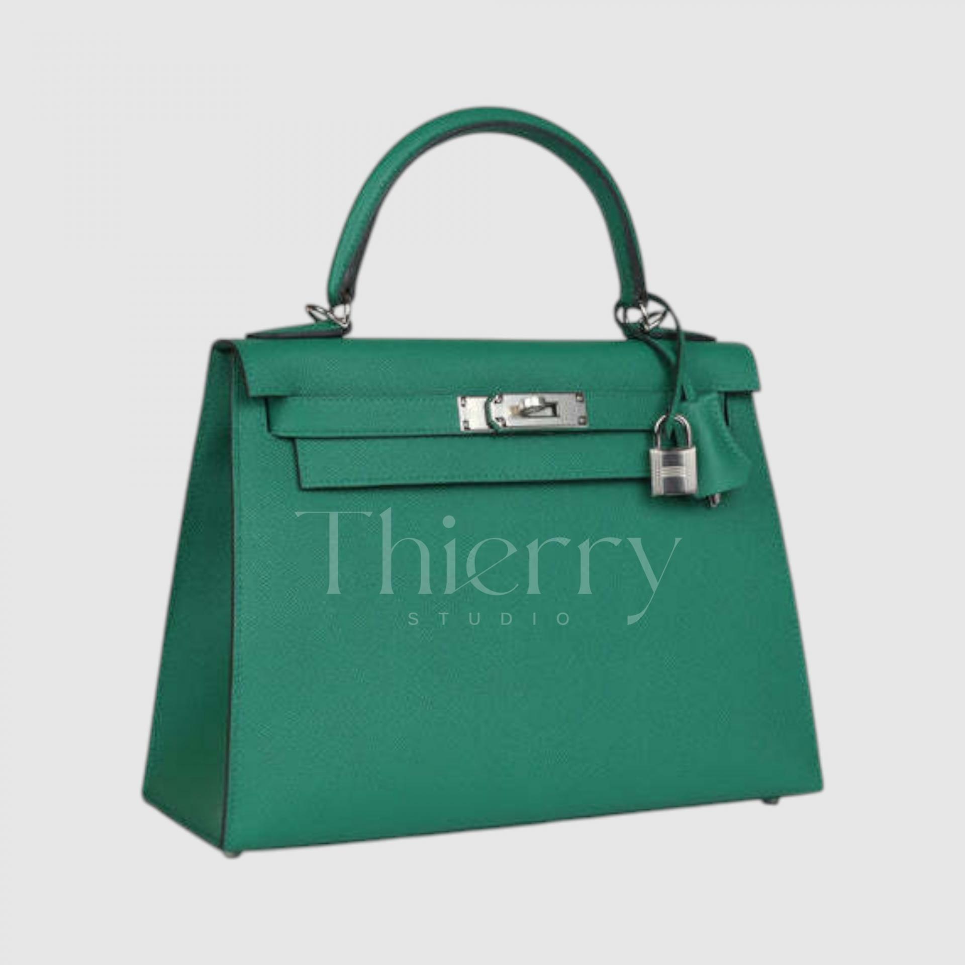
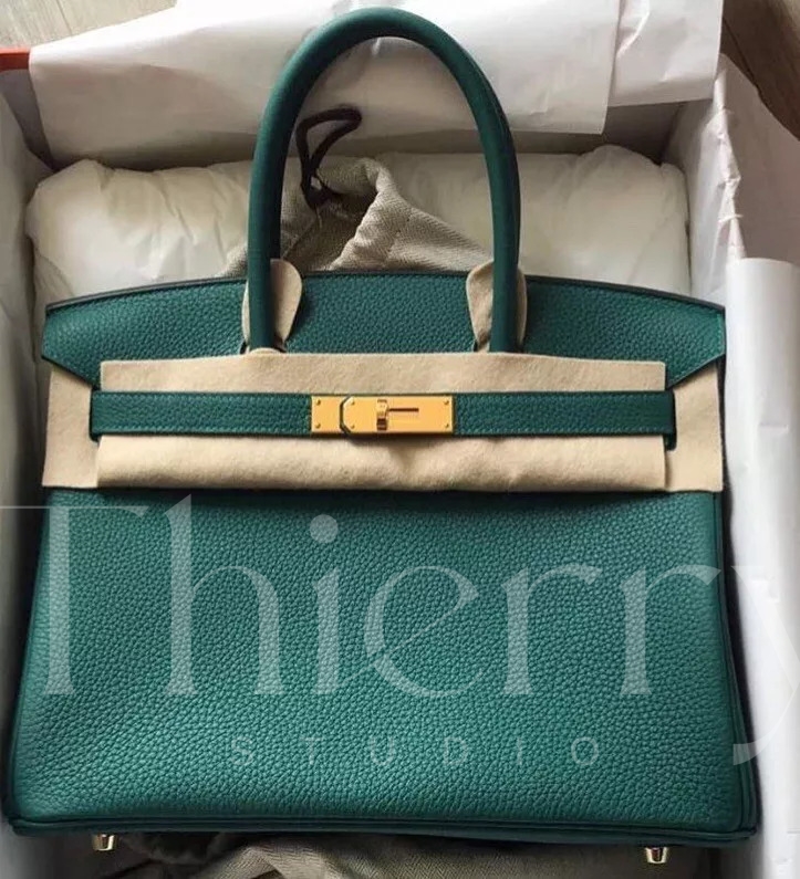
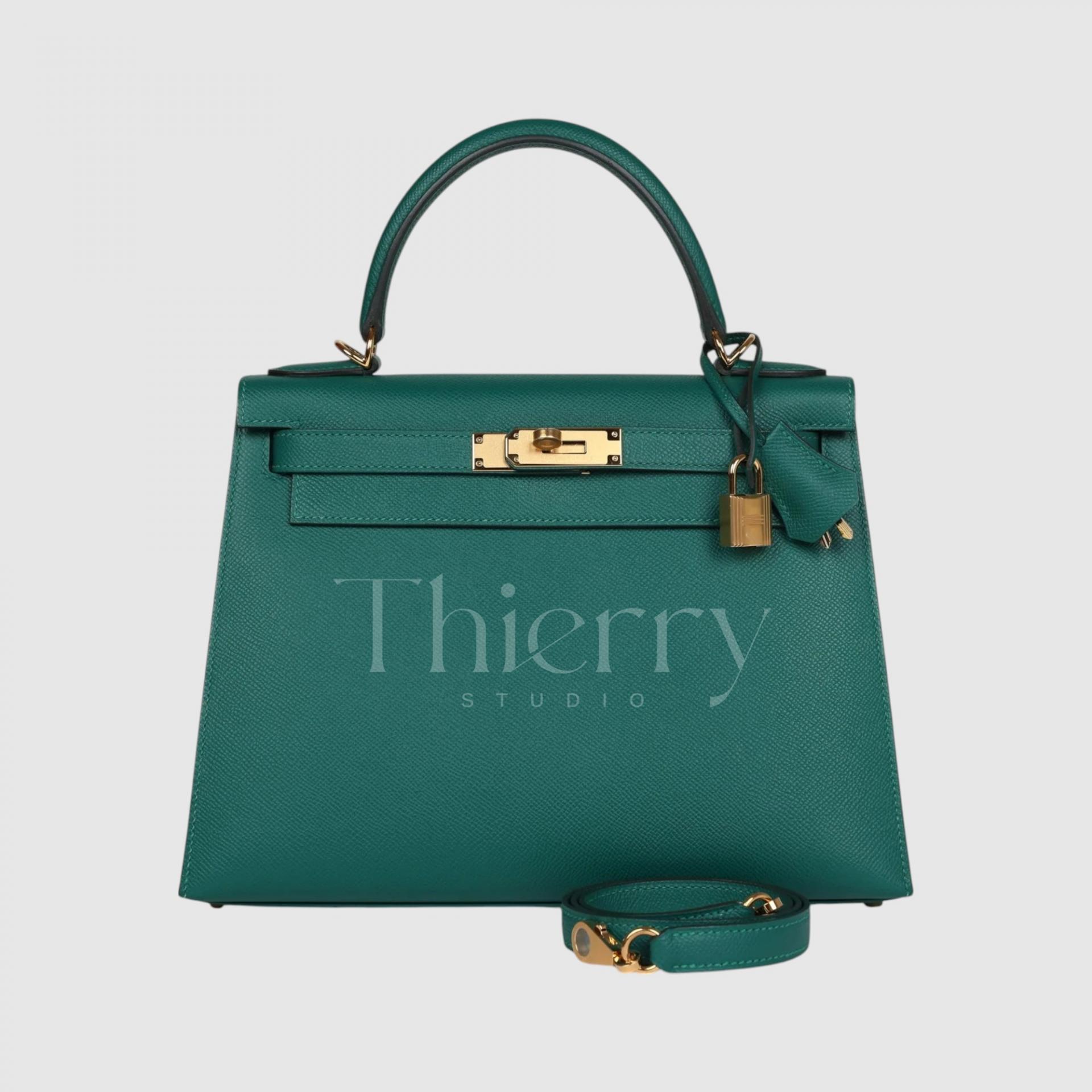
Malachite
Named after the gemstone, Malachite captures its deep emerald green. Rich and dark yet still saturated, it is a lush, luxurious green and the most popular shade in the Hermès green family.
Darker and calmer than Vert Vertigo, it lends itself to formal styling while retaining green’s natural vibrancy.
Pair it with beige or brown clothing for an elegant effect, or use it to accent a black or navy suit. Its depth and refinement make it a standout among Hermès greens.
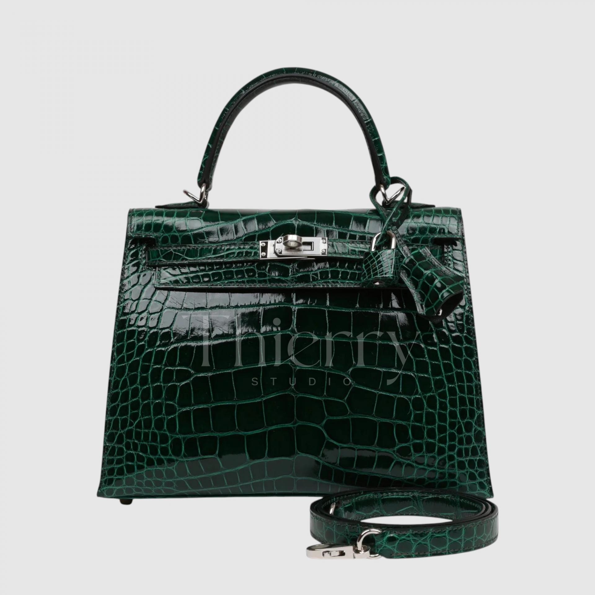
Vert Foncé
Literally meaning “dark green” in French, Vert Foncé is a very deep, dark forest green. In the tradition of shades such as Vert Anglais, it has a composed, understated feel. Pair it tonally with restrained tailoring for quiet sophistication.
It is more often seen in crocodile or Box leather than in Togo, Epsom or Swift.
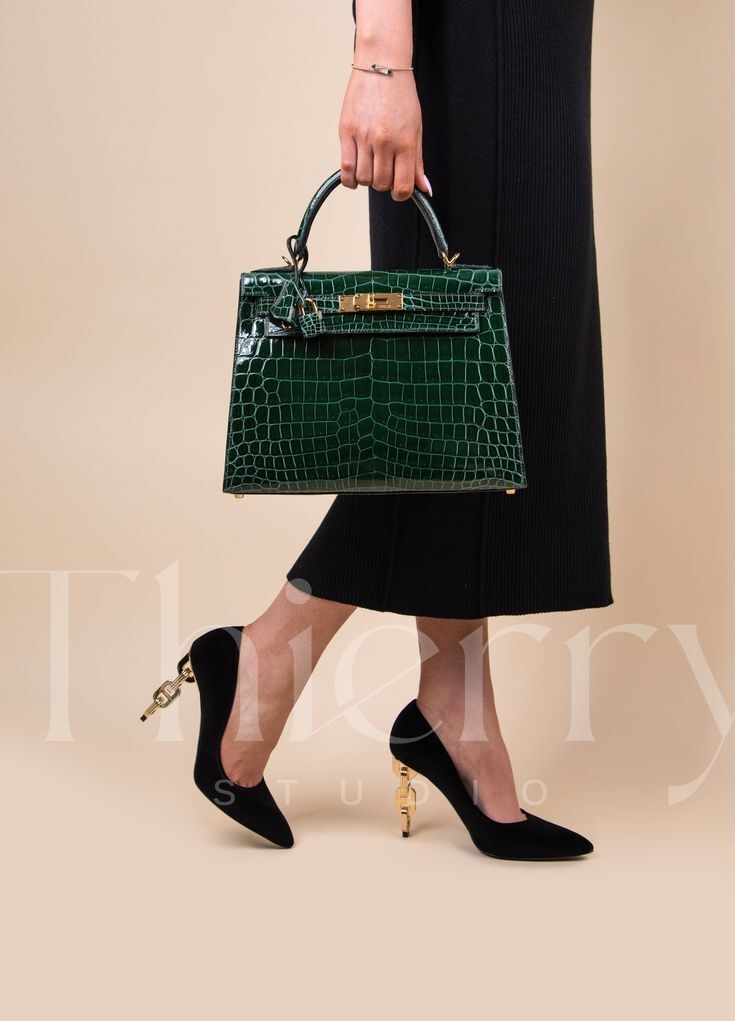
Vert Cypres
Introduced in autumn 2018, Vert Cypres recalls the deep green of a cypress tree.
An almost-black green, sometimes called “black emerald,” it reveals subtle blue-green and gray undertones on closer inspection. Gold or palladium hardware emphasizes its depth, making it ideal for
a subtle color variation with formal businesswear or an all-black outfit🙂
The photo brings out the green, but it looks much darker in person.
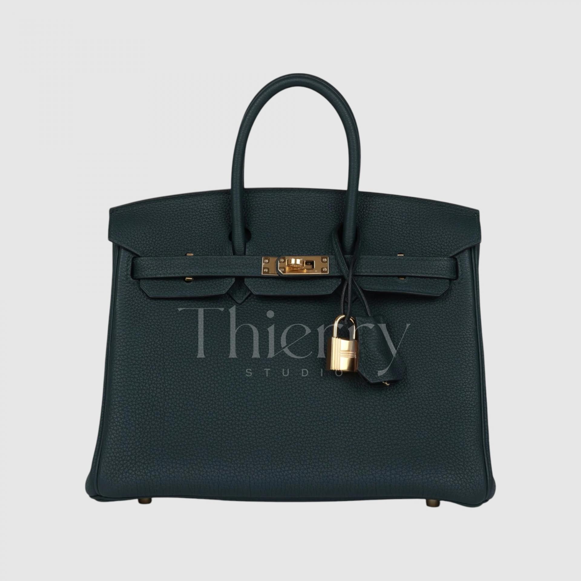
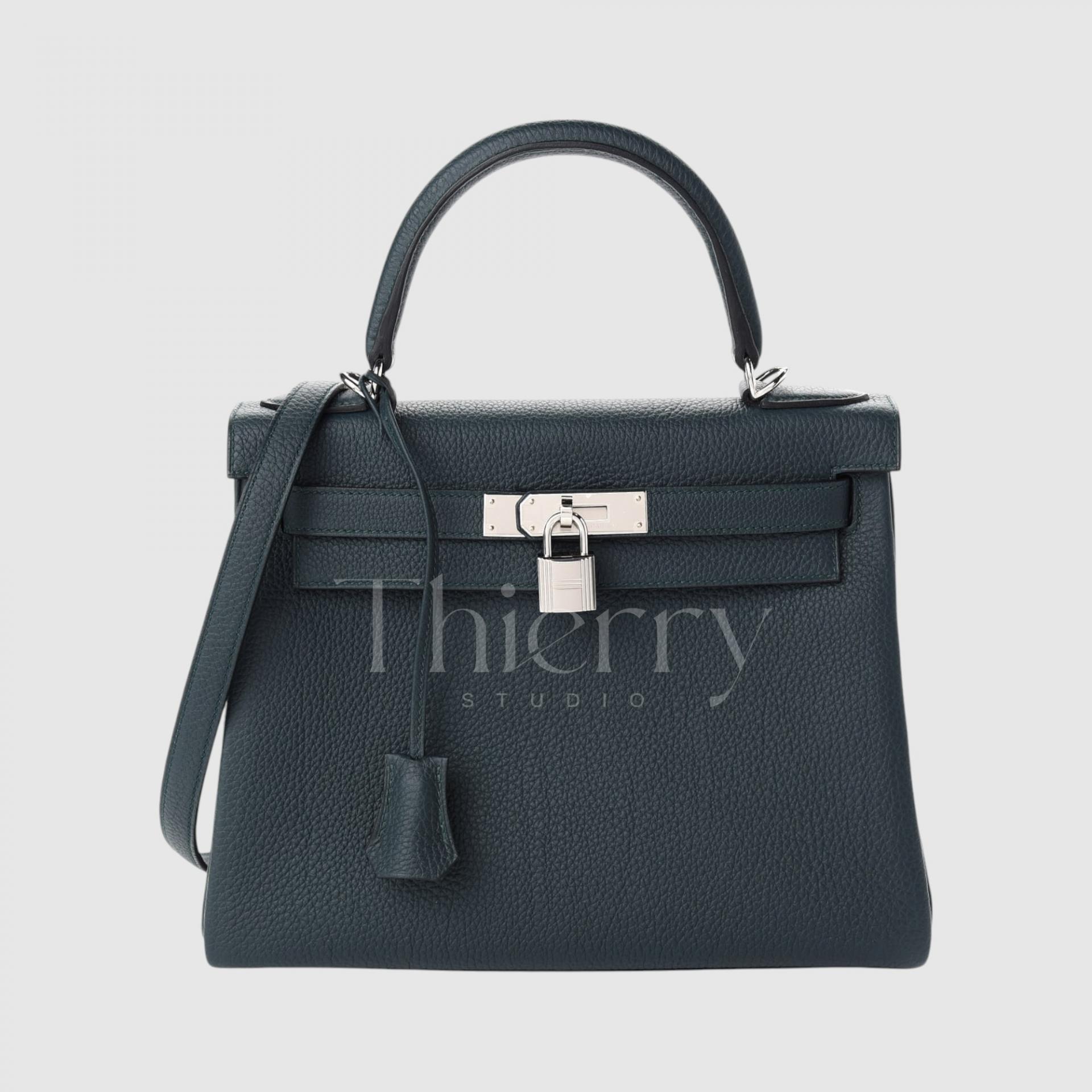
When styling greens, work with each shade’s character.
Light or bright shades such as Fizz and Bamboo make playful accents with simple clothing and are perfect for enlivening holiday outfits.
Mid-toned Vert Vertigo and Malachite have a classic yet refined character and are versatile across many clothing colors.
Dark Vert Foncé and Vert Cypres are subdued enough to work as alternatives to black, adding weight to formal looks and depth to monochrome autumn or winter outfits.
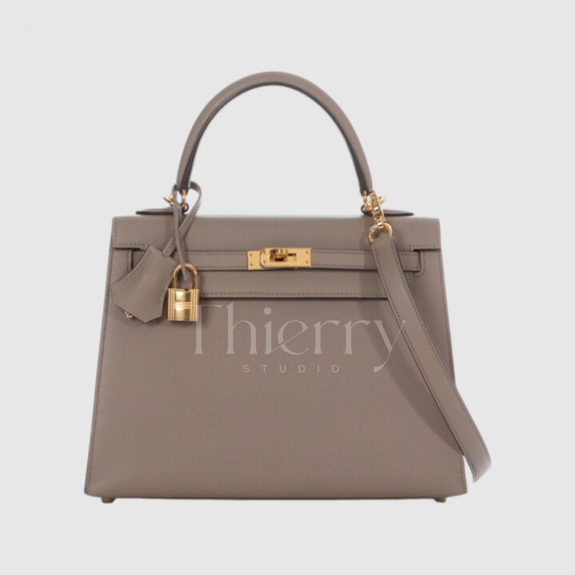
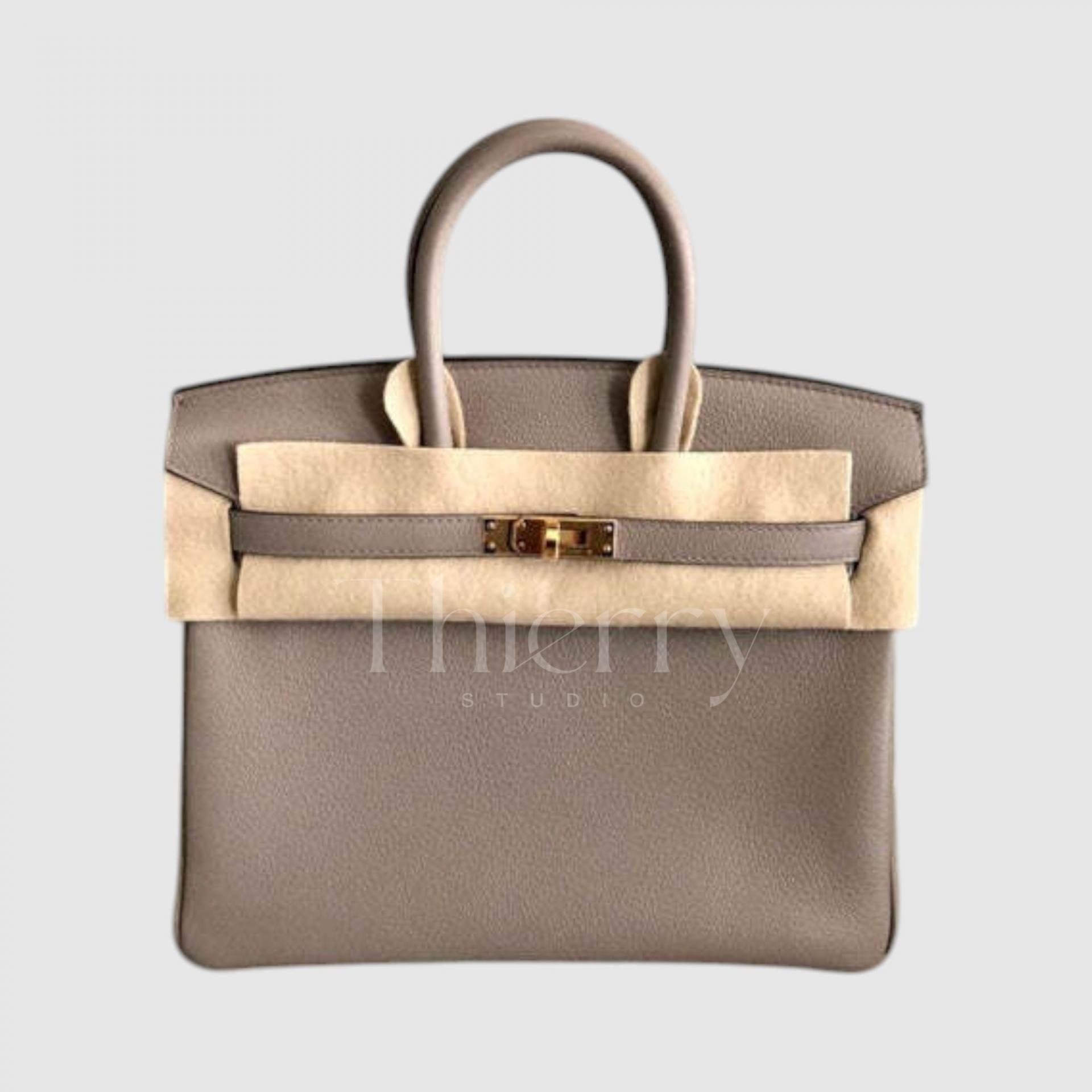
Gris Tourterelle
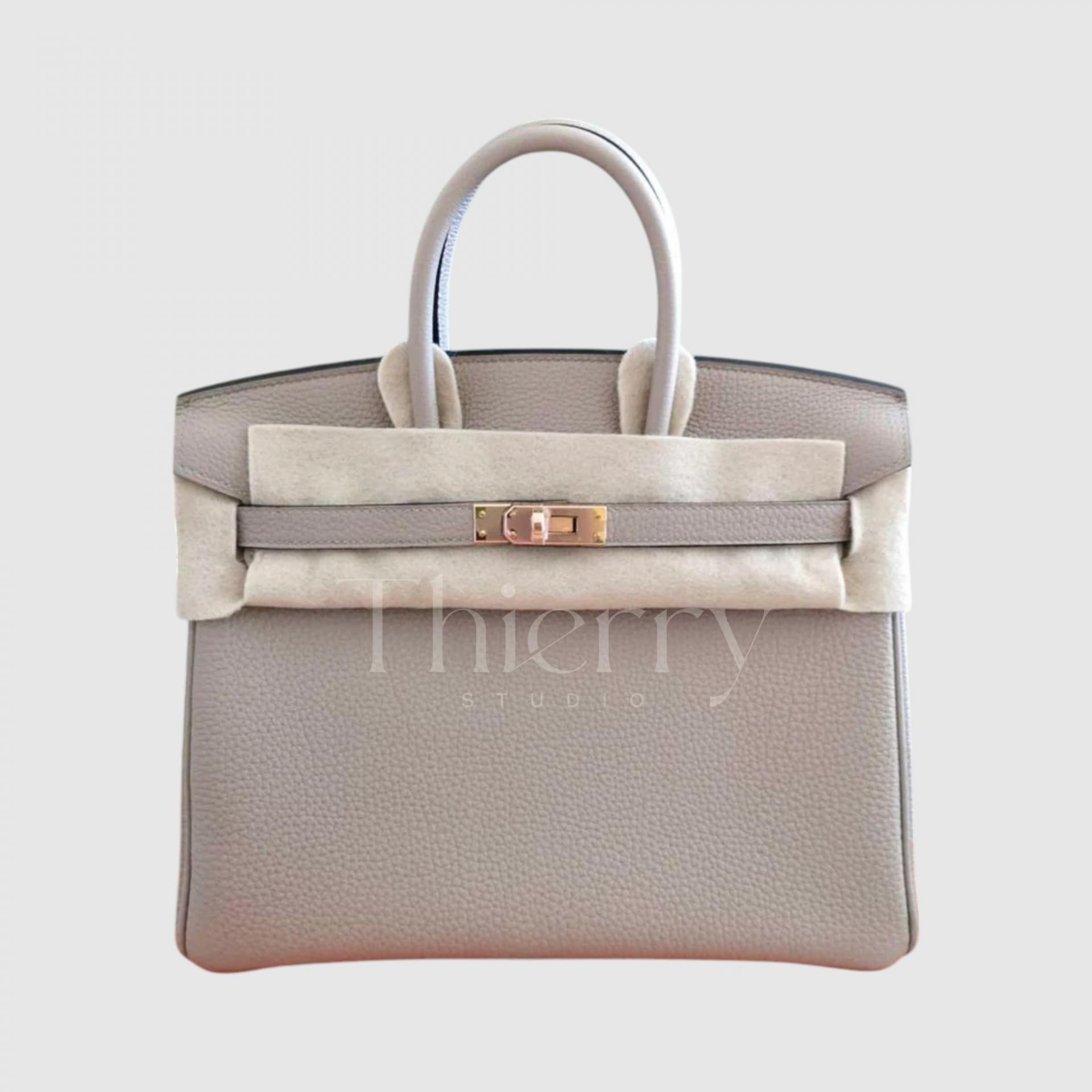
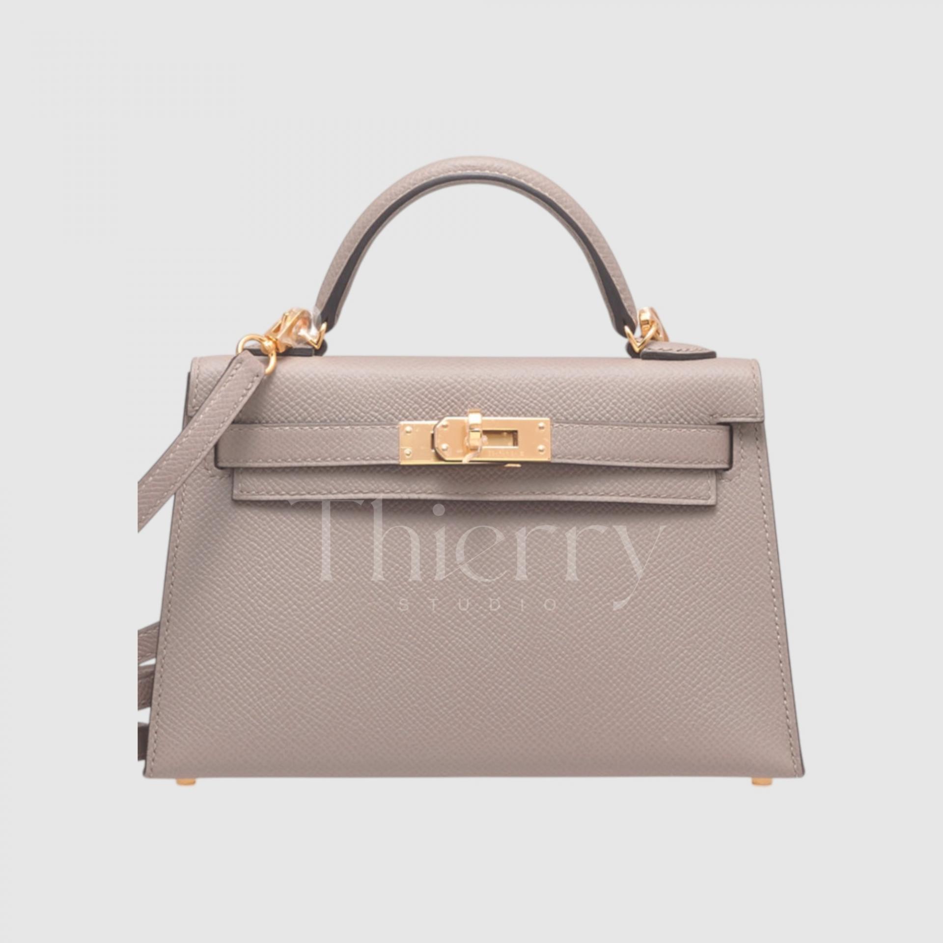
Meaning “turtledove gray,” Gris Tourterelle is a pale gray-brown inspired by the bird’s plumage. Lighter and grayer than Étoupe, it can be described as light taupe or warm gray.
Its warm beige undertone keeps this light gray soft rather than cold, making it a very popular spring and summer neutral.
It adds subtle refinement to ivory linen sets or pastel dresses, and elevates an everyday jeans-and-T-shirt outfit.
It was mainly available in its release year and has rarely been offered in boutiques since, making it a relatively scarce color.
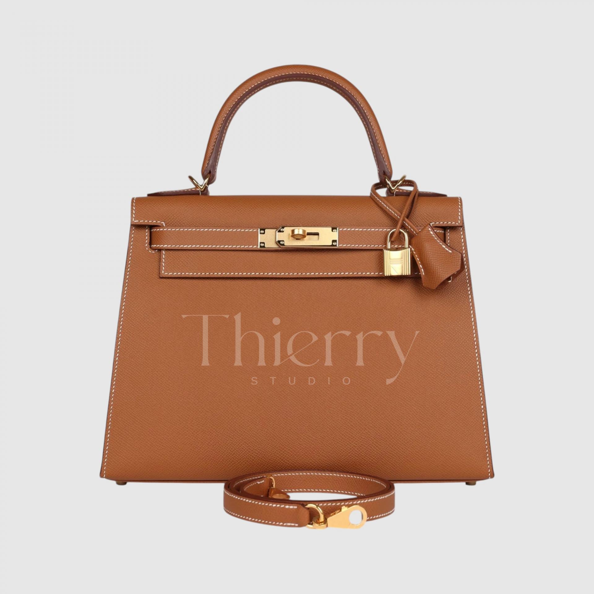
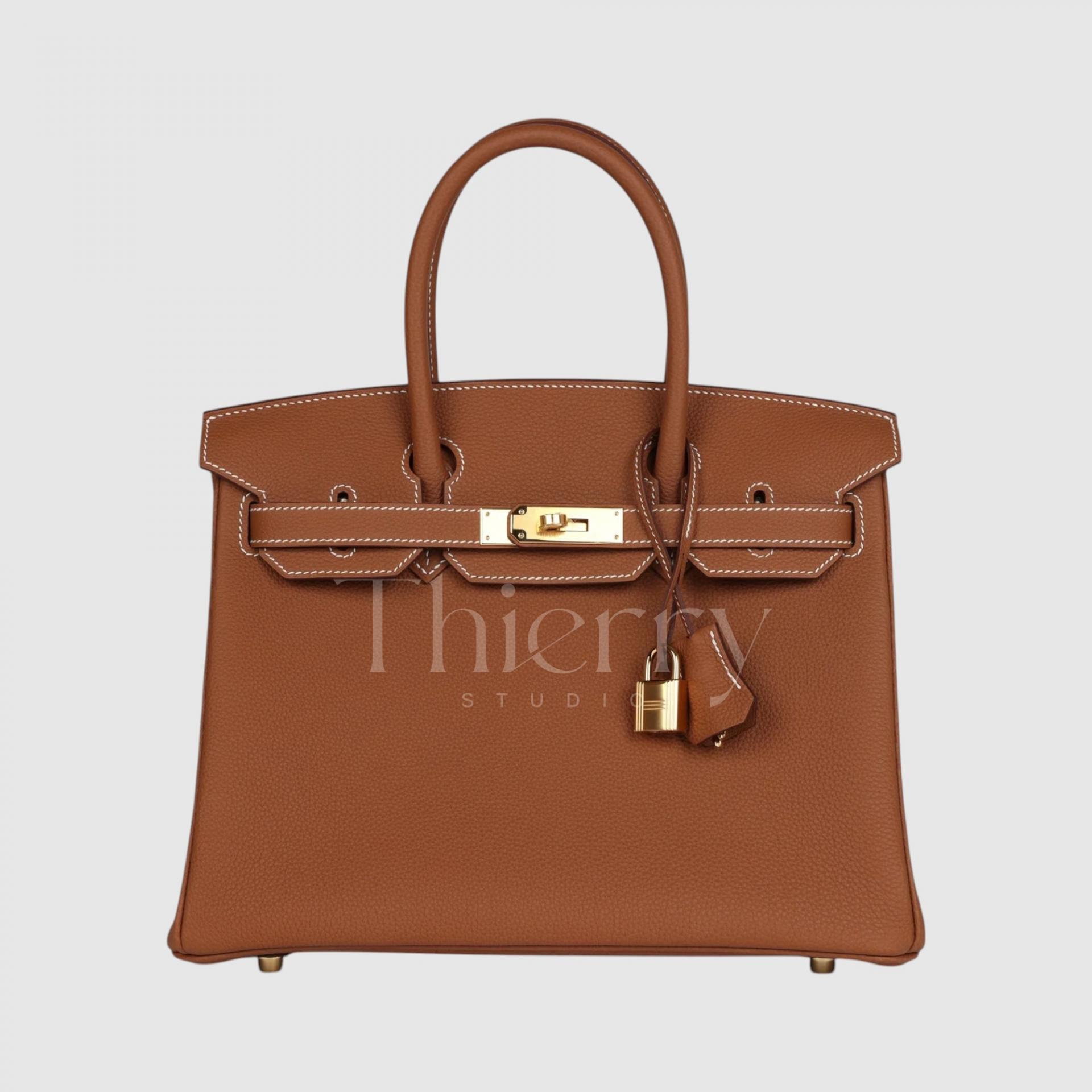
Gold
An Hermès signature inspired by saddle leather, Gold is a warm camel brown. Rather than metallic yellow gold, it is a rich ochre brown reminiscent of honey and caramel.
Often paired with white contrast stitching, Hermès Gold also has a relaxed quality, making it a versatile, classic color that works with everything from jeans to a trench coat.
This mid-toned brown transcends the seasons, pairing with summer linen dresses as easily as winter wool coats. Celebrity popularity has made Gold Birkins and Kellys especially sought after, and a favorite first Hermès color.
Gris Asphalt
Introduced around 2017, Gris Asphalt is a deep, cool gray taupe. Compared with dove-toned Gris Tourterelle, it is a darker gray with less brown and a subtle, intriguing cool-green cast.
According to an Hermès representative, it is slightly darker and cooler than Gris Tourterelle. Seen in Swift leather, it has a deeper, more modern character.
Charcoal-gray or khaki coats make sophisticated tonal pairings, while lighter clothing creates a gentle rather than stark contrast.
It looks far more luxurious in person than in photos—a great choice if Étoupe feels too familiar.
Étoupe
A blend of soft gray and brown, Étoupe is one of Hermès’ best-selling colors.
This medium-toned taupe can be described as a soft grayish beige, combining warm brown undertones with cool gray so it blends naturally with almost any outfit.
Étoupe is so versatile that it is often called the quintessential Hermès neutral. It gives casual outfits ease and formal looks refinement.
A white shirt with cotton trousers feels natural with it, while black tailoring becomes softer and more elegant. This gentle balance of gray and brown keeps Étoupe popular alongside Gold, with strong appeal in the resale market too 🙂
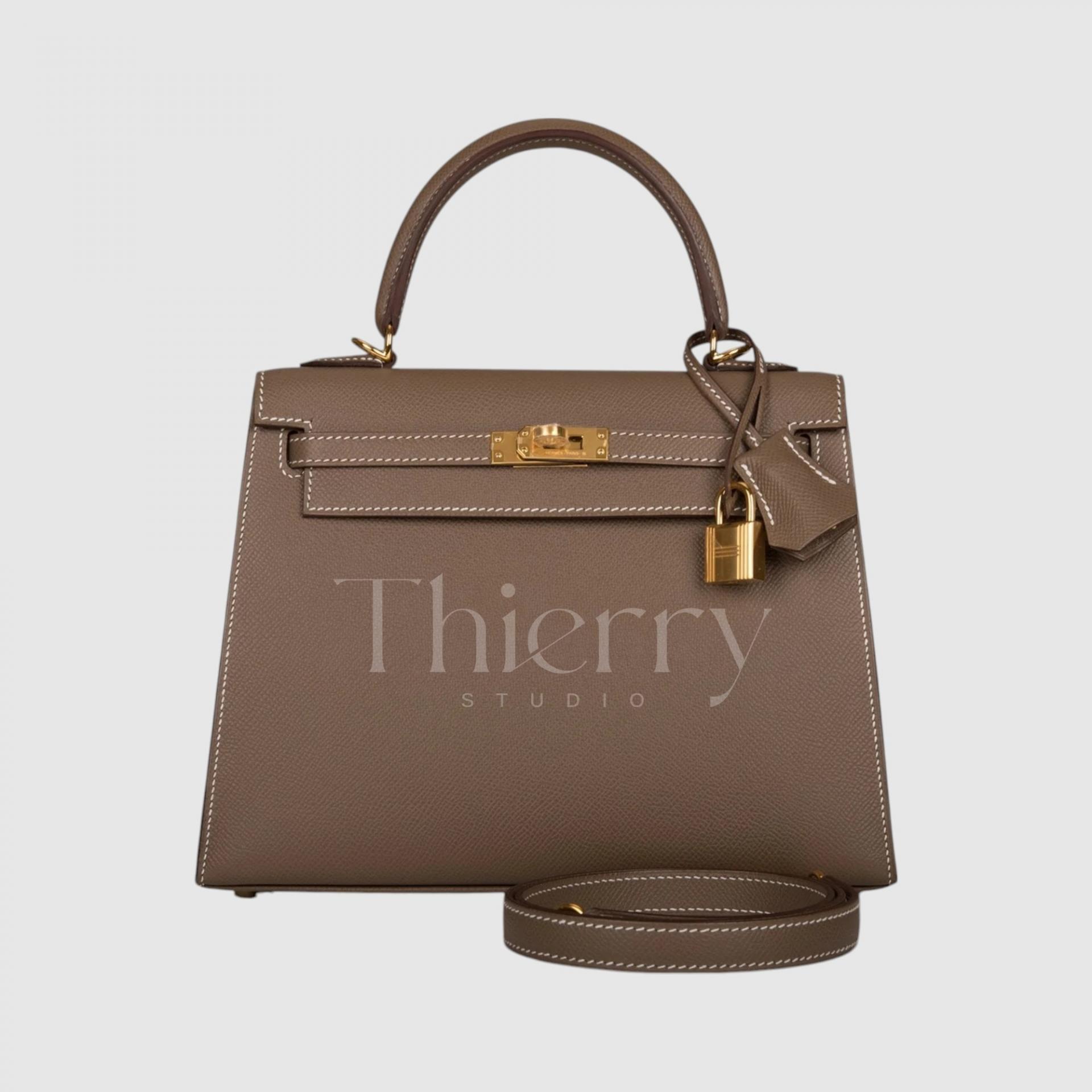
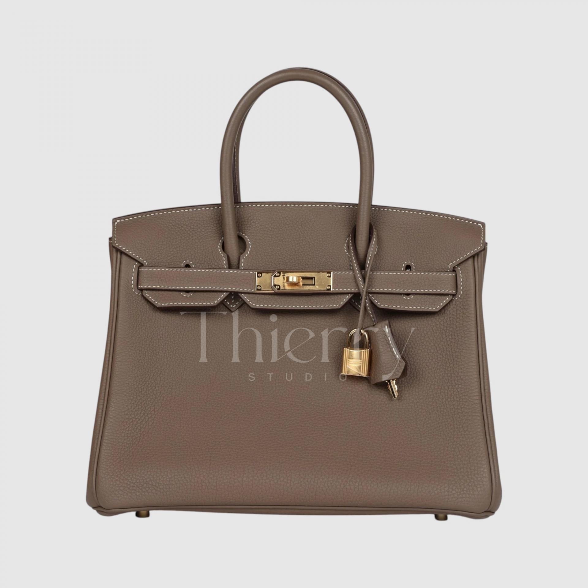
The Gold and Étoupe families are all versatile neutrals, but each shade has its own emphasis.
Gold is a warm yellow-brown that works especially well with vivid casualwear, autumn checks and ivory outfits.
Étoupe is a grayish brown that is equally versatile with tailoring and casualwear.
Gris Tourterelle is the lightest, suited to fresh, feminine looks,
while Gris Asphalt has a modern, urban character that complements chic monochrome outfits🙂
Gris Pale
As the name suggests, Gris Pale is a very pale gray with a blue undertone: a cool, clean light gray.
Its light, cool tone feels crisp and modern, offering a gentler accent than pure white. It adds depth to an all-white outfit or, balances pastel combinations such as pink and mint for a refined result.
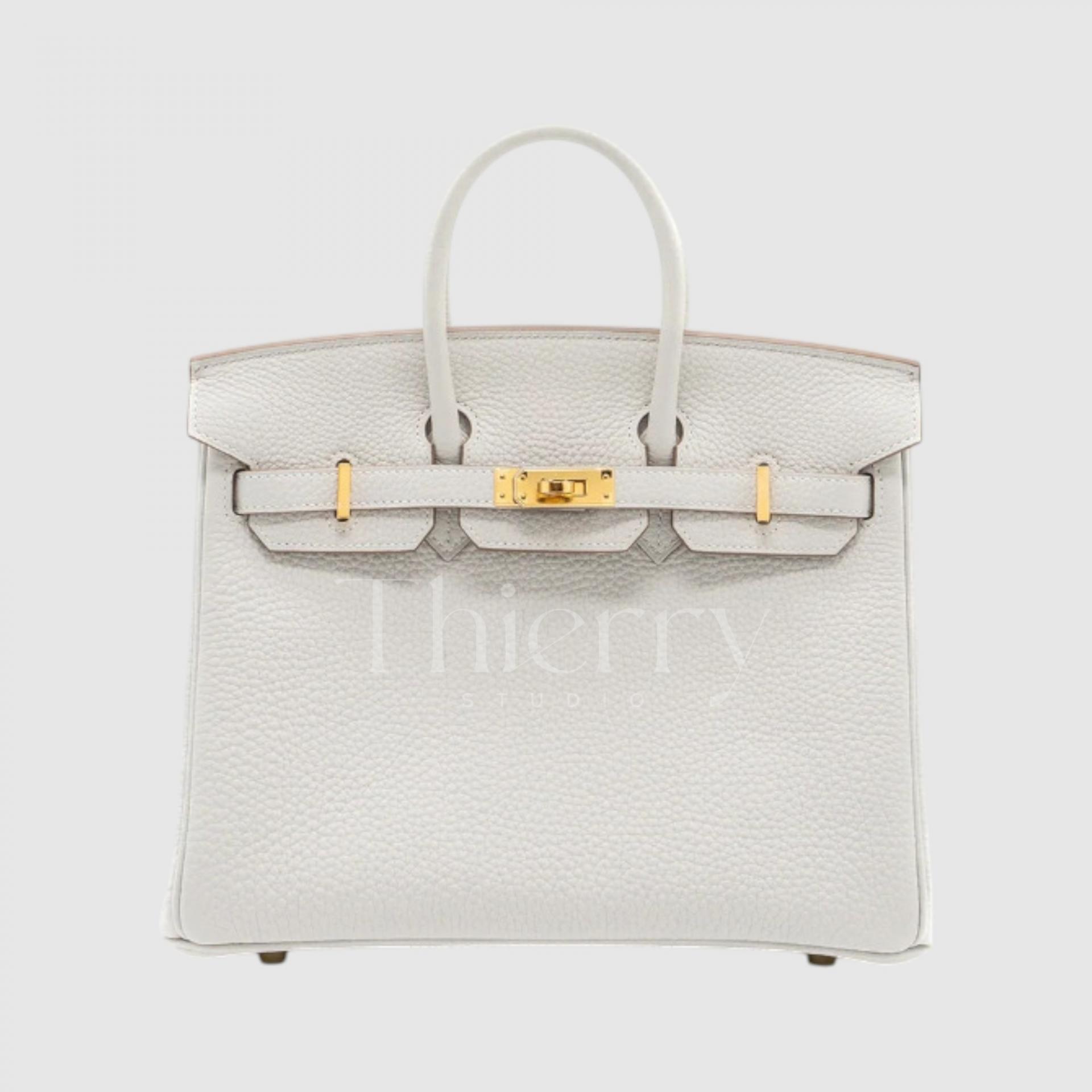
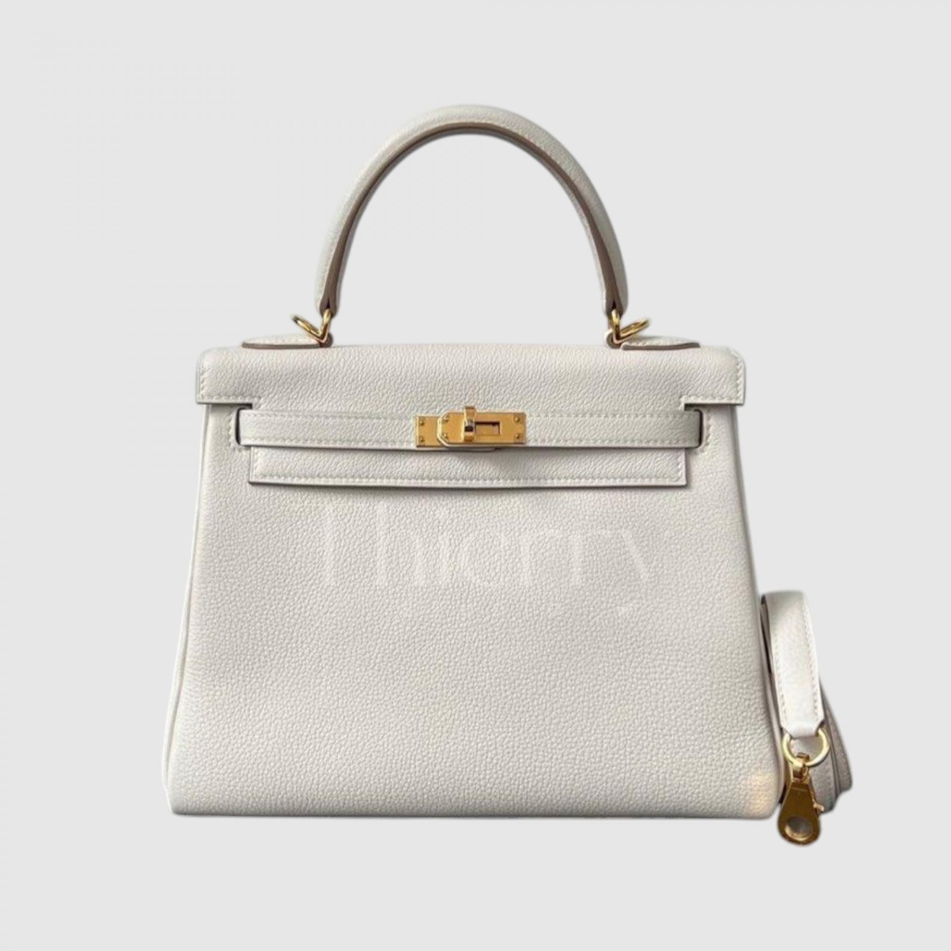
Gris Perle
Gris Perle is a soft, pearly gray with a drop of beige, creating a warm pearl gray. Compared with Gris Pale, its slight beige undertone gives it an elegant, gentle mood, ideal if you want a softer, feminine neutral.
Cream knits or beige coats pair beautifully with it. Combining gray’s composed feel with beige’s warmth, it works from formal occasions to casual days🙂
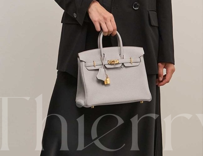
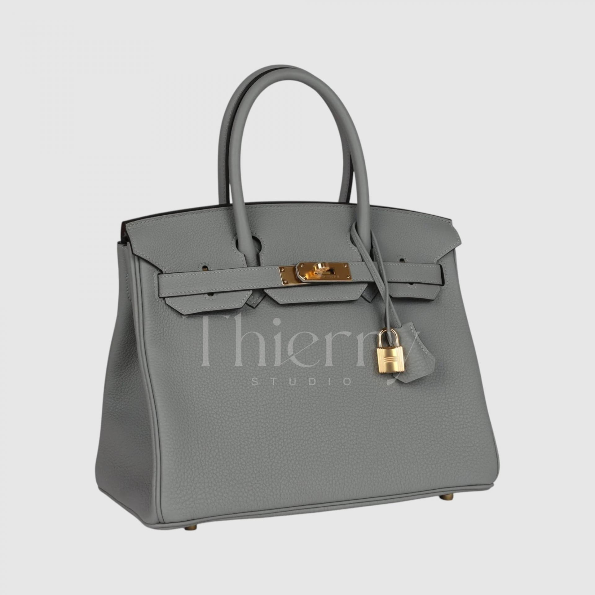
Gris Mouette
Meaning “seagull gray,” Gris Mouette has been much loved since its 2016 introduction as a medium-toned cool gray.
An icy gray with a blue cast, it feels clear and cool, and is regarded as one of Hermès’ most modern, sophisticated grays. It was described as a particularly desirable gray soon after its release.
Light enough to feel fresh yet distinct enough to make an impression, it provides a polished accent with a navy suit or black dress, and lends a smart touch to a light shirt and tailored trousers.
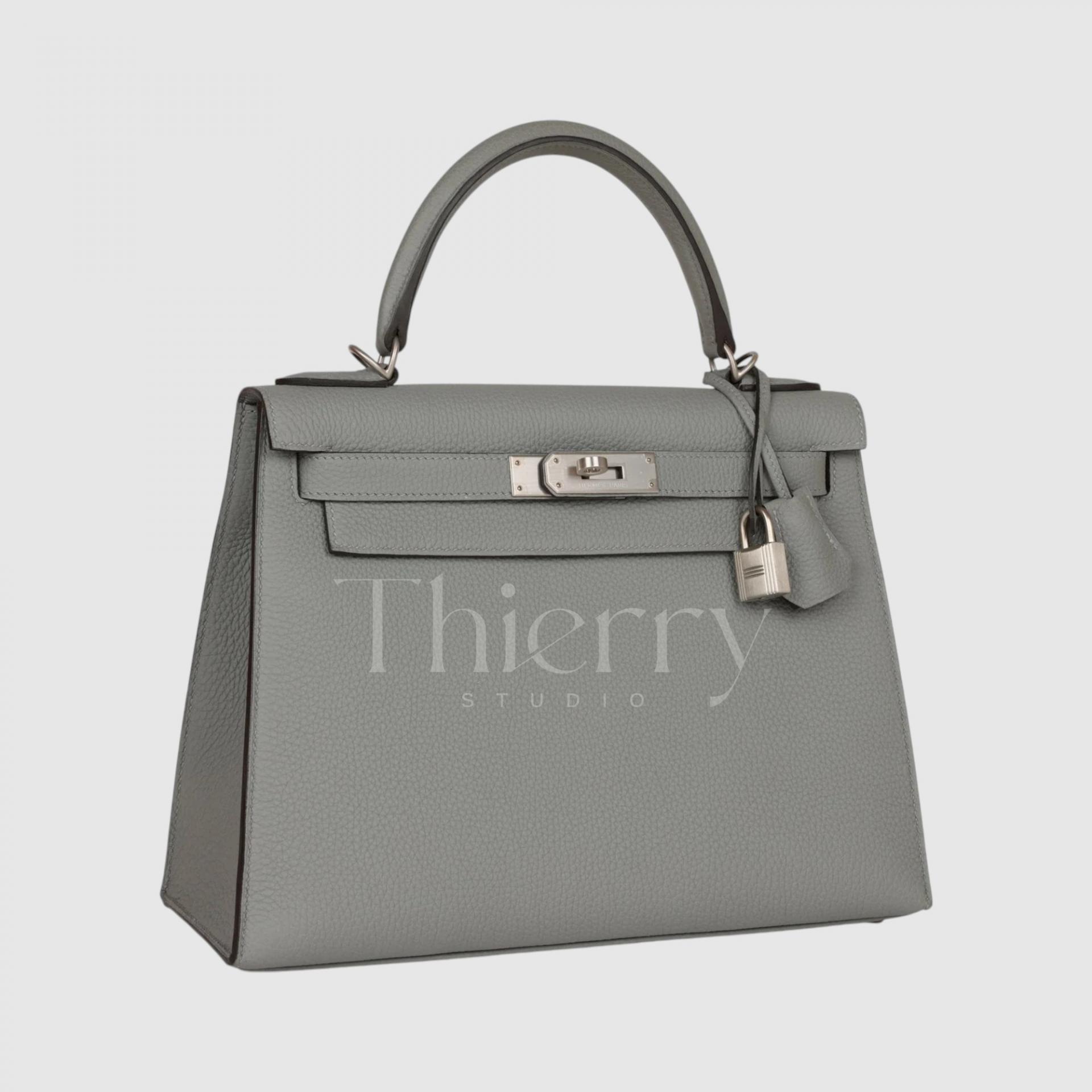
Étain
Meaning “pewter,” Étain is a signature Hermès dark gray: a deep gray with subtle brown and beige undertones.
Rather than a purely cool gray, its blend of beige and brown gives it depth and a quiet warmth, despite its darkness.
Étain is often described as “softer than black and more urban than brown”, making it a refined everyday alternative to black.
For example, use an Étain bag instead of black with an all-black suit for a softer, more distinctive neutral combination. It also blends into casual clothing without overwhelming it, making it exceptionally versatile.
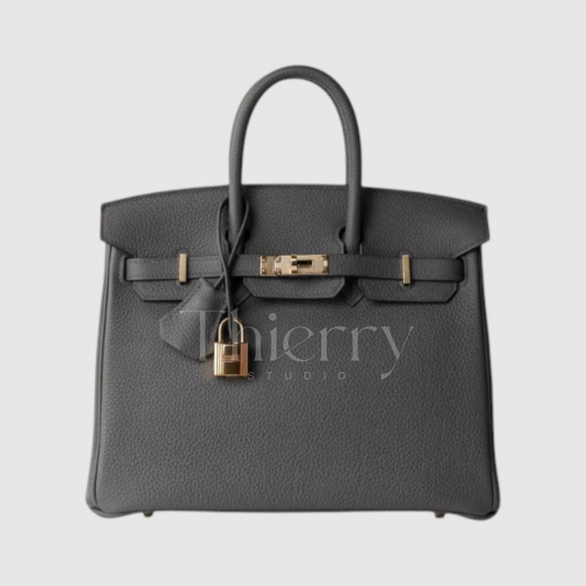
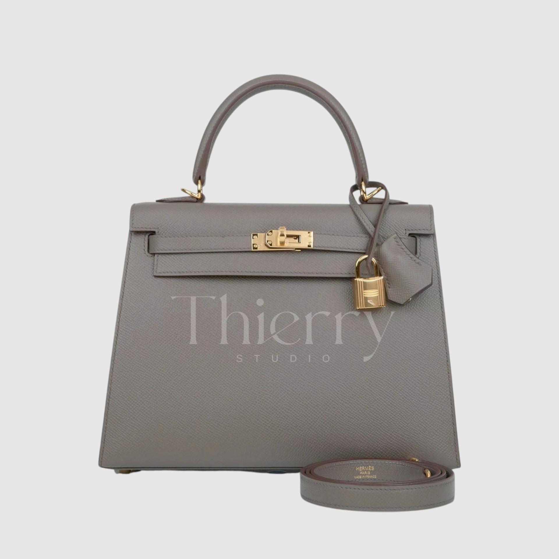
Gris Meyer
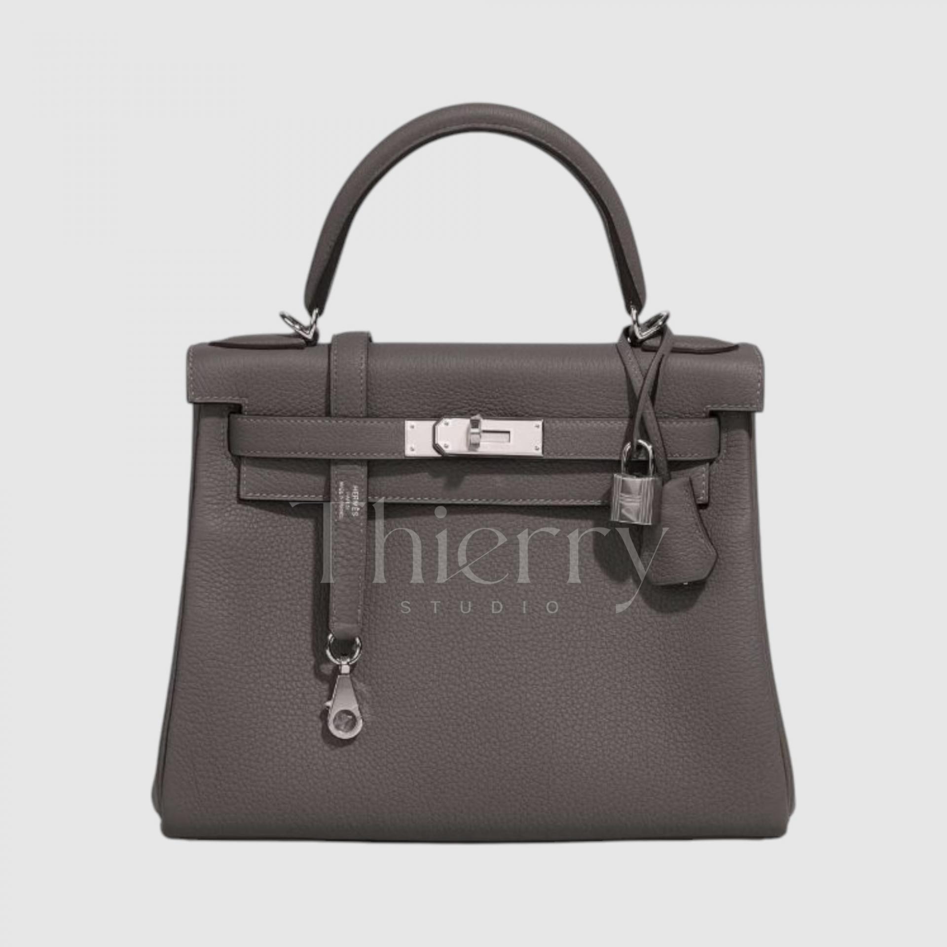
Introduced around 2022, Gris Meyer sits between Étain and Gris Mouette as a medium-toned neutral gray.
With a hint of tree-bark brown, it can be described as a warm gray with a subtle chestnut undertone. Lighter and softer than Étain, it remains closer to gray than beige and feels understated.
Its character changes subtly with the viewing angle and hardware: palladium hardware makes it look calm and cool,,
while gold hardware draws out its beige warmth.
That flexibility makes it an excellent year-round everyday neutral. In particular, brown clothing brings out its gray side, while gray clothing emphasizes its beige undertone, creating a nuanced effect.
Gris Misty
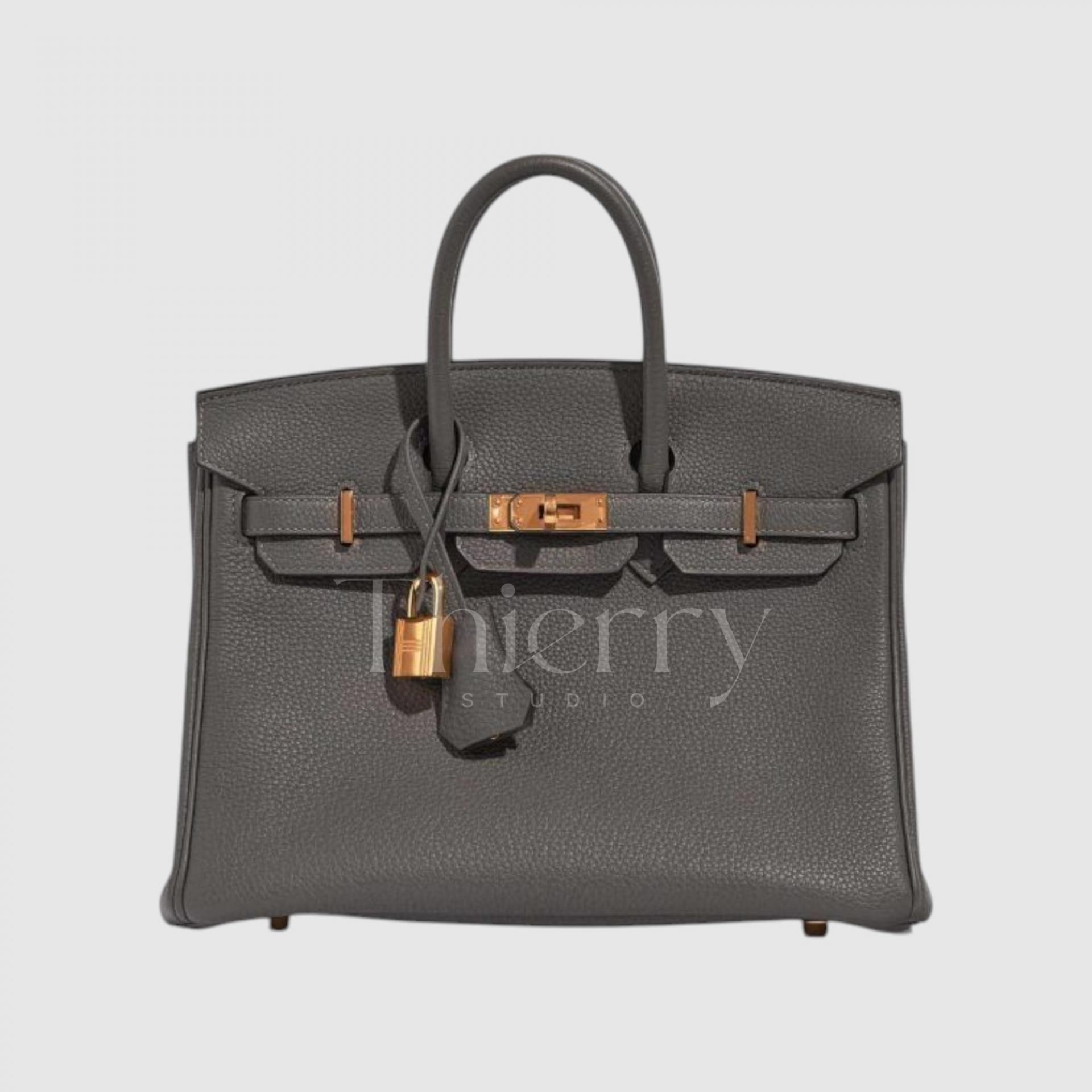
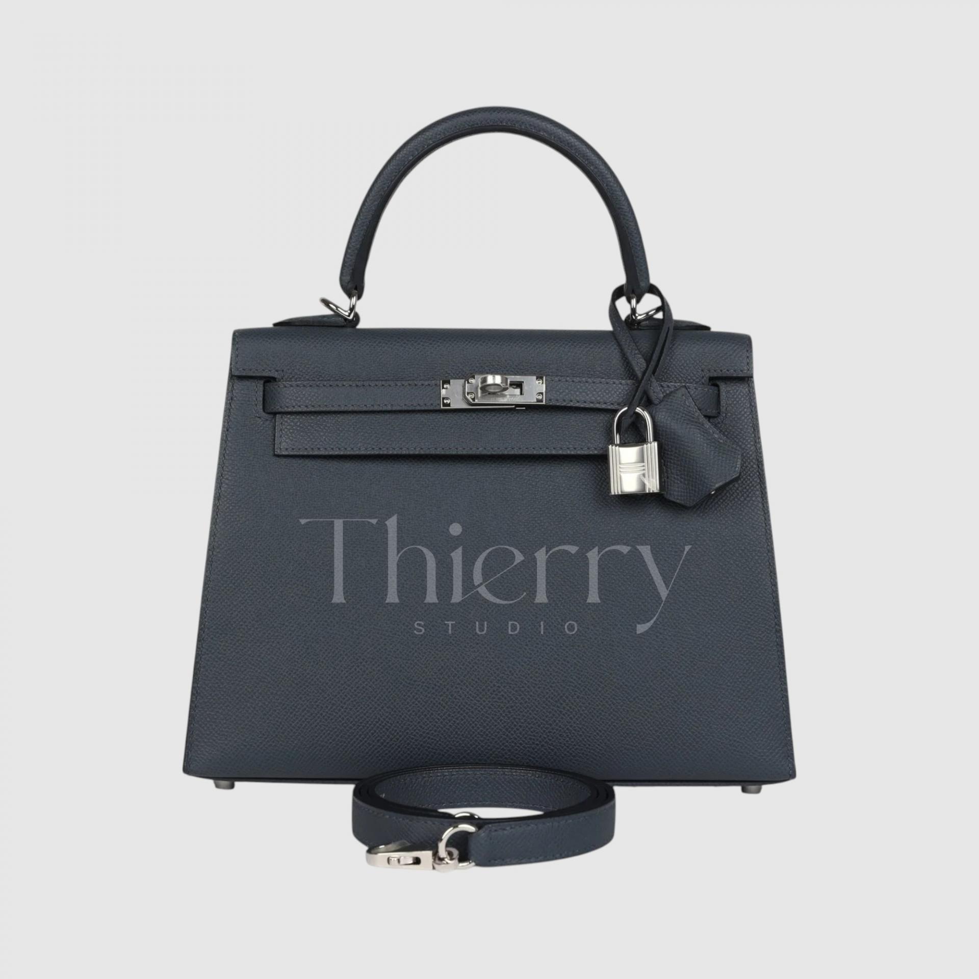
Introduced in 2024, Gris Misty is a deep, mist-like dark gray.
A modern dark gray with a subtle blue undertone, it is darker than Étain and has a distinct presence.
Deeper than Gris Meyer, it evokes a veil of dark gray mist, creating a crisp, chic mood.
A Gris Misty bag has depth to rival black, making it well suited to formal occasions. Light reveals its cool undertone, which pairs elegantly with navy or blue clothing.
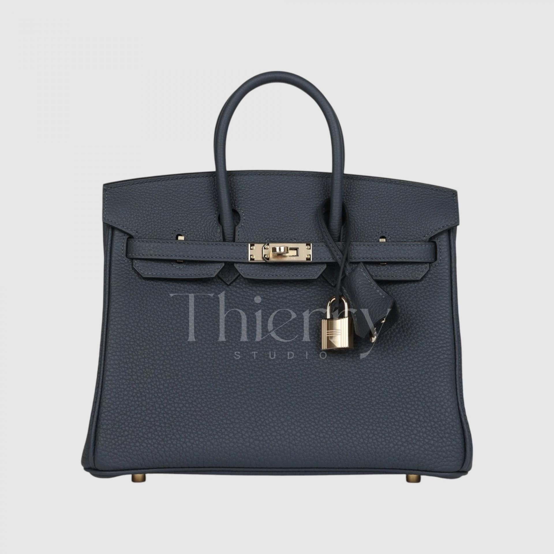
Hermès grays have many uses, depending on their warm or cool undertones and lightness.
Light, cool grays such as Gris Pale add freshness to summer monochrome outfits,
while warm pale grays such as Gris Perle pair softly with beige or pink clothing.
Mid-toned Gris Mouette is ideal for chic urban styling,
while Gris Meyer suits soft neutral looks.
The darkest shades, Étain and Gris Misty, work well as alternatives to black, with Étain a little warmer and Gris Misty a little cooler.
That concludes our look at some signature Hermès colors. Did any shades you had previously overlooked catch your attention?
Classics such as Black, Gold, Étoupe and Craie are beautiful, of course, but to me, the real pleasure of Hermès is“pairing colored bags with your wardrobe to create a mood that is your own”.
I put this guide together to make questions such as “Will it suit me?” and “How would I style it?” feel less daunting.
If there are other colors you would like to know about, please ask 🙂
